Introduction: Why Text Mine the Local News?
Media ‘slant’ is a fascinating topic. Ask anyone who reads the news, and they’ll probably have a reason for choosing one media source over another. Invariably, that reason often turns out to be because, according to them, the one they read isn’t biased and all the others are.
The starting point of this post was an attempt to recreate this graph for the local news context. But as soon as I started, I realised that I was only working off my own subjective opinions. The rest of this post is an attempt at an objective analysis to see if text mining principles implemented in the R programming language can offer more objective insights into how local media is different, and in what ways it is similar.
What this post is not about
It’s not about discrediting any media outlet, and it’s certainly not about individual journalists. An organisation’s journalists might themselves have no idea that they’re even biased: ‘groupthink’, or working in a bubble with other people who tend to share several sociocultural factors that might not reflect the broader population has in the past led several newsrooms up strange avenues.
The Data: A Summer of Maltese News
Over a three month period spanning June 21st to September 21st, I collected news from these 5 English language news websites/current events blogs:
Times of Malta, the oldest daily newspaper, having both the largest physical circulation and the most views of any Maltese website according to Alexa Internet.
Malta Today, a weekly newspaper with extensive political, court and environmental issues reporting. Alexa Internet rank: 8.
Newsbook, a leaner, contemporary offshoot of RTK, a media organisation owned by the Archdiocese of Malta. Alexa Internet rank: 7.
Lovin Malta, the local franchise of the Lovin Media group.
Manuel Delia’s Truth be Told, a current events blog.
All articles selected were not behind any paywalls. Only English content was selected from websites that had bilingual articles(Newsbook), and only items listed as local news were analysed. The data was stored in a 4 column table, containing the article title, date, article text and publisher. The corpus, in it’s entirely, contained 1.8 million words.

The whole dataframe looks something like the above, for another 5,300+ rows.
Here are the number of articles per publication we’ll be examining:
articles %>% group_by(Publisher) %>% count()## # A tibble: 5 x 2
## # Groups: Publisher [5]
## Publisher n
## <chr> <int>
## 1 Lovin Malta 646
## 2 MaltaToday 876
## 3 ManuelDelia 300
## 4 Newsbook 1734
## 5 TimesOfMalta 1820The Most Common Publishing Time for News?
With the exception of Lovin Malta, which doesn’t give a timestamp in their date field, we can plot the number of articles published in each hour:
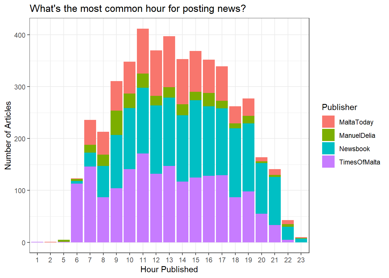
The hour with the largest number of articles is 11. Times of Malta seems to take an early bird approach, with posts starting as early as 6, while Newsbook adopts more of a night owl approach, posting consistently into the late hours of 9 and 10.
Average pieces of ‘Local News’ Per Day?
articles %>%
    mutate(day = floor_date(Date, unit = "day")) %>%
    group_by(day, Publisher) %>%
    count()%>%
    group_by(Publisher) %>%
    summarise(Average_Articles_Per_Day = mean(n))
## # A tibble: 5 x 2
## Publisher Average_Articles_Per_Day
## <chr> <dbl>
## 1 Lovin Malta 6.73
## 2 MaltaToday 9.12
## 3 ManuelDelia 4.55
## 4 Newsbook 18.4
## 5 TimesOfMalta 19.4Word Counts of Titles and Articles
Alright, time to start analysing the actual text! Who has the longest titles? Who has the shortest ones?
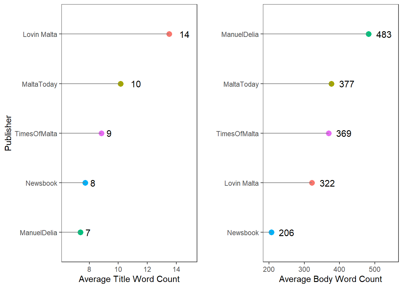
The longest headlines are written by Lovin Malta, who average double the words of Manuel Delia or Newsbook. Interestingly, Lovin Malta’s articles are among the shortest, which hints to the top heavy structure of their articles. It’s probably no accident that Manuel Delia is the exact opposite, and that Malta Today and Times of Malta are so similar to each other.
But besides one aggregated average, the power of R can give us something better! We can take each individual article, and plot the distribution of how many of Newsbook’s headlines were 10 words vs 9 words in length for instance!
Enter the mighty violin plot:
  ggplot(articles, aes(Publisher, titlewordcount, fill = Publisher))+
    geom_violin()+
    ylab("Word Count - Title")+
    theme_bw()+
    theme(legend.position="none")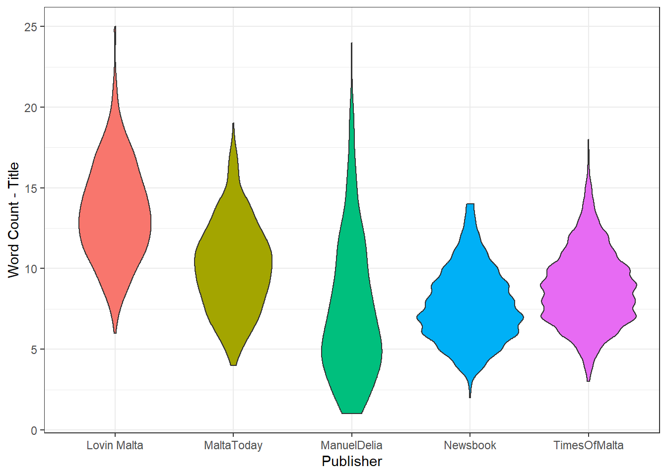
What the graph shows is that Times of Malta and Newsbook have a smaller variance in title length: most are either 7-11 words in length, while very few are shorter or longer. Contrast this with Manuel Delia for instance, where the most common title length is around the 6-7 mark, while longer titles are rare but not unheard of.
We can do the same for the article bodies:
 ggplot(articles, aes(Publisher, bodywordcount, fill = Publisher))+
    geom_violin()+
    ylim(0, 2000)+
    theme_bw()+
    theme(legend.position="none")+
    ylab("Word Count - Body")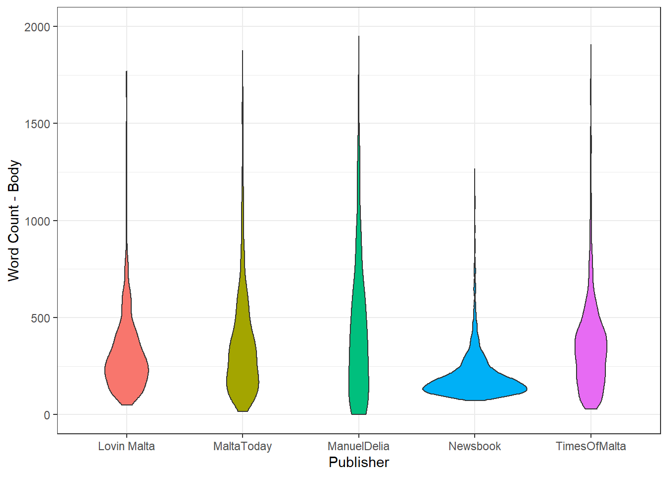
##What are the most common words? I’ve been wanting to use the tidytext package ever since I read Julia Silge and David Robinson’s fantastic book Text Mining with R: A Tidy Approach… and hey, this was just the chance!
Let’s start off with something simple, what are the most common words that local Publishers have used in a whole summer of covering the news? Well to answer this question, we’ll have to first turn our first table into a slightly different one, where each word will be a row. We can achieve this by using the unnest_tokens function from the tidytext package. This lets us count the number of times a specific word, like government, is present in the whole text corpus.
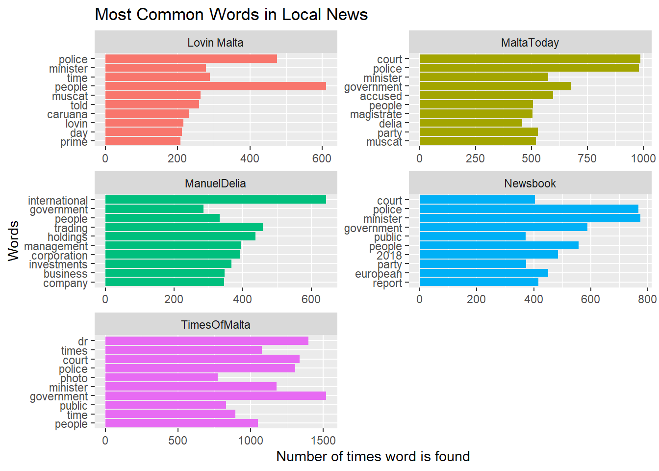
Common English words like ‘The’, “is”, “at”, “which”, or “on” (called stopwords) would naturally have the highest frequency, and top the chart. But since these words do not provide and meaningful information, they are filtered away. Besides a list of the standard English stopwords that tidytext has, I also added a separate list that filtered out things like “Malta”, “Malta’s” and the names of several staff photographers - since their photos tend to be captioned, their names also dominated.
But even with these steps, our top 10 words are hardly insightful. Most words were about the police, ministers, court or government - or exactly what’s in the news.
A more meaningful way to look into what the publications are writing about is to see what words, say, Manuel Delia would use more frequently compared to Lovin Malta. Since almost all publications will report about a government decision or court case, we need a method that penalises common terms across the entire text corpus and promotes terms unique to that website.
The field of Information Retrieval has had a solution for this since the late 1980’s, called term frequency-inverse document frequency, often abbreviated as TF-IDF. A more thorough explanation of TF-IDF can be found in it’s wikipedia entry here, but for our purposes, all we really need to know is this:
If Times Of Malta wrote 5 articles about colour purple, and a 100 articles about court cases, while other publications also wrote a large number of articles about court but none about the colour purple, Times of Malta’s TF-IDF score for “purple” would be very high, but Times of Malta’s TF-IDF score for “court” would be very low.
Here’s what the top 12 TF-IDF terms are, using tidytext’s bind_tf_idf() function.
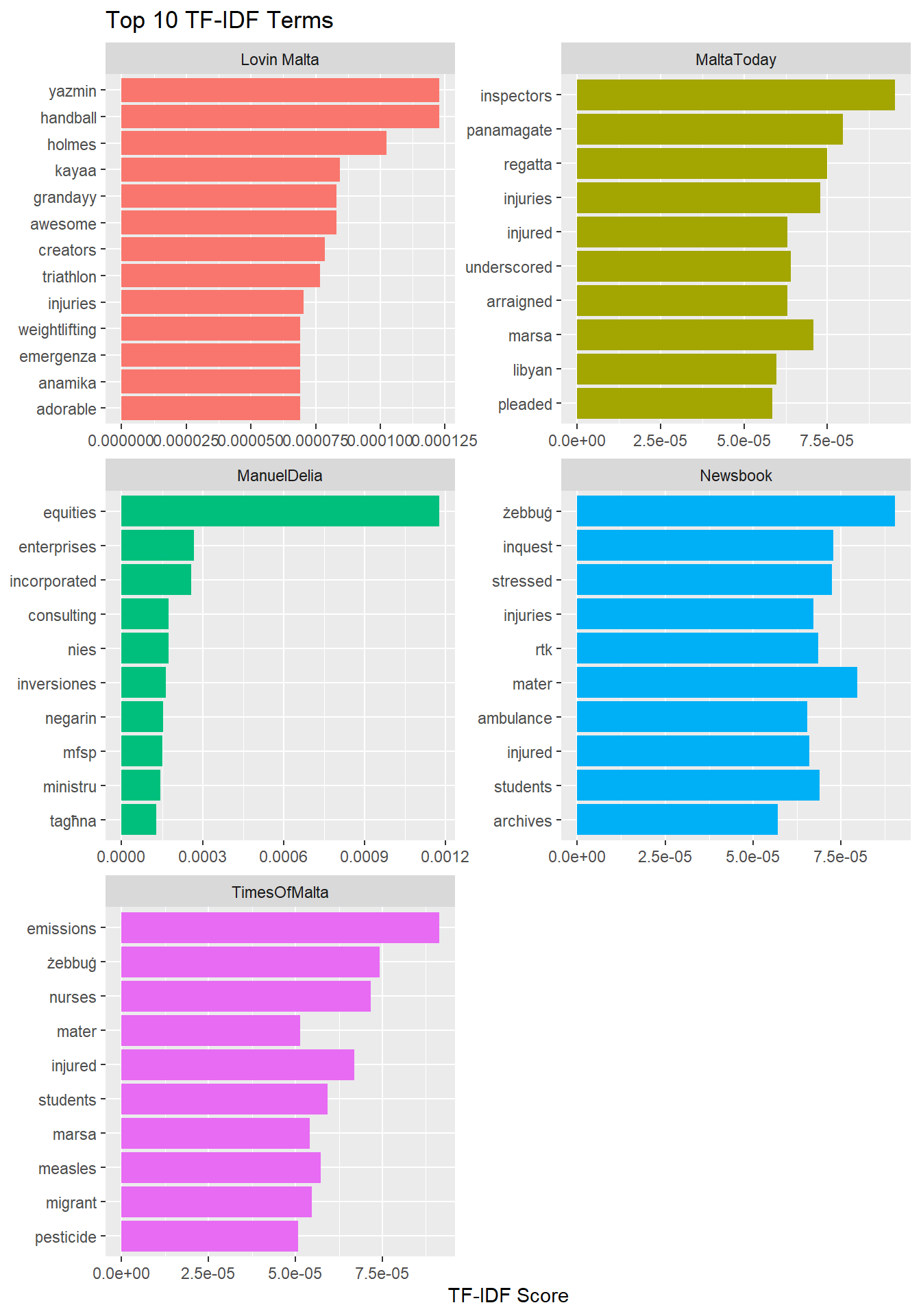
That’s an improvement! Lovin Malta is more likely than anyone else to talk about weight lifting champion Yazmin Zammit Stevens, the Daniel Holmes case and Maltese YouTuber Grandayy.
Malta Today was more likely to use the terms “panamagate” and “underscored” - the result of either stylistic choices, or an individual journalist’s predisposition to use one term over the other.
Manuel Delia was more concerned with financial and corporate terms like “equities”, “enterprises” and “incorporated”, and the sister of Ali Sadr, of Pilatus bank fame.
Interestingly, the town of “Zebbug” scored high for both Newsbook and Times of Malta. A quick check reveals that this is indeed correct, with many happenings in Zebbug… compounded by the fact that there are two Zebbugs, one in Malta and the other in Gozo. Newsbook’s “inquest” is also interesting, since it’s probably a different stylistic choice to the same material that was “panamagate” in Malta Today’s pane.
“Emissions” scored high in TF-IDF for Times of Malta as a result of a summer long series on the harmful impact of ship emissions on air quality..
Also noteworthy is the overlap of some terms in two publications: mater [dei hospital] managed to score high in TF-IDF for both Newsbook and Times of Malta, which means those two media houses either report on hospital affairs more frequently than the three others, or, that the others use a different term, like only “hospital”. This is also true for “Marsa” and “Regatta” - the site of a prolific arrest.
##Bigrams!
So far, we’ve only been examining bigrams, or single words. More insight can be gleamed from the knowing which word is most likely to pair with another.
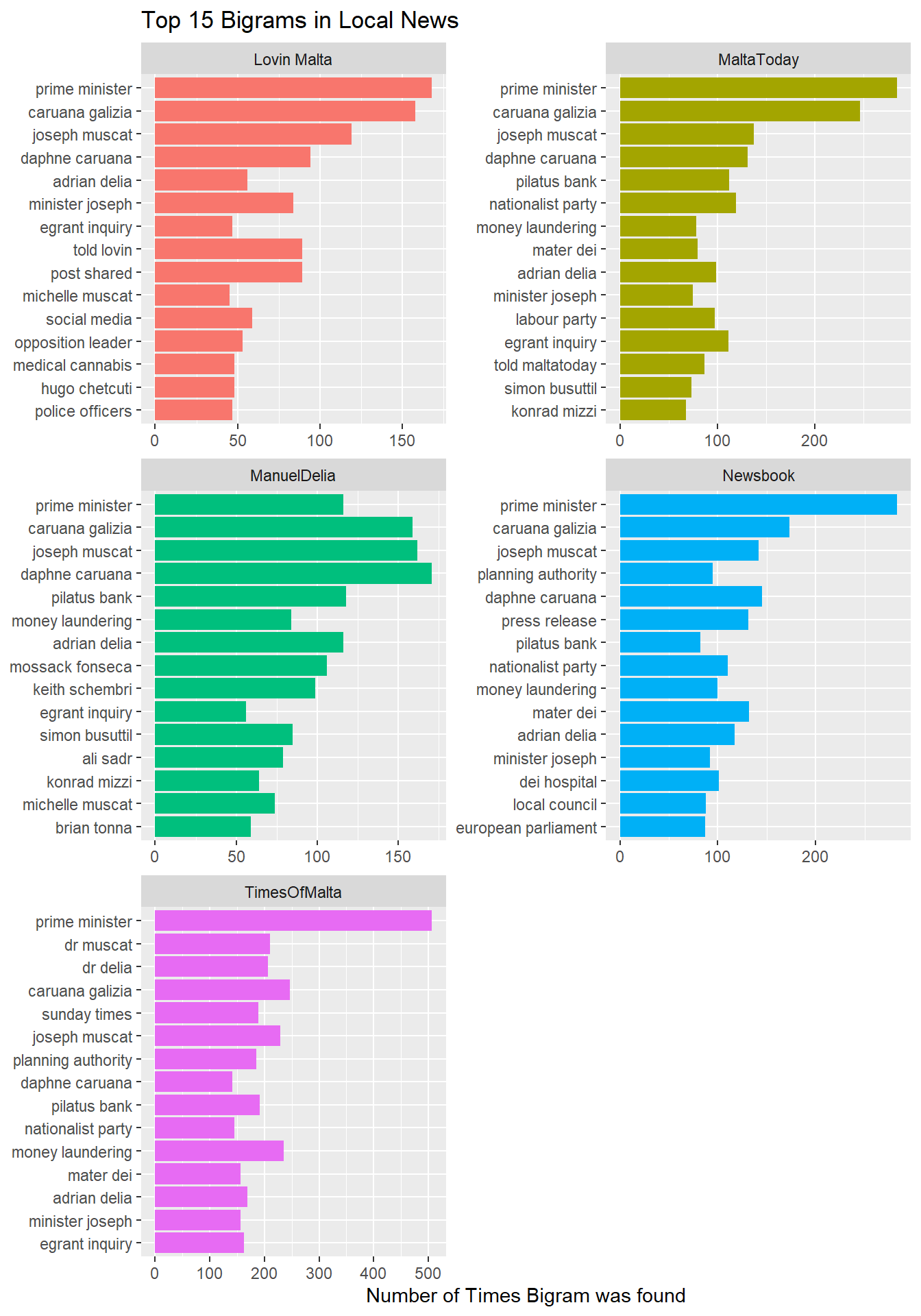
One of the things I was most struck by about after reading Text Mining with R was how intiutively bigrams translate into networks.
By using the igraph package, to convert the bigrams into a network, they can then be plotted like this:
## IGRAPH 80e6622 DN-- 251 179 --
## + attr: name (v/c), n (e/n)
## + edges from 80e6622 (vertex names):
##  [1] prime      ->minister   caruana    ->galizia    joseph     ->muscat
##  [4] daphne     ->caruana    adrian     ->delia      pilatus    ->bank
##  [7] money      ->laundering egrant     ->inquiry    nationalist->party
## [10] minister   ->joseph     simon      ->busuttil   mater      ->dei
## [13] planning   ->authority  konrad     ->mizzi      labour     ->party
## [16] keith      ->schembri   social     ->media      dei        ->hospital
## [19] leader     ->adrian     opposition ->leader     magisterial->inquiry
## [22] local      ->council    dr         ->delia      sunday     ->times
## + ... omitted several edges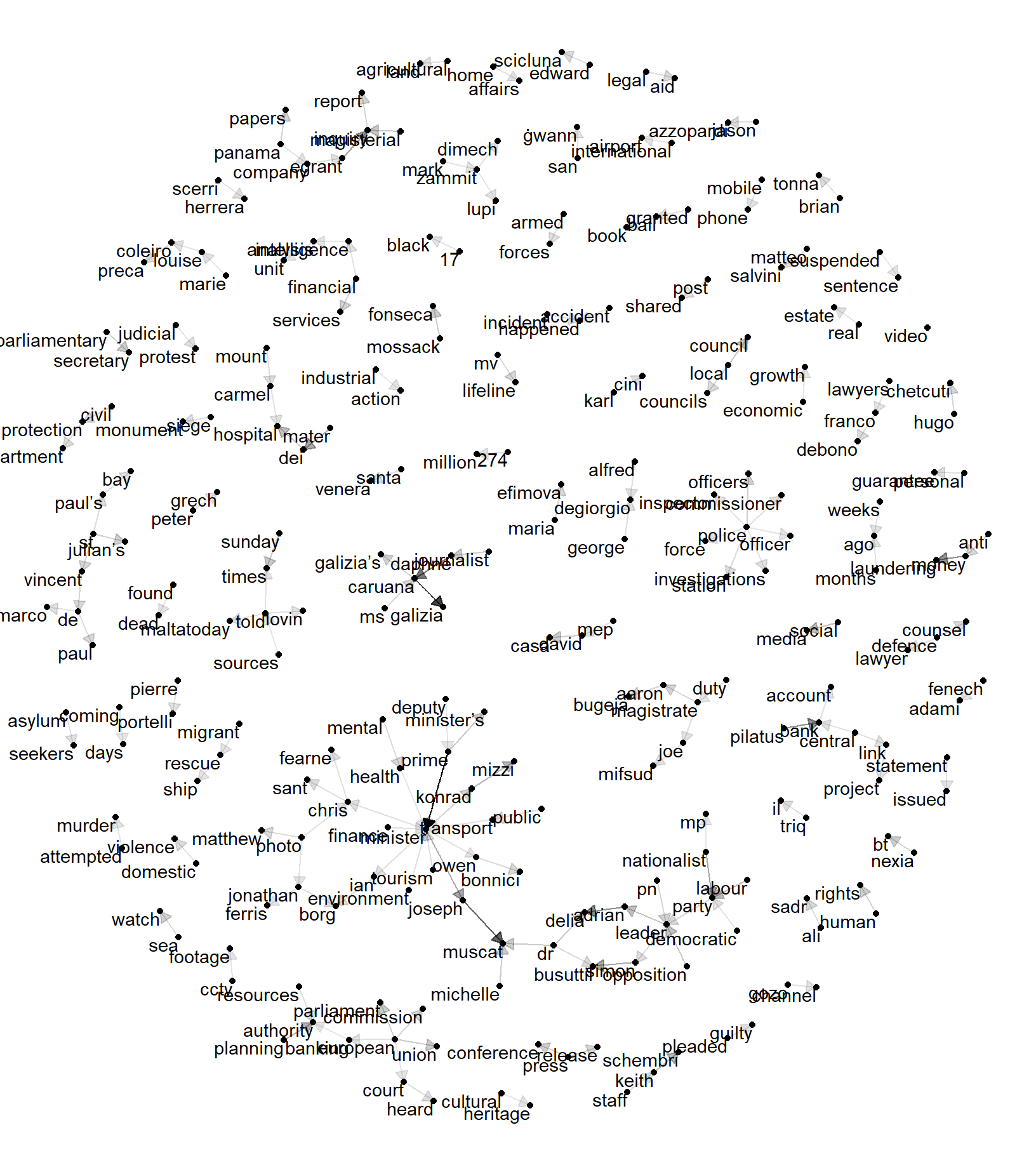
I’ve set the thickness of the lines to correspond to the frequency of the pairs.
Probably the best way to think of this would be a map of the landmarks of news this summer: Proper names of people who were in the news, the 274 million Euro direct order for an elderly home, the company 17 Black, the Gozo Channel deal, magisterial inquiries, FIAU reports, and M.V. Lifeline, among others.
##Sentiment Analysis ### “Tkunux Negattivi” ~ Kurt Farrugia
Malta is rarely first in anything, but before ‘fake news’ became the standard method of dismissal, politicians had already been using their own indigenous solution: as soon as some pesky reporter starts asking disagreeable questions, point out the bias of his publication to covering the negativity in the world.
So how ‘negative’ is local news? Before we find out, some of you might be wondering how computers can ‘read’ sentiment. The answer is in a more rudimentary way than you probably assumed. The starting point is a sentiment lexicon, similar to a dictionary of words that have been manually tagged to an emotion.
Some sentiment lexicons have a mapping of a word to an emotion: the word fury for example corresponds to the emotion anger. The AFINN sentiment lexicon I’ll use here was developed by Finn ?rup Nielsen and is slightly different.
He tagged 2476 English words with a sentiment score between -5 (very negative) to +5 (very positive). Here’s what the first 10 entries of the AFINN sentiment lexicon look like:
get_sentiments("afinn") %>%
  head(n=10)
## # A tibble: 10 x 2
## word value
## <chr> <dbl>
## 1 abandon -2
## 2 abandoned -2
## 3 abandons -2
## 4 abducted -2
## 5 abduction -2
## 6 abductions -2
## 7 abhor -3
## 8 abhorred -3
## 9 abhorrent -3
## 10 abhors -3Yikes. In case you’re wondering, it also has happy words.
get_sentiments("afinn") %>%
  filter(value >= 4) %>%
  head(n=10)
## # A tibble: 10 x 2
## word value
## <chr> <dbl>
## 1 amazing 4
## 2 awesome 4
## 3 breathtaking 5
## 4 brilliant 4
## 5 ecstatic 4
## 6 euphoric 4
## 7 exuberant 4
## 8 fabulous 4
## 9 fantastic 4
## 10 fun 4Next, we take all our previously unnested tokens, and see what words appear both in the corpus of our articles, and the sentiment lexicon. Think of it as two overlapping Venn diagrams.

Grouping by day allows us to get the average sentiment per publication per day, which lends itself well to comparing both fluctuations in polarity between publishers on the same day, and the same publisher across different days.
sentiment_by_time %>%
   count(date, Publisher, value) %>%
   mutate(weighted_sent = value * n) %>%
   group_by(Publisher, date) %>%
   mutate(avg_sent = mean(weighted_sent)) %>%
   filter(avg_sent <50) %>%
   ggplot(aes(date, avg_sent, col = Publisher)) +
   geom_line(size = 1.5) +
   expand_limits(y = 0) +
   facet_wrap(~ Publisher, nrow = 5)+
   theme(legend.position="none")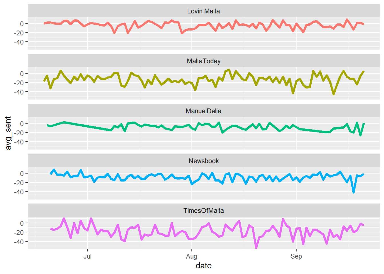
So, what does the above graph show? Sentiment in local news tends to be more negative than positive on most days, although some days do manage to buck the trend. What I was more surprised about is how closely several publications manage to mirror each other at times.
It’s worth pointing out that when measuring sentiment like this, there’s no real limit against which to compare a ‘good’ or ‘bad’ score, but as a general rule, on most days, the polarity of articles is more inclined to being negative than positive.
With that in mind, let’s try one last thing.
##Sentiment take 2 ### ‘Tghid vera negattivi?’ Many things about R are fantastic, but the one that tops them all has to be the sheer amount of exceptional packages available for it. Enter the Quantitative Discourse Analysis Package, and it’s polarity function.
QDAP’s polarity is much more sophisticated than the rudimentary scoring I did. It examines whole content clusters, rather than words, and can determine not only if a word is positive or negative, but do some pretty impressive things. It can handle negators (not good is recognized as negative), amplifiers (it scores very good higher than just good), and more importantly, it returns a value between 1 (perfectly positive) and -1 (perfectly negative), with 0 being neutral.
Here’s what QDAP’s polarity score looks like for each publication:
load("C:/Users/Charles Mercieca/Documents/RProjects/Local News Text Analysis/polarityobject.RData")
polarity_tidy<-polarity_object$group %>% select(Publisher, ave.polarity, sd.polarity)
ggplot(polarity_tidy, aes(Publisher, ave.polarity, col = Publisher)) +
    geom_point(size = 5)+
  #Red, 'fully negative' line.
    geom_hline(yintercept = -1, color = "red", size = 2, linetype = "dotted")+
  #Blue, 'fully positive' line.
    geom_hline(yintercept = 1, color = "Blue", size = 2, linetype = "dotted")+
  #Black, 'neutral' line.
    geom_hline(yintercept = 0, color = "black", size =1, alpha = .5)+
    theme_bw()+
    theme(legend.position="none")+
    ggtitle("QDAP Polarity Scores of Local News over the Summer")+
    ylab("Average Polarity Score")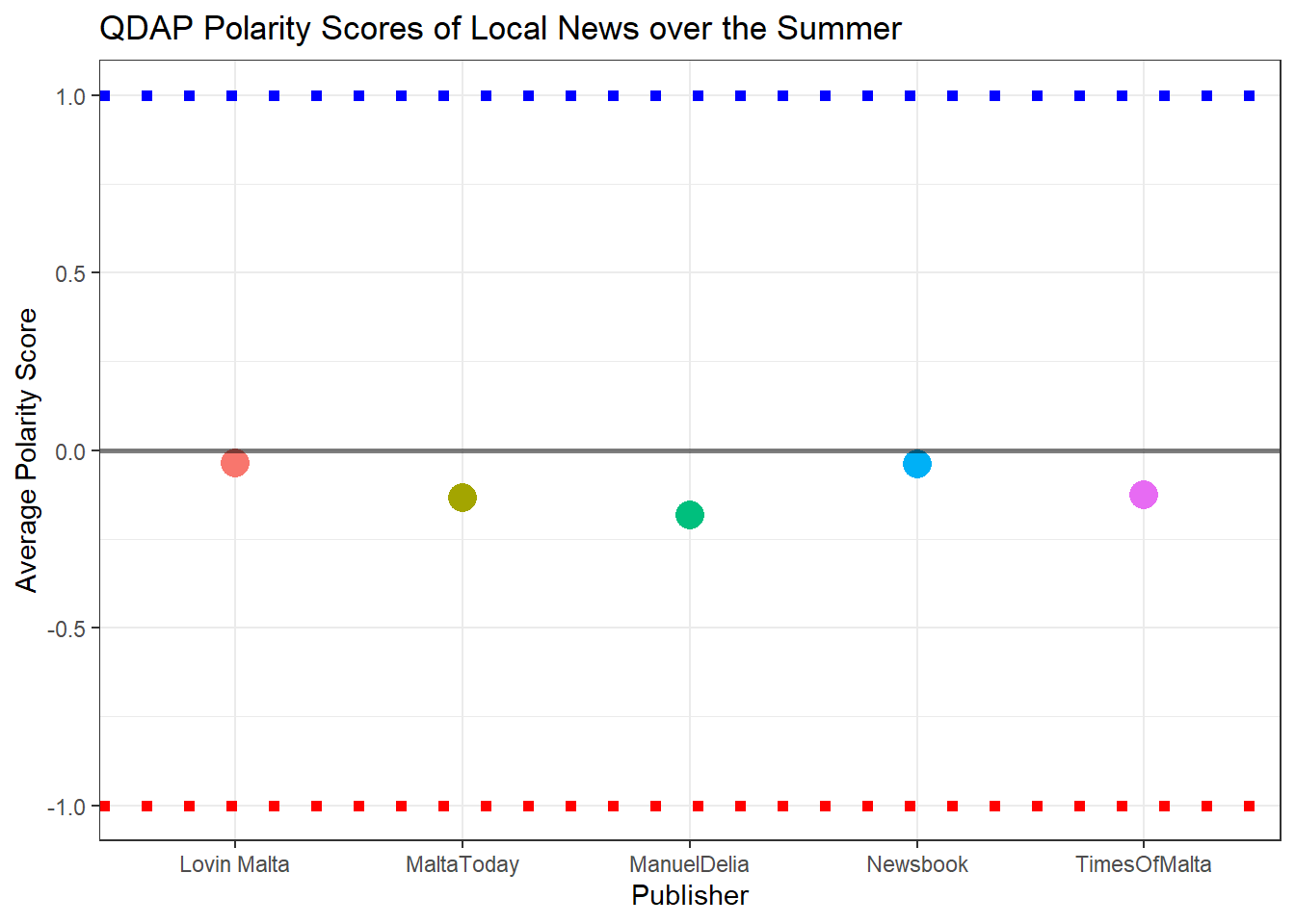
The maximum positive value is given by the blue dotted line, and the maximum negative value is given by the red dotted line.
In the grand scheme of things: slightly negative polarity, but hardly gut wrenching Jeremiads. Instead, what probably tends to happen is that events that are more likely to lead to negative polarity words probably get reported on more than ones that are more likely to lead to positive polarity words. Stephen Pinker agrees.
Here are a few examples of words that QDAP’s polarity function rated as positive:
head(polarity_object$all$pos.words)## [[1]]
## [1] "steady" "top" "better" "stronger" "compliant"
##
## [[2]]
## [1] "affordable" "proper" "lead" "orderly" "credible"
## [6] "positive" "important" "prudent" "realistic" "sustainable"
## [11] "affordable" "free" "protect" "benefits" "good"
## [16] "fast" "enough" "available"
##
## [[3]]
## [1] "led" "appropriate"
##
## [[4]]
## [1] "solidarity" "right" "solidarity" "solidarity" "solidarity"
## [6] "well" "solidarity" "easier" "solidarity" "approval"
## [11] "solidarity" "wise" "gracious" "better"
##
## [[5]]
## [1] "support" "innovation" "robust" "recommendation"
##
## [[6]]
## [1] "important" "best" "prompt" "award" "qualify"And here are the negative ones:
head(polarity_object$all$neg.words)## [[1]]
## [1] "weak" "gross" "risks" "subdued" "wound" "warned" "downside"
## [8] "risks" "risks"
##
## [[2]]
## [1] "poverty" "warned" "underestimate" "incorrect"
## [5] "vulnerable" "limit" "slow" "warned"
## [9] "beware" "unjustified" "interference" "reluctant"
## [13] "worry" "expensive" "expensive" "misleading"
## [17] "problems"
##
## [[3]]
## [1] "denied" "lengthy" "dangerous" "denied" "refused" "hardships"
## [7] "died"
##
## [[4]]
## [1] "burden" "warned" "crisis" "shake" "burden"
## [6] "poor" "poverty" "worse" "opposition"
##
## [[5]]
## [1] "warned" "crime" "threat" "threats" "issues"
## [6] "problematic" "abuse" "criminal" "extortion" "attacks"
## [11] "criminal" "abuse" "crime" "reluctant" "refusing"
## [16] "abuse" "set up"
##
## [[6]]
## [1] "protest" "condemned" "outrage" "harassment" "irked"##In Conclusion The average local news article over this summer had a title 9 words long, and a body word count of 318. It was most likely published around 11am, and some publishers exhibited a tendancy to use some words more than others. The average sentiment was negative, but not overly so, given the nature of what makes the news.