Measures of an area’s urban-rural score play an important part in political science, and sites like fivethirtyeight and the Economist often use it as part of their election forecast models.
This factor particularly makes sense in first past the post systems like the UK and US, where regional leans can influence national politics. While they should make less of an impact on a national level in proportional systems like ours, understanding individual districts might be beneficial for many other purposes.
In this post, we’ll first create an urban index, and then use it for a case study on the 2015 Spring Hunting Referendum.
#Libraries
library(tidyverse)
library(raster)
library(terra) #for raster processing
library(sf) #spatial manipulation
library(brms) #some Bayesian Regression
Step 1: Making our Urban score
Get Land Cover
A really quick way to get some measure of urbanisation is Copernicus’s Corine Land Cover data. CLC is a European Environment Agency project running since the mid 1980s, which among other things tracks land cover among it’s member states. For this application I’ll use the CLC2018 raster available here.
Reading the raster is fairly easy with the rast function from the terra package.
lc <- rast(paste0(path,"DATA/U2018_CLC2018_V2020_20u1.tif"))The first step is cropping it to just Malta:
#Malta Bounding Box
mt <- ext(4701225, 4738089, 1425668, 1457329)

cropped <- crop(lc, mt)
plot(cropped)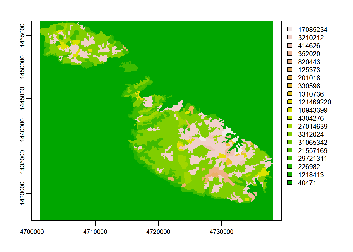
Then we transform it to a data frame and add the land cover classes.
lc_classes <- read_csv(paste0(path,'DATA/names.csv')) %>%
  mutate(Count = as.factor(Count)) %>%
  dplyr::select(Count, LABEL)

land_cover_df <- as.data.frame(cropped, xy=T, cells=T)%>%
  left_join(lc_classes) %>%
  st_as_sf(coords = c("x","y"), crs = 3035)
Get Maltese Localities
The raster package has a pretty great getData function which allows us to download shapefiles down to the locality level. The st_transform(3035) projects the data onto the recommended transformation for EU statistical mapping.
aoi <- raster::getData(country = "Malta", level = 2) %>%
  st_as_sf() %>%
  st_transform(3035)
Which very roughly looks like something like this:
plot(aoi, max.plot=1)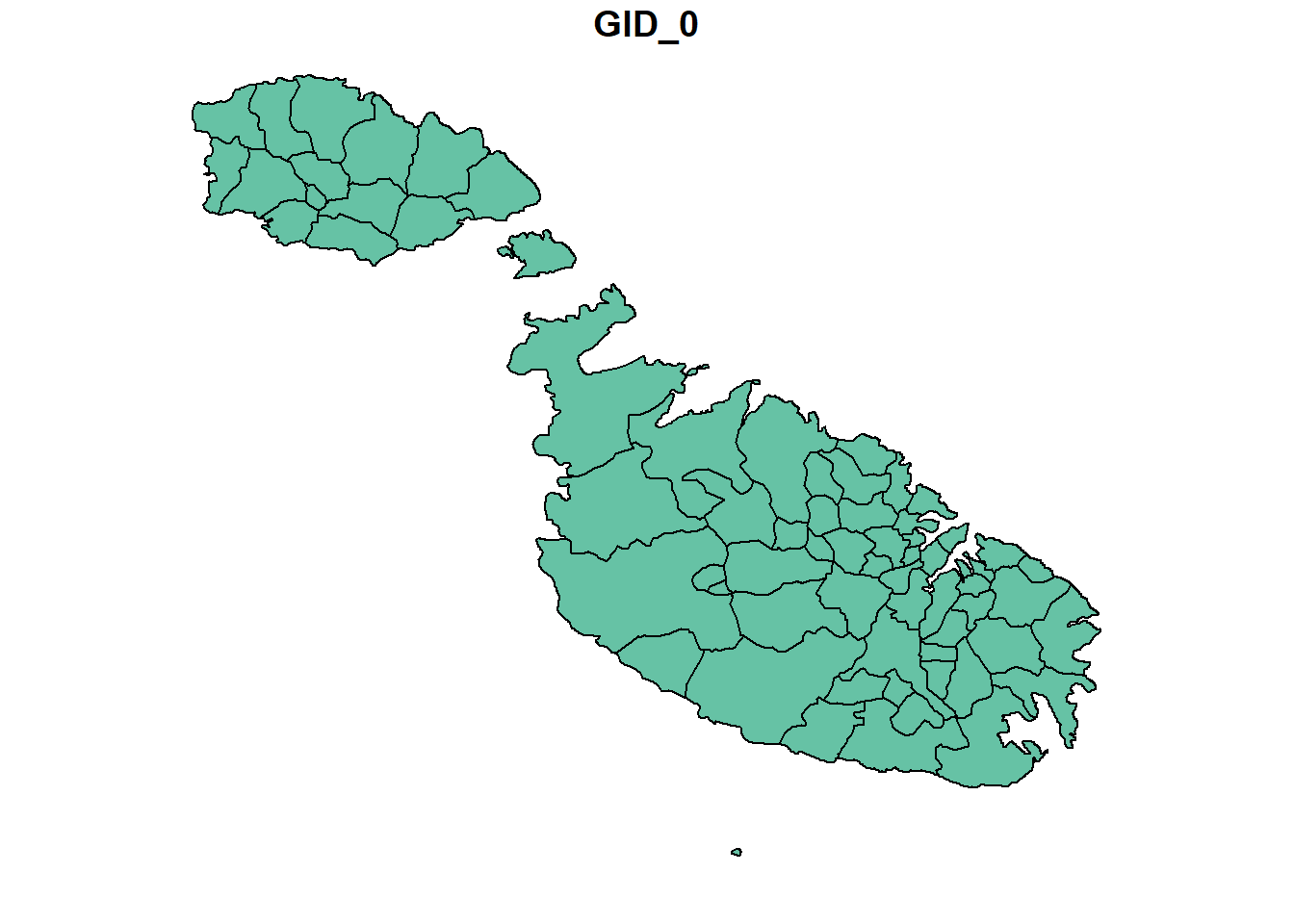
We’ll then use this almost like a cookie cutter to lay on top of the raster and count the land type values falling into each locality boundary.
Merge them together
Lastly, I created a quick vector of which land use types fit the urban ‘umbrella’. Using a case statement, we transform the 20 or so tags available here into a single Urban/Rural flag (and an NA category which we’ll ignore), before joining both data sets together.
urban_classes <- c('Construction sites', 'Discontinuous urban fabric', 'Green urban areas', 'Industrial or commercial units', 'Road and rail networks and associated land', 'Sport and leisure facilities', 'Dump sites', 'Mineral extraction sites')

urbanality <- land_cover_df %>%
  st_intersection(aoi) %>%
  mutate(urban_rural = case_when(LABEL %in% urban_classes ~ 'Urban',
                                 LABEL == "NODATA" ~ as.character(NA),
                                 TRUE ~ 'Rural'))
Check how well that worked
And as a quick check to see we’re not making any gross category errors. I deliberately left airport as ‘rural’ because most of the land surrounding Gudja/Luqa arguably is, and while the airport is built up, it’s also not densely populated urban fabric.
urbanality %>%
  group_by(urban_rural, LABEL) %>%
  tally()
## Simple feature collection with 20 features and 3 fields
## Geometry type: MULTIPOINT
## Dimension: XY
## Bounding box: xmin: 4701250 ymin: 1425750 xmax: 4737950 ymax: 1457250
## Projected CRS: ETRS89-extended / LAEA Europe
## # A tibble: 20 x 4
## # Groups: urban_rural [3]
## urban_rural LABEL n geometry
## <chr> <chr> <int> <MULTIPOINT [m]>
## 1 Rural Agro-forestry areas 14383 ((4701350 1455550), (4701350 145565~
## 2 Rural Airports 260 ((4729950 1438150), (4730050 143805~
## 3 Rural Burnt areas 768 ((4705350 1457150), (4705450 145705~
## 4 Rural Fruit trees and berry~ 50 ((4723150 1438350), (4723250 143835~
## 5 Rural Intertidal flats 23 ((4723250 1442950), (4723250 144305~
## 6 Rural Land principally occu~ 1251 ((4703350 1455350), (4703350 145545~
## 7 Rural Mixed forest 66 ((4717550 1442750), (4717650 144265~
## 8 Rural Natural grasslands 140 ((4716650 1446350), (4716750 144635~
## 9 Rural Non-irrigated arable ~ 218 ((4708850 1452650), (4708850 145275~
## 10 Rural Permanently irrigated~ 678 ((4703750 1455750), (4703750 145585~
## 11 Rural Transitional woodland~ 4798 ((4701750 1451950), (4701750 145205~
## 12 Urban Construction sites 65 ((4724750 1443350), (4724850 144325~
## 13 Urban Discontinuous urban f~ 407 ((4726350 1438850), (4726350 143895~
## 14 Urban Dump sites 317 ((4714450 1453150), (4714450 145325~
## 15 Urban Green urban areas 27 ((4734250 1437850), (4734350 143785~
## 16 Urban Industrial or commerc~ 6755 ((4702550 1455250), (4702550 145535~
## 17 Urban Mineral extraction si~ 410 ((4727350 1432650), (4727350 143275~
## 18 Urban Road and rail network~ 744 ((4723350 1437150), (4723350 143725~
## 19 Urban Sport and leisure fac~ 171 ((4730650 1434550), (4730650 143465~
## 20 <NA> NODATA 809 ((4701250 1455550), (4701250 145565~The structure of the data is also essentially counts of cells. How we arrive to an urban score from here is fairly straightforward. We just group by town, spread the urban and rural into two columns, and compute the total units.
The CORINE cells are roughly 100m x 100m so total units in the case of Birgu for instance should in theory mean 47 units of 100m x 100m, or an area of 0.47 km2. Wikipedia lists Birgu’s area as 0.5 km2, so we’re pretty close.
locality_score <- urbanality %>%
  st_set_geometry(NULL) %>%
  group_by(NAME_2, urban_rural) %>%
  tally() %>%
  filter(!is.na(urban_rural)) %>%
  pivot_wider(names_from = urban_rural, values_from = n) %>%
  mutate(total_units = sum(Rural, Urban, na.rm=T),
         urban_score = Urban/total_units)

locality_score %>% head()
## # A tibble: 6 x 5
## # Groups: NAME_2 [6]
## NAME_2 Rural Urban total_units urban_score
## <chr> <int> <int> <int> <dbl>
## 1 Birgu 4 43 47 0.915
## 2 Birkirkara 1 247 248 0.996
## 3 Birzebbuga 684 256 940 0.272
## 4 Bormla NA 78 78 1
## 5 Ghajnsielem 604 146 750 0.195
## 6 Gharghur 171 30 201 0.149The urban score then becomes how many units out of the possible maximum are urban, with somewhere being completely urban being 1 and somewhere being completely rural being 0.
In case you’re wondering how this breaks down by locality:
ggplot(locality_score,
       aes(x=fct_reorder(NAME_2, urban_score),
           y=urban_score))+
  geom_point(color="blue", size=1, alpha=0.6)+
  geom_segment( aes(x=NAME_2, xend=NAME_2, y=0, yend=urban_score), color="skyblue")+
  scale_y_continuous(labels = scales::percent)+
  coord_flip()+
  theme(
    panel.grid.major.y = element_blank(),
    panel.border = element_blank(),
    axis.ticks.y = element_blank())+
  theme_light()+
  xlab('')+
  ylab('% Urban Score')+
  labs(title = 'Urban Score by Locality')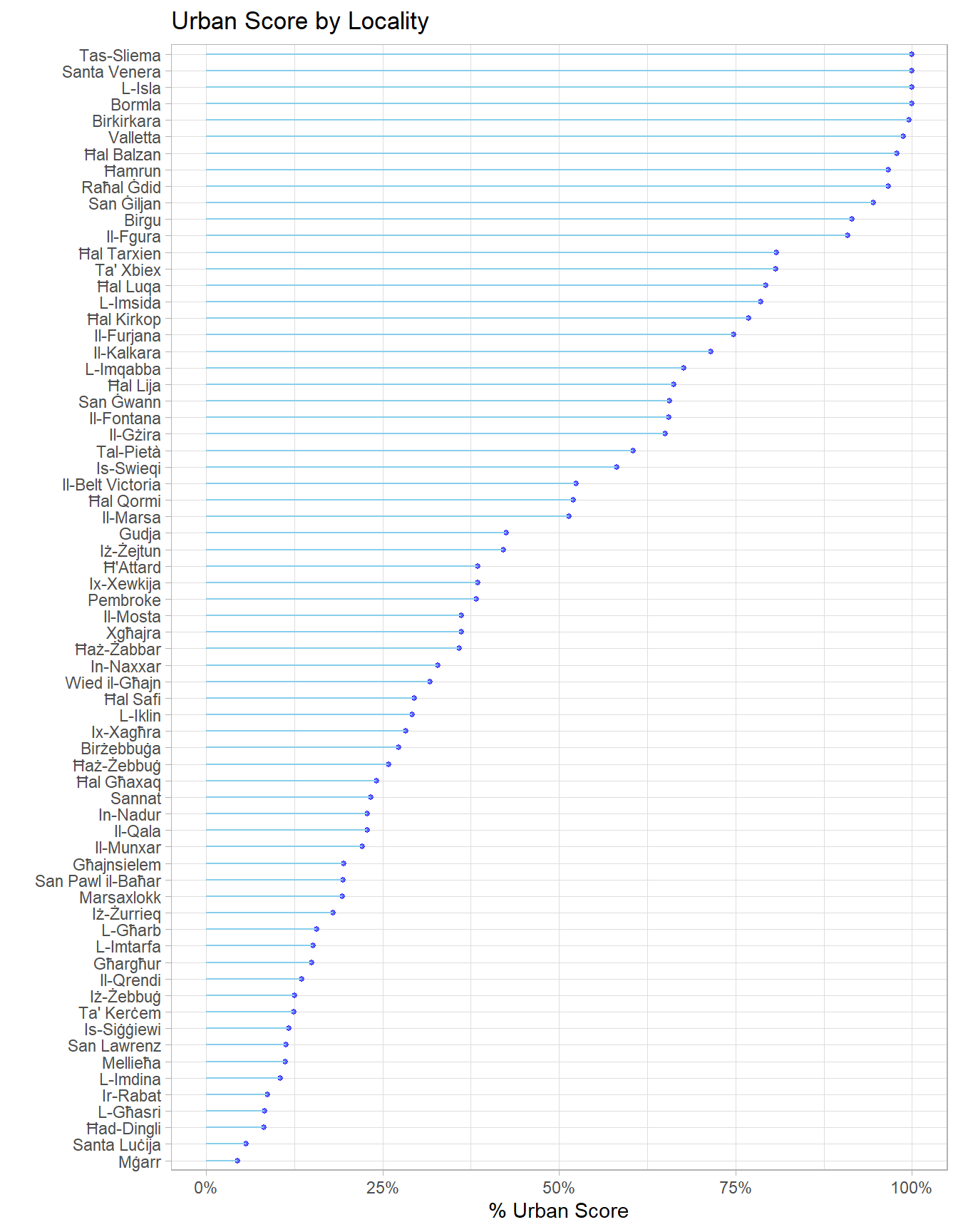
Compute it by District
Unfortunately for us, the lowest granularity political data we have is by electoral district. Districts are nothing more than a collection of towns, so it should be easy to go up to this.
The only potential pitfall here is to start from the unaggregated data, add the districts, and group by those, computing the score last. If we were to average the score, we would treat each locality as equally sized, when in reality rural ones tend to have much larger areas. Few statistical rules are likely to keep you out of trouble as aggregate as the last step.
To do this part, I just pulled out the vector of names, and assigned the relevant districts manually using this as a backup.
locality_names <- locality_score %>%
  dplyr::select(NAME_2) %>%
  pull()
districts <- c(2, 8, 5, 2, 13, 9, 4, 11, 7, 8, 3, 5, 8, 6, 6, 5, 4, 1, 2, 7, 13, 4, 13, 1, 9, 2, 1, 11, 13, 13, 5, 13, 12, 7, 6, 9, 13, 13, 13, 3, 5, 13, 13, 8, 11, 5, 9, 7, 2, 3, 12, 7, 10, 4, 10, 9, 13, 12, 13, 4, 1, 13, 9, 1, 10, 1, 3, 2)

localities <- tibble(locality = locality_names,
                     district = districts)

localities %>% head()
## # A tibble: 6 x 2
## locality district
## <chr> <dbl>
## 1 Birgu 2
## 2 Birkirkara 8
## 3 Birzebbuga 5
## 4 Bormla 2
## 5 Ghajnsielem 13
## 6 Gharghur 9The process here is then identical to the locality one.
district_score <- urbanality %>%
  st_set_geometry(NULL) %>%
  dplyr::inner_join(localities, by = c("NAME_2" = 'locality')) %>%
  group_by(district, urban_rural) %>%
  tally() %>%
  filter(!is.na(urban_rural)) %>%
  pivot_wider(names_from = urban_rural, values_from = n) %>%
  mutate(total_units = sum(Rural, Urban, na.rm=T),
         urban_score = Urban/total_units)
ggplot(district_score,
aes(x=fct_reorder(factor(district), urban_score),
y=urban_score))+
geom_point(color="blue", size=3, alpha=0.6)+
geom_segment( aes(x=factor(district), xend=factor(district), y=0, yend=urban_score), color="skyblue")+
scale_y_continuous(labels = scales::percent)+
coord_flip()+
theme(
panel.grid.major.y = element_blank(),
panel.border = element_blank(),
axis.ticks.y = element_blank())+
theme_light()+
xlab('Electoral District')+
ylab('% Urban Score')+
labs(title = 'Urban Score by Electoral District')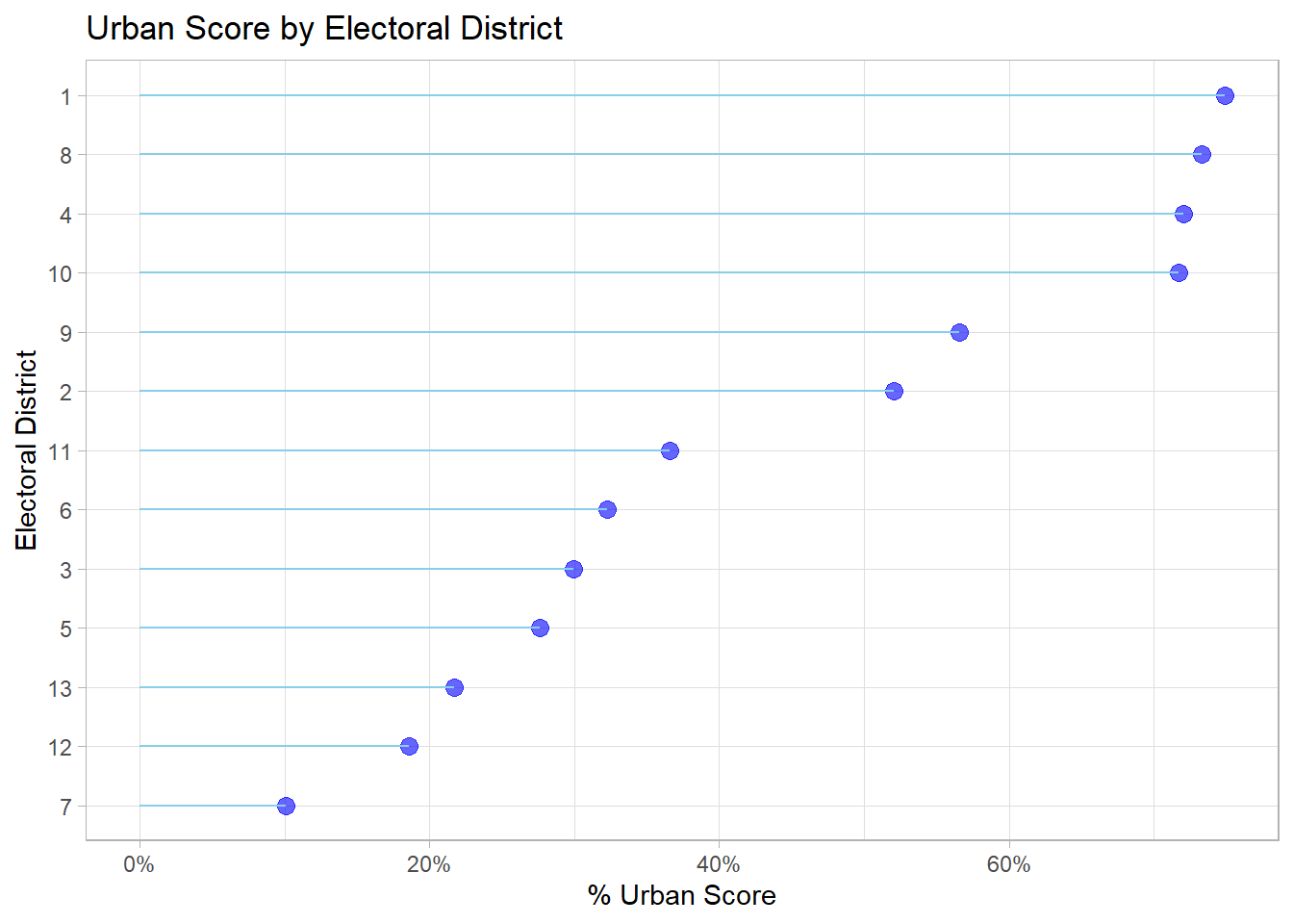
Step 2: Case Study
Hunting Referendum
As a test of how useful our new score is, let’s see if it helps us interpret the 2015 Hunting Referendum result a bit better. I managed to get the district level results from here (granular results for referenda are surprisingly hard to come by, if anyone has any, suggestions are welcome), and the district’s PL vote in the 2017 General Election off the Electoral Commission website.
region_data <- tibble(
  district = seq(1, 13),
       hunting_perc_against=c(0.5295, 0.3775, 0.4336, 0.4468, 0.3959,
                      0.4054, 0.3726, 0.5919, 0.6448, 0.6947,
                      0.6214, 0.5400, 0.3734),
       pl_vote_2017 = c(57.22, 71.22, 69.89, 67.71,
                        65.73, 59.44, 56.44, 45.49,
                        42.01, 38.05, 43, 47.54, 51.23),
       pn_lean = if_else(pl_vote_2017 < 50.0, 'yes', 'no')) %>%
  left_join(district_score)
Visualizing opposition to hunting vs. urbanisation does suggest some sort of relationship (I added the districts as labels):
  ggplot(region_data, aes(x=urban_score,
                    y = hunting_perc_against,
                    label = district))+
  geom_point()+
  geom_text(nudge_x = 0.02)+
  geom_smooth(method = 'lm')+
  theme_bw()+
  scale_y_continuous(labels = scales::percent)+
  scale_x_continuous(labels = scales::percent)+
  ylab('% Against Hunting')+
  xlab('Urban Score %')+
  labs(title = 'Relationship of Urban Score on Spring Hunting',
       subtitle = "Across Malta's 13 Electoral Districts")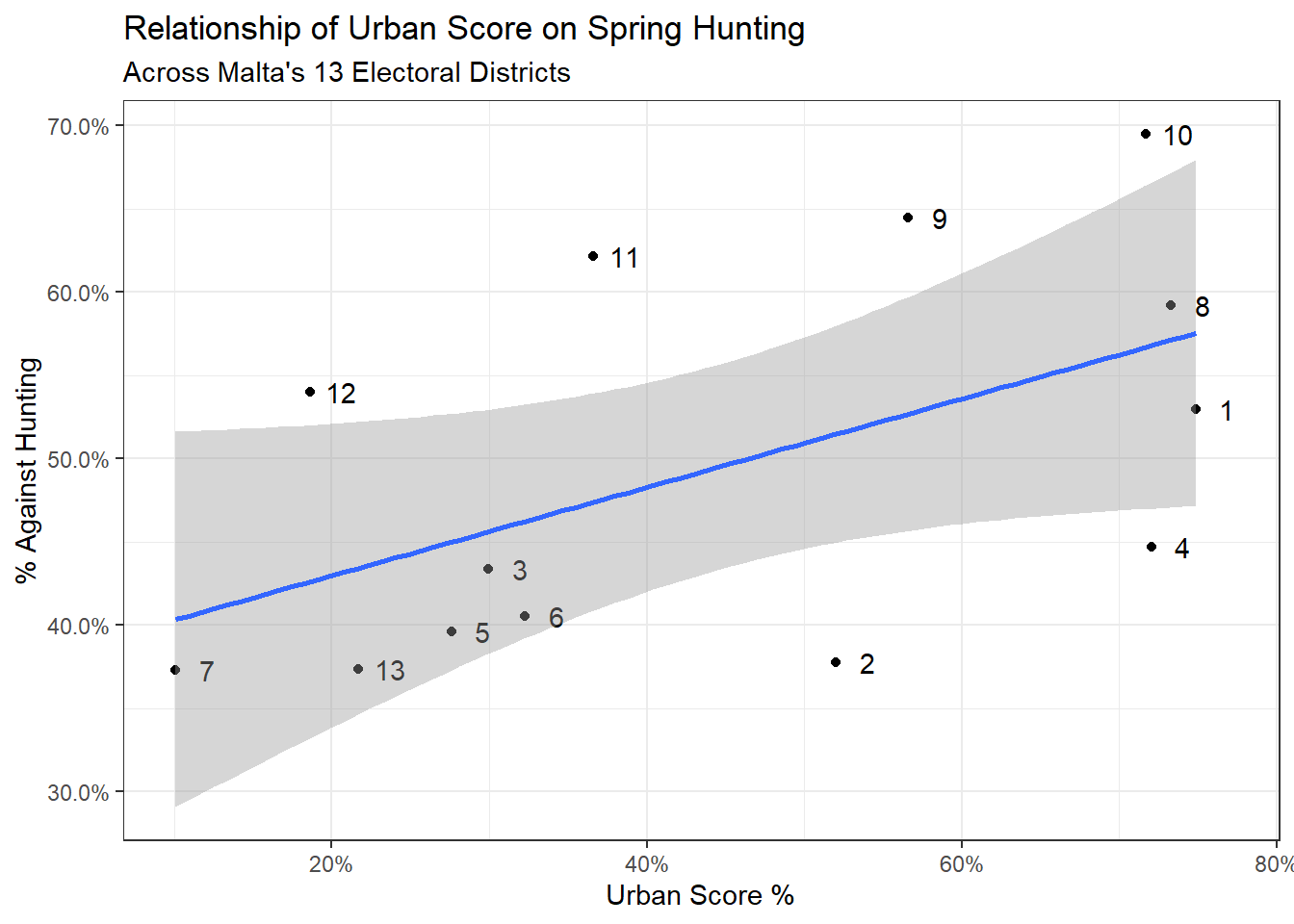
To model with a sample size of 13, let’s use the brms package to fit a Bayesian linear regression. The brm function makes it almost as easy as the default lm syntax. The silent and refresh arguments are entirely to suppress output from the MCMC sampling chains, and since the sampling is random, the seed argument ensures the results are reproducible.
fit1 <- brm(hunting_perc_against ~ urban_score,
            data = region_data,
            silent = 2,
            refresh = 0,
            seed = 2022)
Assess Fit
With Bayesian regression, we get the estimate (0.27), which tells us that for each additional 1% increase in urban score, the opposition to hunting grows by 0.27%. And running the bayes_R2 function gives us a score of 0.28, which means our simple model is explaining 28% of the variation.
summary(fit1)## Family: gaussian
## Links: mu = identity; sigma = identity
## Formula: hunting_perc_against ~ urban_score
## Data: region_data (Number of observations: 13)
## Samples: 4 chains, each with iter = 2000; warmup = 1000; thin = 1;
## total post-warmup samples = 4000
##
## Population-Level Effects:
## Estimate Est.Error l-95% CI u-95% CI Rhat Bulk_ESS Tail_ESS
## Intercept 0.38 0.07 0.24 0.52 1.00 2821 2221
## urban_score 0.27 0.14 -0.02 0.55 1.00 2842 2280
##
## Family Specific Parameters:
## Estimate Est.Error l-95% CI u-95% CI Rhat Bulk_ESS Tail_ESS
## sigma 0.11 0.03 0.07 0.18 1.00 2224 2273
##
## Samples were drawn using sampling(NUTS). For each parameter, Bulk_ESS
## and Tail_ESS are effective sample size measures, and Rhat is the potential
## scale reduction factor on split chains (at convergence, Rhat = 1).bayes_R2(fit1)## Estimate Est.Error Q2.5 Q97.5
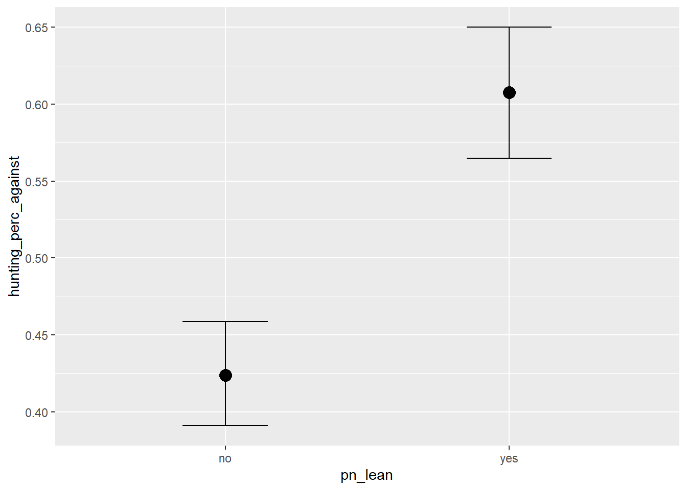
## R2 0.2811769 0.1598616 0.005316461 0.5443557An interesting thing that’s apparent from the visualisation above is that more urbanised PL leaning districts tended to support hunting more than more rural PN leaning districts. To investigate this effect of party support further, I included results from the 2017 general election and set a flag indicating that the district leaned PN if PN got more than 50% of the votes in the district and PL otherwise.
What we’re doing here is the same as the above model but also controlling for party lean. Graphing our new model would look something like this:
ggplot(region_data, aes(x=urban_score,
                    y = hunting_perc_against,
                    label = district,
                    col = pn_lean))+
  geom_point()+
  geom_smooth(method = 'lm', se=F)+
  geom_text(nudge_x = 0.025, nudge_y = -0.01, color = 'black')+
  theme_bw()+
  scale_y_continuous(labels = scales::percent)+
  scale_x_continuous(labels = scales::percent)+
  ylab('% Against Hunting')+
  xlab('Urban Score %')+
  labs(title = 'Relationship of Urban Score on Spring Hunting',
       subtitle = 'While Controling for District Lean',
       color = 'PN Leaning?')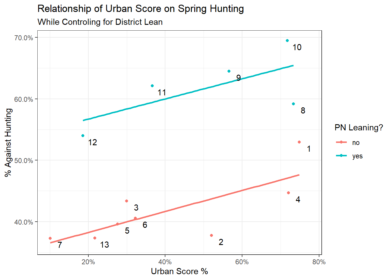
The equivalent model would be:
fit2 <- brm(hunting_perc_against ~ urban_score + pn_lean,
            data=region_data,
            silent = 2,
            refresh = 0,
            seed = 2022)

summary(fit2)
## Family: gaussian
## Links: mu = identity; sigma = identity
## Formula: hunting_perc_against ~ urban_score + pn_lean
## Data: region_data (Number of observations: 13)
## Samples: 4 chains, each with iter = 2000; warmup = 1000; thin = 1;
## total post-warmup samples = 4000
##
## Population-Level Effects:
## Estimate Est.Error l-95% CI u-95% CI Rhat Bulk_ESS Tail_ESS
## Intercept 0.35 0.03 0.29 0.41 1.00 3146 2069
## urban_score 0.17 0.06 0.04 0.28 1.01 2761 1914
## pn_leanyes 0.18 0.03 0.13 0.24 1.00 3262 2366
##
## Family Specific Parameters:
## Estimate Est.Error l-95% CI u-95% CI Rhat Bulk_ESS Tail_ESS
## sigma 0.05 0.01 0.03 0.08 1.00 2096 2173
##
## Samples were drawn using sampling(NUTS). For each parameter, Bulk_ESS
## and Tail_ESS are effective sample size measures, and Rhat is the potential
## scale reduction factor on split chains (at convergence, Rhat = 1).bayes_R2(fit2)## Estimate Est.Error Q2.5 Q97.5
## R2 0.8735153 0.04826566 0.749813 0.9087303The interesting thing to note is that our estimated effect of urbanisation, given our data, actually got smaller (0.17), but is also more certain (the 95% credible interval has shrunk). Since this is a Bayesian CI, it means exactly what it says on the tin i.e. we can be 95% sure that the effect of 1 unit of urbanisation on opposition to hunting is between 0.04% and 0.28%, with the most likely value being 0.17%.
The ‘betterness’ of this model is also reflected in the much higher R2 value.
Put graphically, the first (red) model estimated that the effect spanned a greater range. It was less certain of any one of those values, but was pretty sure it was in the -0.02 to 0.55 range. (A negative value of this parameter in this context just means the opposite relationship, that is, more urban areas tend to support hunting more).
With the added explanation of party lean, the second (blue) model now thinks the effect is smaller, but is also much more certain and concentrated (Bayes is beautiful this way).
draws <- bind_rows(posterior_samples(fit1) %>%
            mutate(model = 1),
posterior_samples(fit2) %>%
  mutate(model = 2)) %>%
dplyr::select("b_urban_score", "model")

ggplot(draws, aes(b_urban_score, fill = factor(model)))+
  geom_density(alpha = 0.5)+
  theme_bw()+
  ylab('Density of Posterior Samples')+
  xlab('Effect of Urban Score')+
  labs(fill="Model Fit")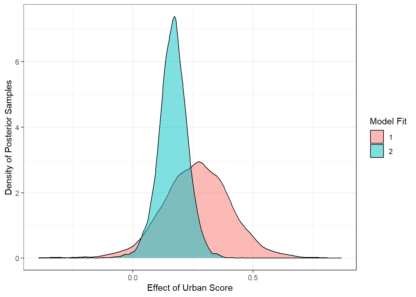
Conditional Effects
We can also pull out the conditional effects from the fit like this:
conditional_effects(fit2)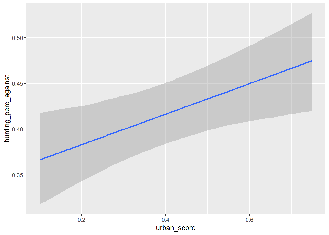
This gives us an estimate for both
The effect of urbanisation on the anti-hunting vote
The effect party lean had on the anti-hunting vote
But I actually think the clearest representation of how urbanisation impacts opposition to hunting is the histogram of posterior samples we used already:
filter(draws, model == 2) %>%
ggplot(aes(b_urban_score))+
  geom_histogram(bins = 50)+
  theme_bw()+
  ylab('Count of Posterior Samples')+
  xlab('Effect of Urban Score')+
  labs(fill="Model Fit",
       title = 'Impact of Urban Score on Opposition to Hunting in the 2015 Referendum')+
  geom_vline(aes(xintercept = mean(b_urban_score)),
             color = 'midnightblue',
             lty = 2)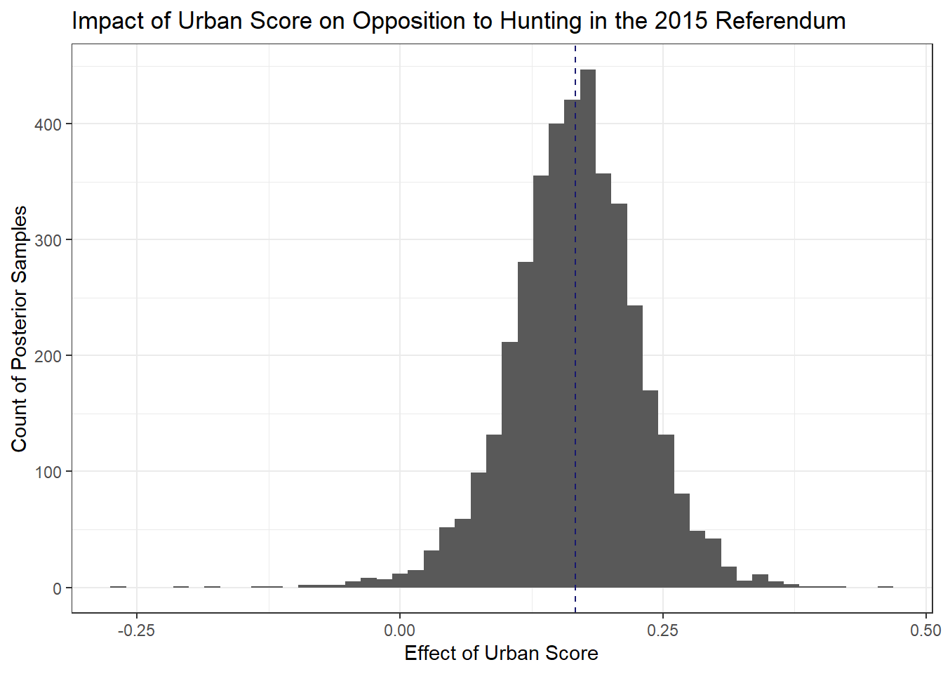
Since these are samples of 4,000 draws from the posterior, we get all the niceties of a Bayesian framework, so for instance, the probability that the effect is between a certain value is just the area bounded by those values over the total area of the histogram.
In the above I just set a dashed line for the mean value of the posterior draws (0.17) just to get some intuition where this value comes from and what it means.
TL;DR,
Given our data, which are essentially a measure of how built up an area is, and the votes in the 2015 Hunting Referendum and the 2017 General Election, we can say that:
The less urbanised an area is, the more likely it is to have voted in favour of Spring Hunting.
This effect gets clearer when you take into account a district’s partisan lean.
PL leaning districts were 18% more likely to support Spring Hunting than PN leaning ones, all else being equal.
The high R2 of the second model suggests that urban score + party lean explain a lot of the results of the 2017 referendum.