I’ve been playing around with a software-defined radio dongle lately, and one of the most satisfying things they let you do is receive weather satellite transmissions. NOAA in particular still has 3 functioning, albeit now relatively outdated, satellites constantly transmitting data.
Getting the WAV file
The hands-on part is relatively basic: plug-in a V-dipole antenna into your SDR dongle, face the antenna North, use your favourite satellite tracker to work out the time a satellite will be over you, tune in to it’s frequency, and save the recording (in my case using SDR++).
The recording itself is a wav file, and sounds something like this. The AM signal is somewhere in there, and typically you’d pass the wav to a decoder and end up with an image.
Decoding the Image
I’d been using this fantastic decoder by Martin Bernardi to handle all the processing, but I got curious as to what was going on under the hood. The approach here is heavily inspired by both that source code and this repo by Peter Bryan that really helped me fill in the gaps.
I’ll be working with a transmission from NOAA 18 I recorded throughout this.
Oh, and… I’ll be using Python for this since finding a good R alternative to scipy.signal was hard.
import matplotlib
import matplotlib.pyplot as plt

import numpy as np

import scipy.ndimage
from scipy.io import wavfile
from scipy.signal import hilbert, resample

import pandas as pd
Reading in the recorded WAV is easy enough.
#read in WAV file
fs, audio = scipy.io.wavfile.read(wav_path)

#this is in stereo, let's keep one channel.
audio = audio[:, 0]
Plotting out the first 3 seconds, we can see that the audio file looks something like this:
plt.plot(range(len(audio[:fs*3])), audio[:fs*3], color = 'blue')
plt.title('First 3 seconds of Raw Audio')
plt.show()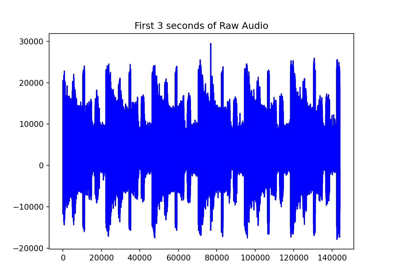
#Work out resample rate
coef = 20800 / fs

samples = int(coef * len(audio))

samples
## 14413337audio = scipy.signal.resample(audio, samples)
plt.plot(range(len(audio[:20800*3])), audio[:20800*3], color = 'blue')
plt.title('Resampled 3 seconds of Audio')
plt.show()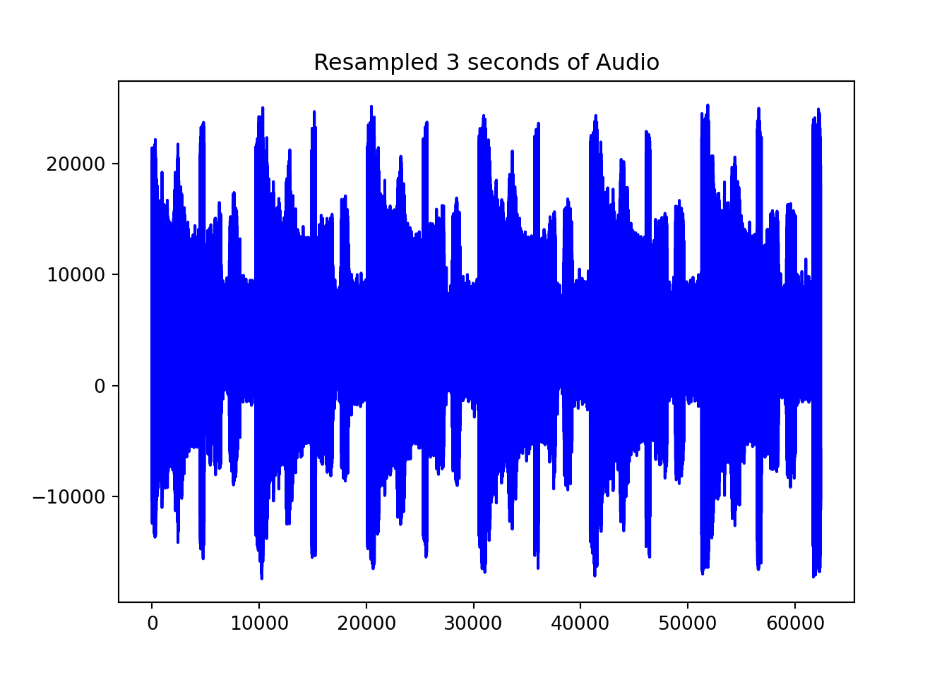
Getting the Analytical Signal
Now that that’s smaller, we run the Hilbert transform. This is to decode the audio signal into an analytical signal giving us the amplitude and phase information we need for AM demodulation. scipy has a nice Hilbert function out of the box
hilbert_transformed = np.abs(hilbert(audio))Which leaves us with:
plt.plot(range(len(hilbert_transformed[:20800*3])), hilbert_transformed[:20800*3], color = 'blue')
plt.title('Hilbert transformed first 3 seconds of Audio')
plt.show()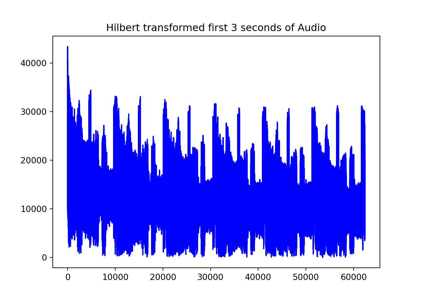
In practice, the Hilbert transformed signal is often downsampled further, I imagine for computational efficiency reasons.
resampled_demodulated = resample(hilbert_transformed, len(hilbert_transformed) // 5)In the AM signal that NOAA APT uses, lower amplitudes = darker pixels and higher amplitudes = brighter pixels. To be able to plot the values better, we need to turn these into discrete values. In 8 bit greyscale, the values are typically 0 to 255.
low, high = np.percentile(resampled_demodulated, (5, 95))

print(f'5th percentile (very black) is {low}, 95th percentile (very white) is {high}')
## 5th percentile (very black) is 4363.90622515017, 95th percentile (very white) is 19304.66193802419Which looks something like this:
normalised_data = np.round((255 * (resampled_demodulated - low)) / (high - low)).clip(0, 255).astype(np.int16)

plt.plot(range(len(normalised_data[int(20800*297//5):int(20800*300//5)])), normalised_data[int(20800*297//5):int(20800*300//5)], color = 'blue')
plt.title('8 bit normalised values')
plt.show()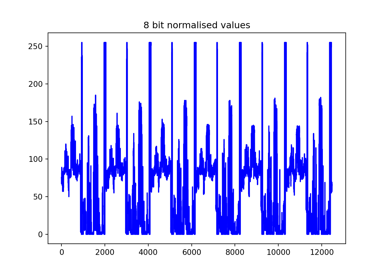
Or I suppose we can swap the blue for the grey scale value to make it more clear what the signal is encoding.
norm = plt.Normalize(vmin=0, vmax=255)
cmap = plt.get_cmap('binary')

# Create figure and axis
fig, ax = plt.subplots()

# Scatter plot with colormap applied based on normalized data
ax.scatter(range(len(normalised_data[int(20800*297//5):int(20800*300//5)])),
           normalised_data[int(20800*297//5):int(20800*300//5)],
           c=normalised_data[int(20800*297//5):int(20800*300//5)], cmap=cmap, norm=norm, s=1)

ax.set_title('Maybe a better representation of the information in the signal')

# Set background color to light blueish
fig.patch.set_facecolor('lightblue')  # Sets figure background
ax.set_facecolor('lightblue')  # Sets axis background

# Show the plot
plt.show()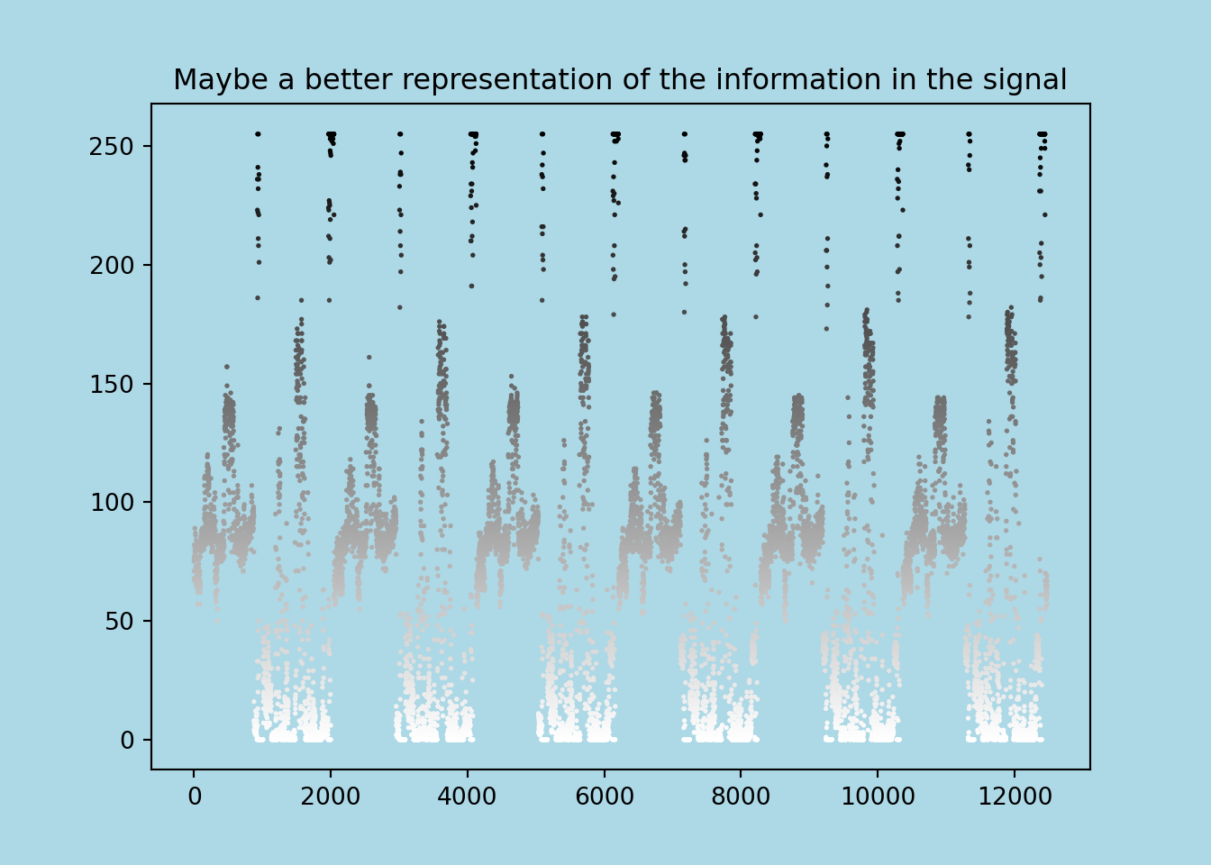
We’ve actually already come a long way: we know how NOAA 18 is encoding information in a signal. But for a pretty picture, we still have a bit further to go!
Synchronizing the Frames
The single continuous stream of information needs to be chopped up at set intervals and stacked on top of each other to make an image. The transmission itself also contains this information in the form of synchronization pixels: when a new line starts transmitting, a 36 pixel black-black-white-white etc. sequence is the first to get encoded. If we can reliably detect this, we can stack up frames!
sync_sequence = np.array([0, 0, 255, 255, 0, 0, 255, 255,
                                     0, 0, 255, 255, 0, 0, 255, 255,
                                     0, 0, 255, 255, 0, 0, 255, 255,
                                     0, 0, 255, 255, 0, 0, 0, 0, 0,
                                     0, 0, 0]) - 128
The Peter Bryan repo provided a really neat way to this in a for loop. The only slight modification I could think of was using np.array - 128 for a vectorised approach, instead of subtracting element wise. This is a few seconds faster.
normalised_data = np.round((255 * (resampled_demodulated - low)) / (high - low)).clip(0, 255)

rows = [None]
previous_corr = -np.inf
previous_pointer = 0
minimum_row_separation = 2000

stats_table = []

for pointer in range(len(normalised_data) - len(sync_sequence)):
    # First get a 36 sequence row
    row = normalised_data[pointer : pointer + len(sync_sequence)] - 128

    # Calculate correlation
    current_corr = np.dot(sync_sequence, row)

    #save these for later
    stats = {'pointer_location': pointer,
             'correlation': current_corr}
    stats_table.append(stats)

    # Check separation and correlation conditions
    if pointer - previous_pointer > minimum_row_separation:
        previous_corr, previous_pointer = -np.inf, pointer
        rows.append(normalised_data[pointer : pointer + 2080])

    elif current_corr > previous_corr:
        previous_corr, previous_pointer = current_corr, pointer
        rows[-1] = normalised_data[pointer : pointer + 2080]
But wait, what’s with that correlation measure
Seeing correlation numbers coming out of np.dot is a bit new for me, but it’s a really smart way to quickly test for the general signal you’re expecting. Say you’re looking for the signal (1, -1, 1, -1). If you have the following candidates:
target = np.array([1, -1, 1, -1])

candidates = {
    'poor_match': np.array([1, 1, 0, -1]),
    'no_signal': np.array([0, 0, 0, 0]),
    'inverse': np.array([-1, 1, -1, 1]),
    'good_match': np.array([0.8, -0.7, 0.7, -0.8]),
    'target': np.array([1, -1, 1, -1])
}

for candidate in candidates:
    print(f'Result for {candidate} is: {np.dot(target, candidates[candidate])}')
## Result for poor_match is: 1
## Result for no_signal is: 0
## Result for inverse is: -4
## Result for good_match is: 3.0
## Result for target is: 4As you can see, this approach yields high positive values when the signal is close to what we want, and 0 or negative values when it is not. This is quite clever, especially when you consider that most computers have been optimised to calculate dot products very quickly.
And here’s how the correlation values vary across (a random slice of) the frame:
correlation_stats = pd.DataFrame(stats_table)

#grab random slice for better viz
correlation_example = correlation_stats.query('pointer_location >=270000& pointer_location <=290000')

plt.scatter(correlation_example['pointer_location'], correlation_example['correlation'], color='blue', marker='o')

plt.xlabel('index location')
plt.ylabel('correlation measure')
plt.grid()
plt.xlim(270000, 290000)
## (270000.0, 290000.0)plt.show()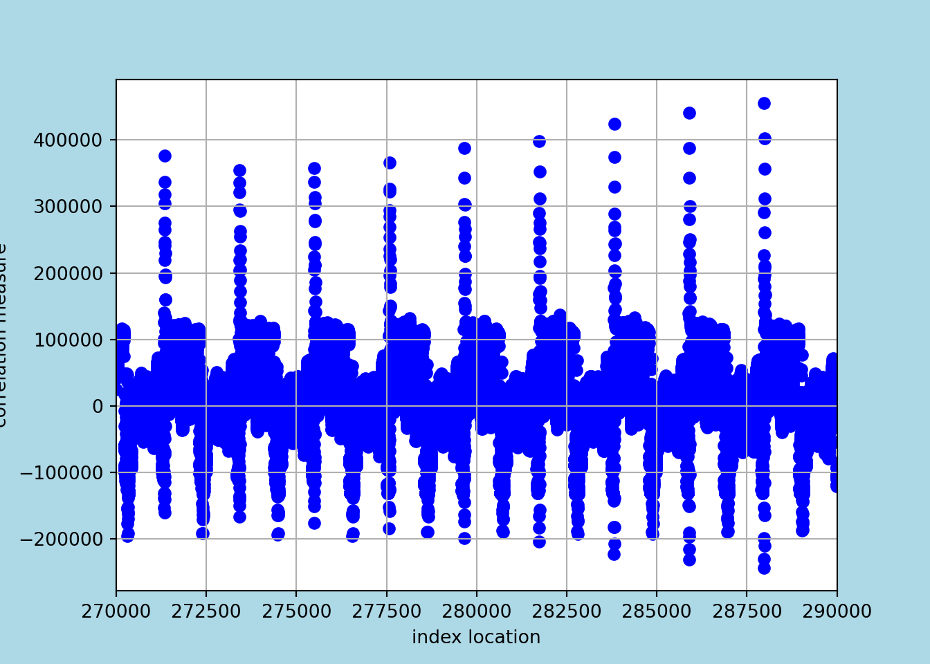
You can see they peak roughly every 2080 rows, which makes sense! Interestingly, the best correlation is not always 2080. I imagine the main reason is noise.
def is_peak(window):
    center = len(window) // 2
    return window[center] == max(window) and center > 0 and center < len(window) - 1

# Apply a rolling window to identify peaks
window_size = 2001
correlation_stats['is_peak'] = correlation_stats['correlation'].rolling(window=window_size, center=True).apply(lambda x: is_peak(x), raw=True).astype(bool)

# Mark peaks in the DataFrame
correlation_stats['peak_marker'] = np.where(correlation_stats['is_peak'], 'Peak', '')

cp = correlation_stats.query('is_peak')
cp['lag'] = cp['pointer_location'].shift()
## <string>:1: SettingWithCopyWarning:
## A value is trying to be set on a copy of a slice from a DataFrame.
## Try using .loc[row_indexer,col_indexer] = value instead
##
## See the caveats in the documentation: https://pandas.pydata.org/pandas-docs/stable/user_guide/indexing.html#returning-a-view-versus-a-copycp['window'] = cp['pointer_location'] - cp['lag']## <string>:1: SettingWithCopyWarning:
## A value is trying to be set on a copy of a slice from a DataFrame.
## Try using .loc[row_indexer,col_indexer] = value instead
##
## See the caveats in the documentation: https://pandas.pydata.org/pandas-docs/stable/user_guide/indexing.html#returning-a-view-versus-a-copycp = cp.query('window > 2076').query('window <2083').reset_index()plt.scatter(cp.index, cp['window'], color='blue', marker='o', label='Shift Values')
plt.xlabel('Index')
plt.ylabel('Shift')
plt.title('Index vs Shift')
plt.show()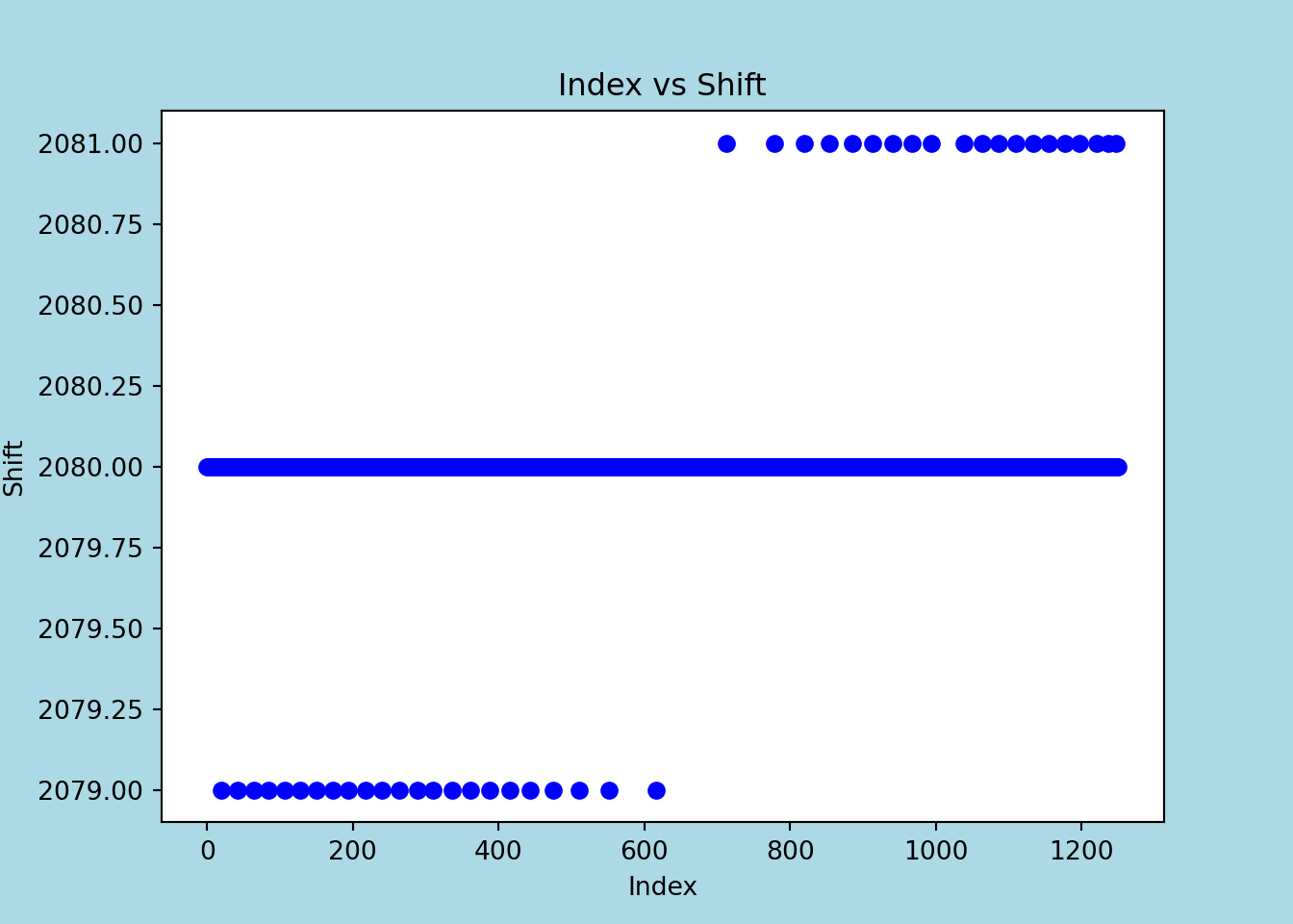
But I was partly hoping the variation was due to the doppler shift (rows arrive slightly faster in the first half of the acquisition as the satellite is flying towards me, and slower in the second half while flying away), but I also imagined this variation to be more pronounced, so I’m not quite sure.
And with that, we’re actually… there.
image = np.row_stack([row for row in rows if len(row) == 2080]).astype(np.uint8)

from PIL import Image

Image.fromarray(image)
## <PIL.Image.Image image mode=L size=2080x1345 at 0x24E04F03D90>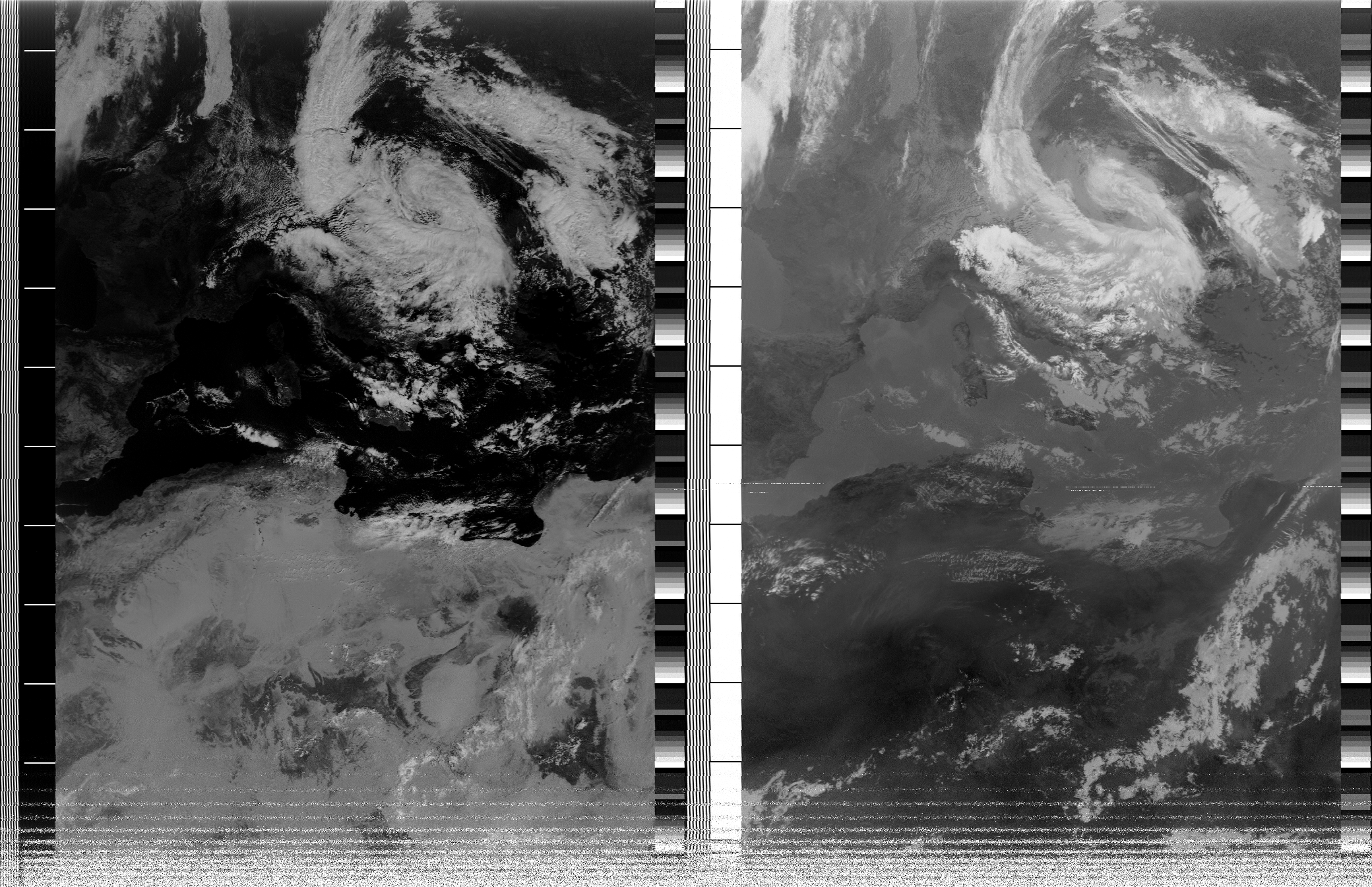
Adding Colour
But let’s go on a side quest. I want to add colour. Let’s focus on adding it to the left side of the image, or Image A in NOAA APT parlance. (The right side, Image B, is the infra red view. Image A is the visible light.)
(Quick aside, also visible are the sync sequences we used, they’re the thin vertical black white lines at the very left. By contrast, the horizontal lines across the bottom are a premature loss of signal as NOAA 18 dipped behind a building to my South while I was recording.)
Selecting it is as straightforward as cropping the matrix:
image_a = image[:, 86:990]
Image.fromarray(image_a)
## <PIL.Image.Image image mode=L size=904x1345 at 0x24E0917E9D0>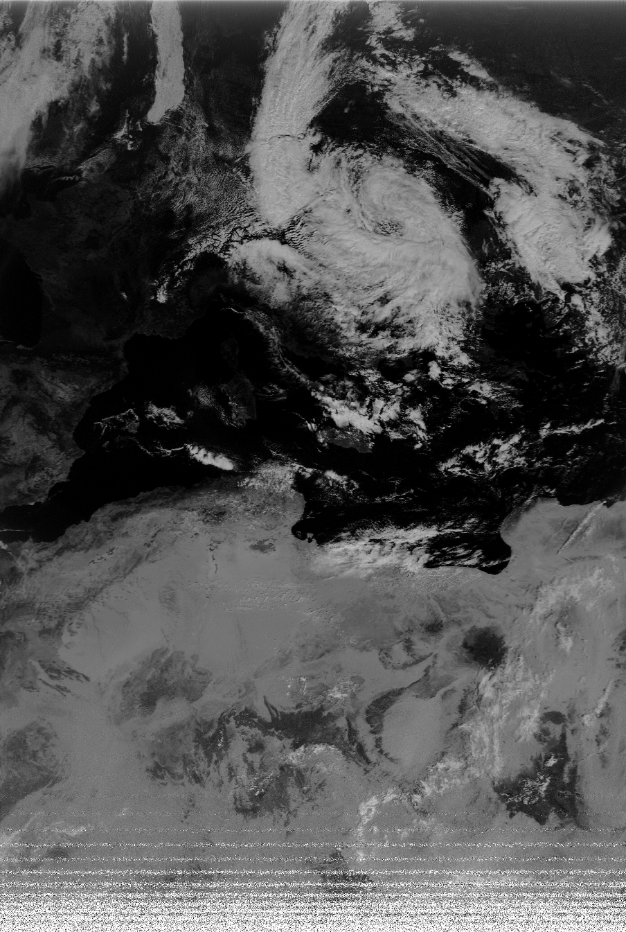
I downloaded a palette I really like from the NOAA APT GUI I was using.
palette_img = Image.open(palette_path)
palette = np.array(palette_img)
indices = np.arange(256)
palette_colors = palette[indices, indices]
The palette is a glorified lookup table which we’ll use to look up the 0 to 255 values of grey scale. For example, at value 0
palette_colors[0,:3]## array([4, 3, 0], dtype=uint8)it is RGB value 4,3,0 or black. At value 255, it is:
palette_colors[255,:3]## array([255, 255, 255], dtype=uint8)or completely black, with intermediate colours in between. ‘Colourising’ the image involves applying the same principle to each pixel:
grayscale_array = image_a
height, width = grayscale_array.shape
colored = np.zeros((height, width, 3), dtype=np.uint8)

flat_gray = grayscale_array.flatten()
colored_flat = palette_colors[flat_gray, :3]

colored = colored_flat.reshape(height, width, 3)
Image.fromarray(colored)
## <PIL.Image.Image image mode=RGB size=904x1345 at 0x24E091554F0>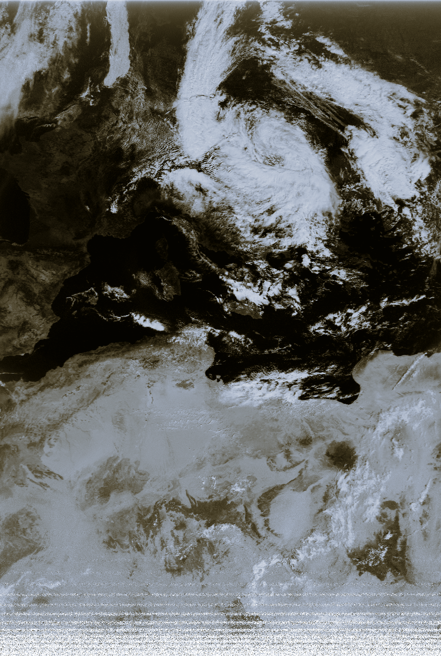
NOAA 19 launched in 2009, was the last major Western weather satellite to have some form of analog data transmission, as APT gave way to a digitised alternative, HRPT. Compared to APT, HRPT has many advantages, including higher resolution, more channels and faster transmission (a full APT transmission is about 20 minutes). It is however a bit more finicky in terms of interference from GSM towers or obstructions.
Some of the inherent romanticism of APT, besides being relatively easy to understand, is the fact that anyone with the most basic antenna can probably get a decent image from most of the earth’s surface.