I spotted this really informative graphic detailing the extent of the wildfire damage to Altadena.
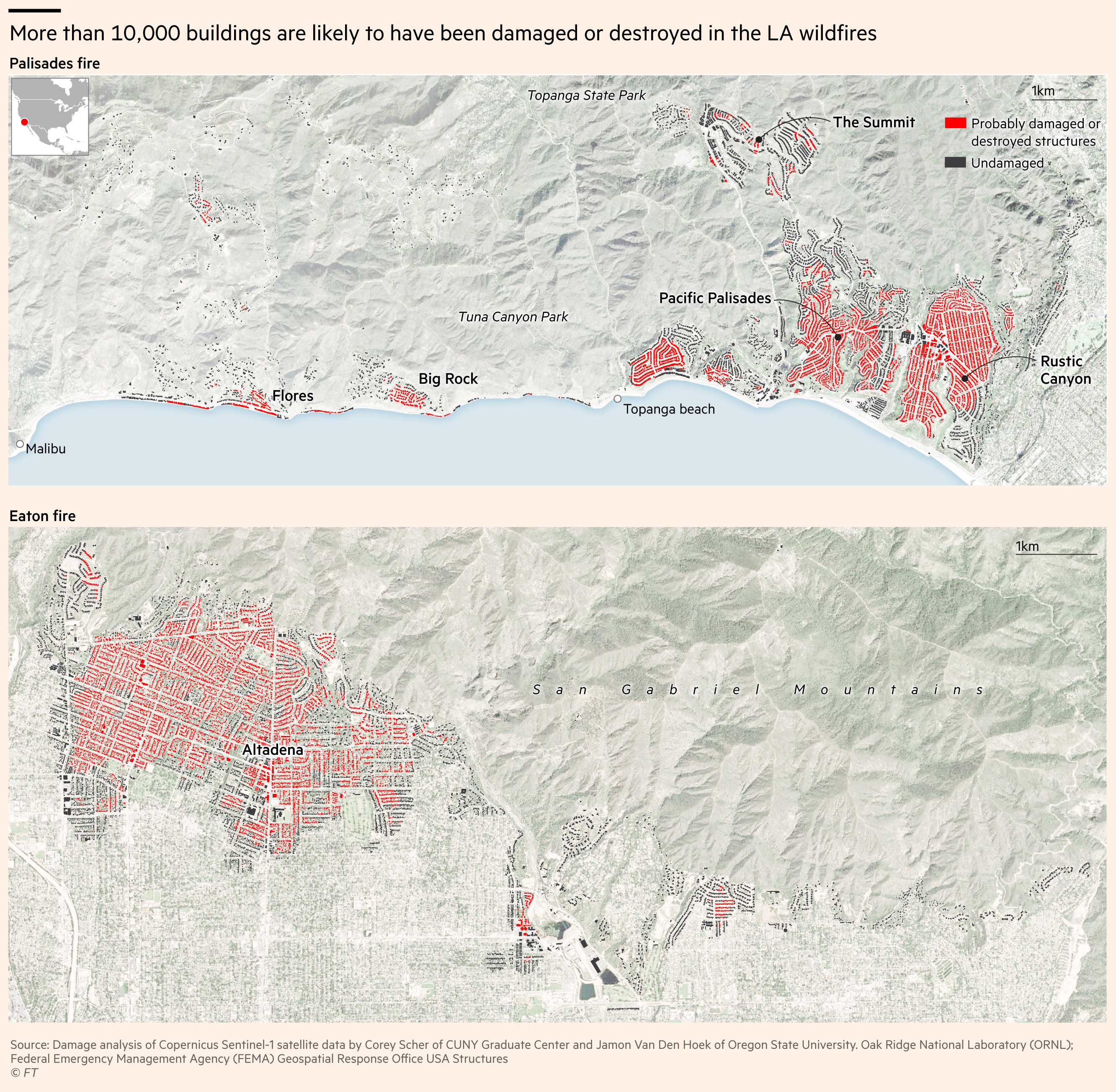
It struck me for a number of reasons: it’s really clear cartography, conveys the extent of the damage well, and uses a cool method to workout what buildings might have of been damaged.
This will be my attempt to recreate it.
A very brief dive into Sentinel 1 Coherence
Sentinel 1 is the ESA’s radar satellite constellation. Radar satellites are most famous for bringing their own energy source to the party: unlike optical sensors which need the sun to illuminate a scene, they use their on-board microwave transmitter. This means they can still capture scenes in darkness or in areas obscured by clouds or smoke.
But the microwave source has another advantage, it allows precise measurement of the phase of the bounced back electromagnetic wave. Phase is related to distance, which means we can estimate if a building moved relative to the sensor. The truly amazing thing about this trick is that this difference is reliably detectable even if the movement is on the order of 10-20 millimetres.
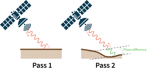
Coherence builds on this idea: it is the correlation of phase for the same pixel over 2 acquisitions. If coherence is high, it means very little in that pixel has changed. For the Eaton fire for example, we have a Sentinel 1 image from the 28th of December, and another on the 9th of January, letting us do a 12 day comparison.
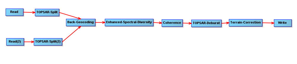
I ran the following processing pipeline in SNAP:
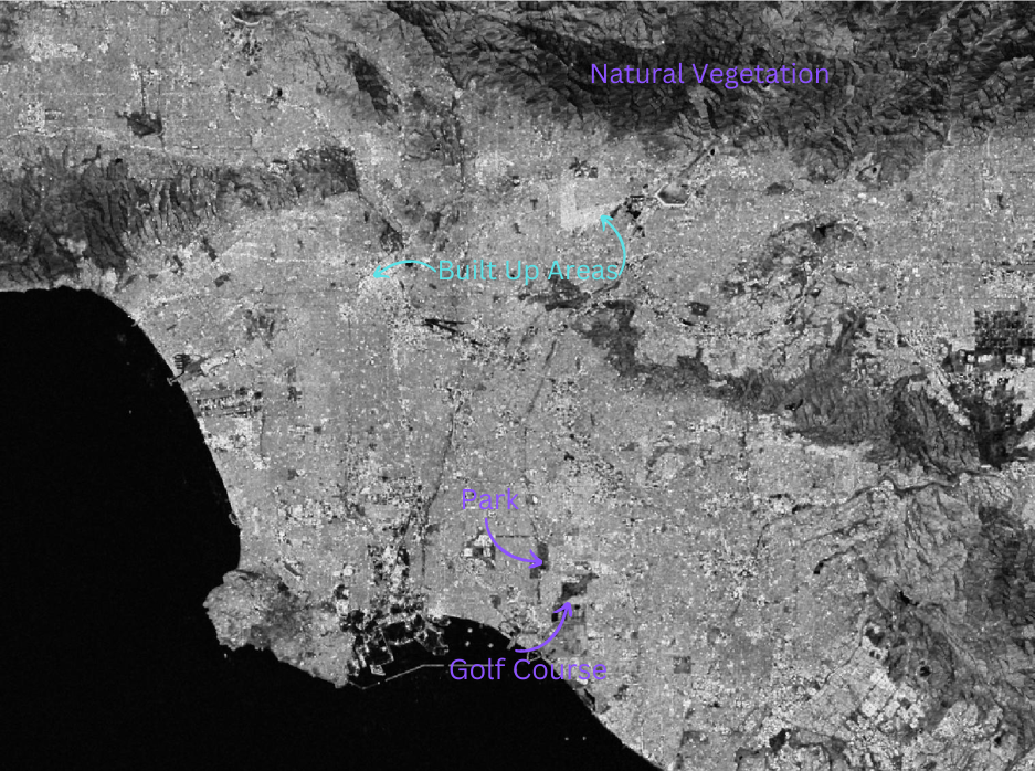
And in case you’ve never seen a SAR coherence image before, here’s what it looks like. In this representation white is a coherence value closer to 1 (no change) while black is closer to 0 (lots of change). Areas that are hilly or with lots of vegetation tend to scatter the signal randomly and appear darker. Runways are often coherent, but aprons are not since the position of individual aircraft on stands tends to vary. Buildings are quite simple geometric shapes, and they tend to stay in one place, so they have high coherence and appear as bright white.
Mapping
I saved the coherence between 28 Dec and 9th Jan and 16 Dec and 28th Dec as geotiffs. With that we can now hop in R.
The first step for our map would be to get some building data. We’ll use Open Street Maps for this.
library(tidyverse)
library(osmdata)
library(ggplot2)
library(sf)
library(raster)
library(exactextractr)
library(viridis)

place_name <- "Altadena, California, USA"

# Get a bounding box
bbox <- getbb(place_name)

# Get buildings
buildings <- opq(bbox = bbox) %>%
  add_osm_feature(key = "building") %>%
  osmdata_sf()

# And roads...
roads <- opq(bbox = bbox) %>%
  add_osm_feature(key = "highway") %>%
  osmdata_sf()

# Extract features as polygons/lines
building_polygons <- buildings$osm_polygons

road_lines <- roads$osm_lines
# Let's check how we did
plot(building_polygons, max.plot =1)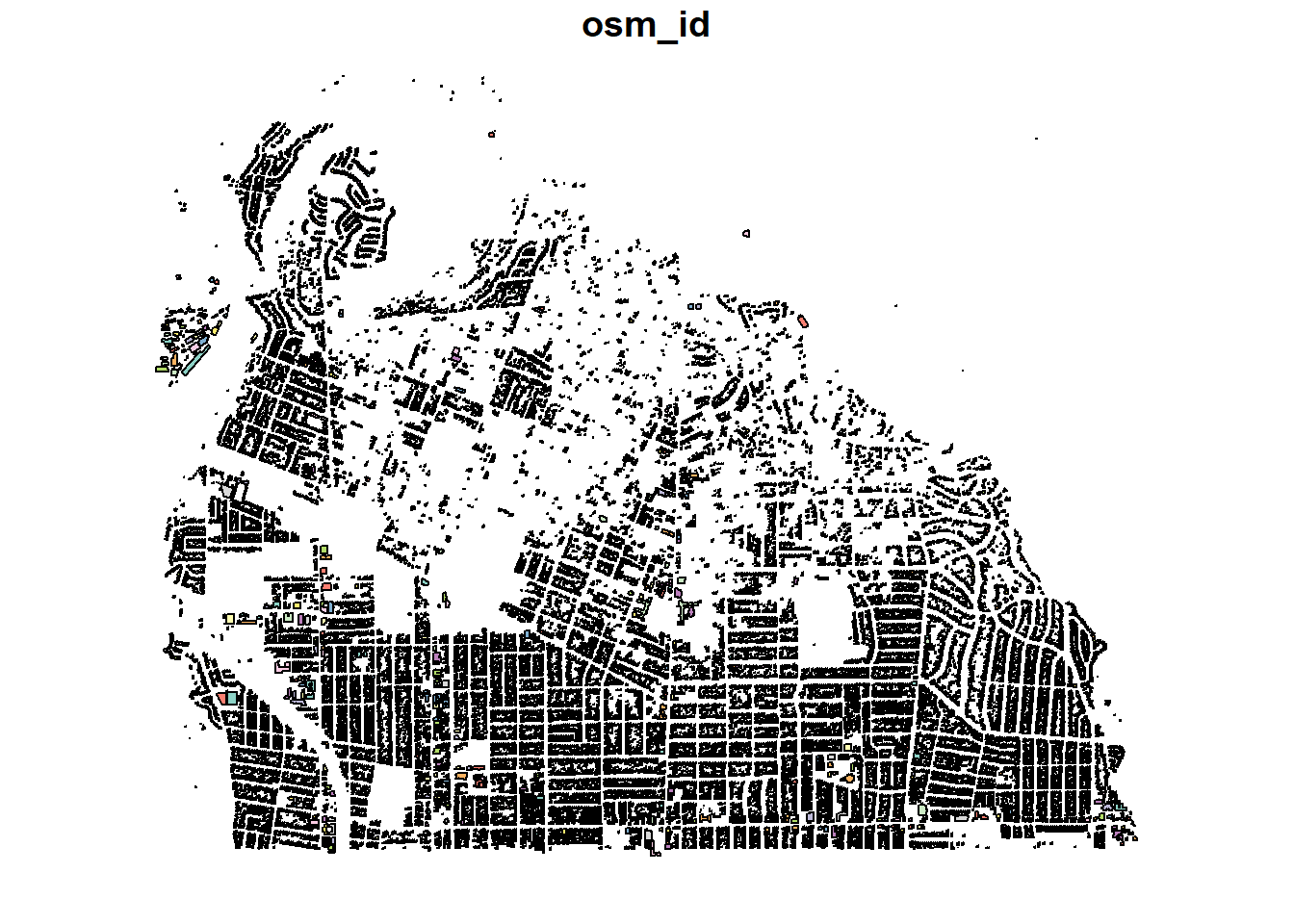
Next, we can load our coherence geotiffs. I calculated two manually in SNAP, one of the event and another one 16 days earlier.
coherence_event <- raster("F:\\california_fires\\vv_coherence_subset.tif")
coherence_prior <- raster("F:\\california_fires\\subset_S1A_IW_SLC__1SDV_20241216T135250_20241216T135317_057018_0701B0_F4F5_Orb_split_Stack_esd_coh_deb_TC.tif")
Since our coherence is represented as a raster layer, but our building polygons are a vector layer, we have to somehow colocate the two. exactextractr is a really great package for this.
building_polygons$coh_event <- exact_extract(coherence_event, building_polygons, 'mean', progress = FALSE)

building_polygons$coh_prior <- exact_extract(coherence_prior, building_polygons, 'mean', progress = FALSE)
If we quickly histogram the coherence before and after, we can get a rough idea of the decrease in coherence around the Altadena area:
ggplot(data = building_polygons)+
  geom_histogram(aes(coh_event), bins=300, fill = 'red', alpha=0.4)+
  geom_histogram(aes(coh_prior), bins=300, fill = 'blue', alpha=0.4)+
  theme_bw()+
  ylab("Count of Pixels")+
  xlab('Coherence')+
  labs(title = 'Shift in Coherence in Altadena area',
         subtitle = 'Before = Blue, After = Red')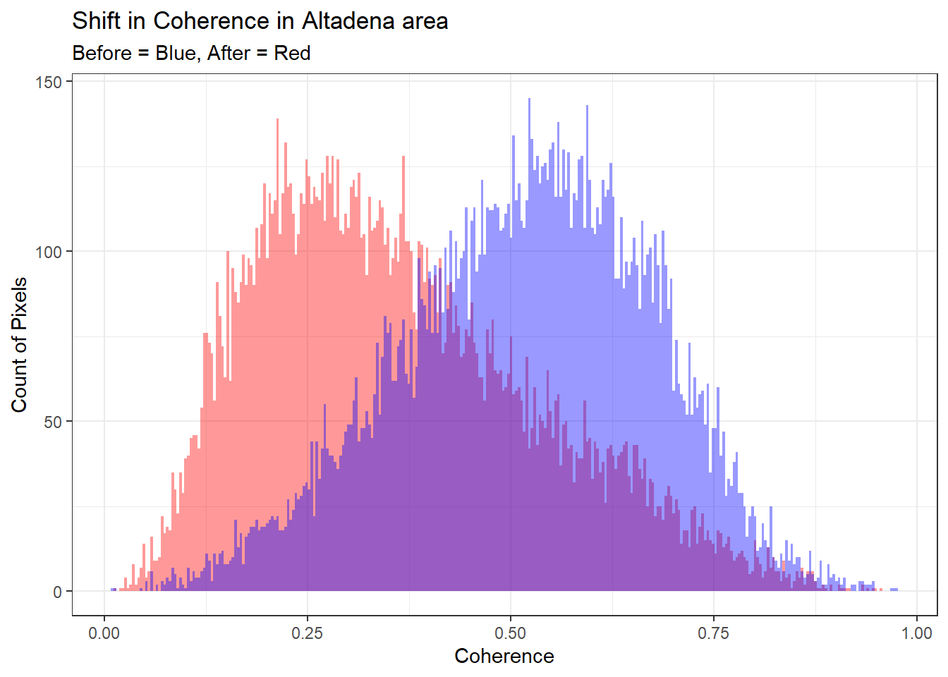
The easiest sort of plot we can do is by creating a burned/not burned decision at some arbitrary threshold. For instance, saying that a coherence value between two pairs is less than 0.4 would leave us with the below map:
ggplot() +
  geom_sf(data = building_polygons, aes(fill = coh_event < 0.4)) +
  geom_sf(data = filter(road_lines, highway=="secondary"), color = "gray70", size = 0.3) +
  scale_fill_manual(values = c("FALSE" = "grey30", "TRUE" = "#B73779")) +
  coord_sf(ylim = c(34.18, 34.215), xlim = c(-118.16, -118.12))+
  theme_minimal()+
  labs(
    title = "Building Damage estimation based on Coherence Threshold",
    fill = "Burned"
  )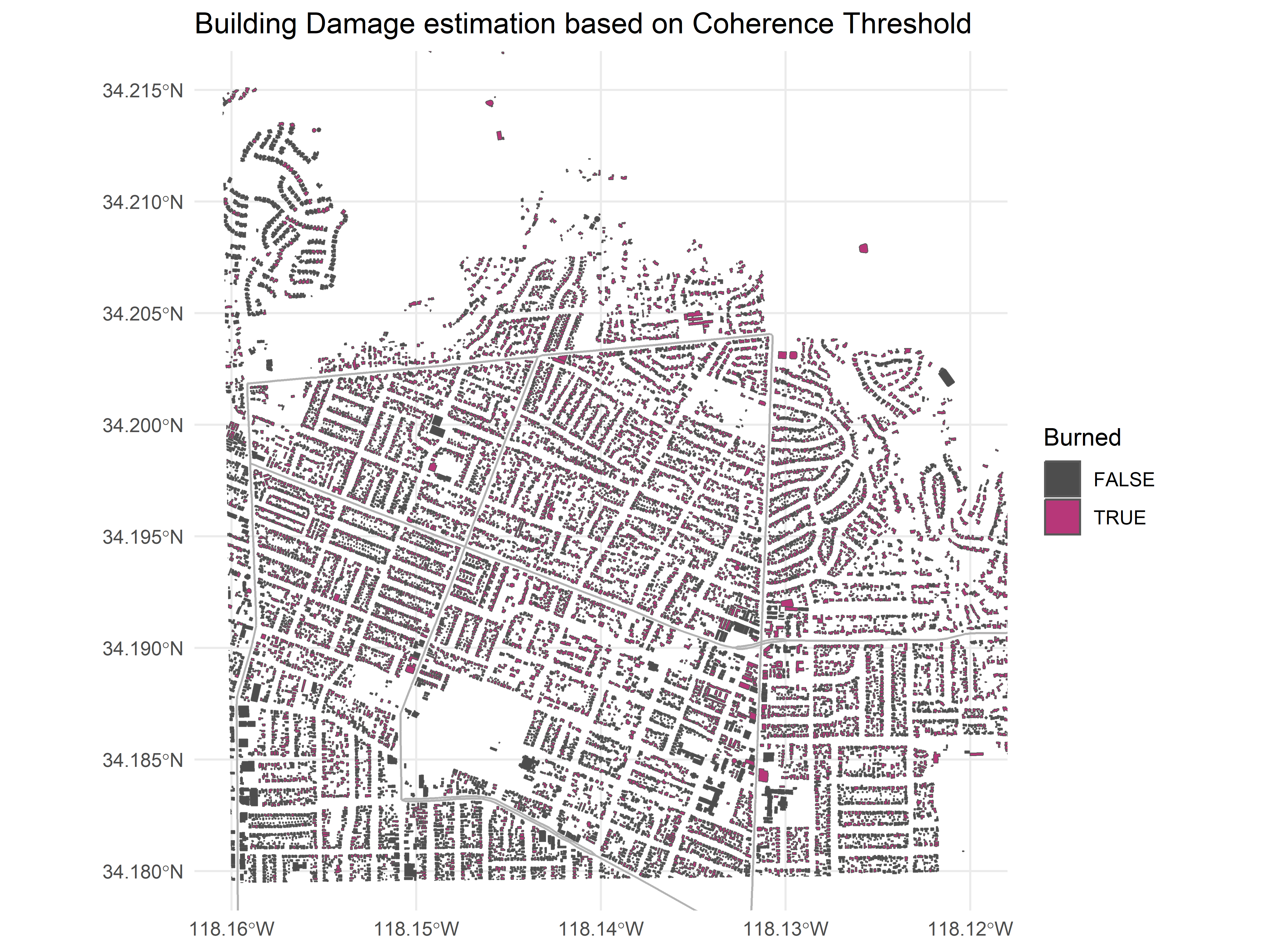
That’s already something, but you might have of noticed a large amount of false positives at for example bottom left. This happens because some areas are always low in coherence: pixels with large amounts of overlap with streets or vegetation for example, both of which are very naturally incoherent.
In practice serious researchers use a prior baseline period of months to years to know what’s normal for a pixel or even if coherence change is applicable. Any sudden movement in this time series signals that something has changed on the ground.
I nearly melted my laptop trying to work out change for 2 image pairs, so I wasn’t looking forward to this baselineing, but I know of a hacky way to get some history through the Alaska Satellite Facility. The ASF is an all round great resource. Besides having a really great search engine, they also provide pre-made processing pipelines. The InSAR processing pipeline computes coherence as an intermediate step, so I generated 4 pairs worth:
Baseline 1: Coherence between 22nd Nov 2024 and 4th Dec 2024
Baseline 2: Coherence between 4th Dec 2024 and 16th Dec 2024
Baseline 3: Coherence between 16th Dec 2024 and 28th Dec 2024
Event: Coherence between 28th Dec 2024 and 9th Jan 2025
Much of the code remains the same.
asf_b1 <- raster("F:\\california_fires\\asf\\S1AA_20241122T135252_20241204T135251_VVP012_INT40_G_weF_D74B_corr.tif")
asf_b2 <- raster("F:\\california_fires\\asf\\S1AA_20241204T135251_20241216T135250_VVP012_INT40_G_weF_29EF_corr.tif")
asf_b3 <- raster("F:\\california_fires\\asf\\S1AA_20241216T135250_20241228T135249_VVR012_INT40_G_weF_9009_corr.tif")

asf_change <- raster("F:\\california_fires\\asf\\S1AA_20241228T135249_20250109T135248_VVR012_INT40_G_weF_4CF1_corr.tif")

building_polygons$b1_raster_value <- exact_extract(asf_b1, building_polygons, 'mean', progress = FALSE)
building_polygons$b2_raster_value <- exact_extract(asf_b2, building_polygons, 'mean', progress = FALSE)
building_polygons$b3_raster_value <- exact_extract(asf_b3, building_polygons, 'mean', progress = FALSE)

building_polygons$asf_change <- exact_extract(asf_change, building_polygons, 'mean', progress = FALSE)
Except this bit here. We’re calculating a baseline mean and standard deviation for coherence for each pixel. We’re taking the lower end of that (mean - sd) and subtracting that from the coherence of the event pair. If this is larger than 0.3, we define it as burned.
 with_baseline <- building_polygons %>%
  rowwise() %>%
  mutate(b_sd = sd(c(b1_raster_value, b2_raster_value, b3_raster_value)),
         b_mean = mean(c(b1_raster_value, b2_raster_value, b3_raster_value)),
         burned2 = (b_mean - b_sd) - asf_change > 0.3)
Put another way, the custom decision boundary we made looks like this.
with_baseline %>%
  ggplot(aes(x=b_mean - b_sd, y = asf_change, colour = burned2))+
  geom_point()+
  theme_bw()+
  ylab('Coherence after Fire')+
  xlab('Mean - SD Coherence, before Fire')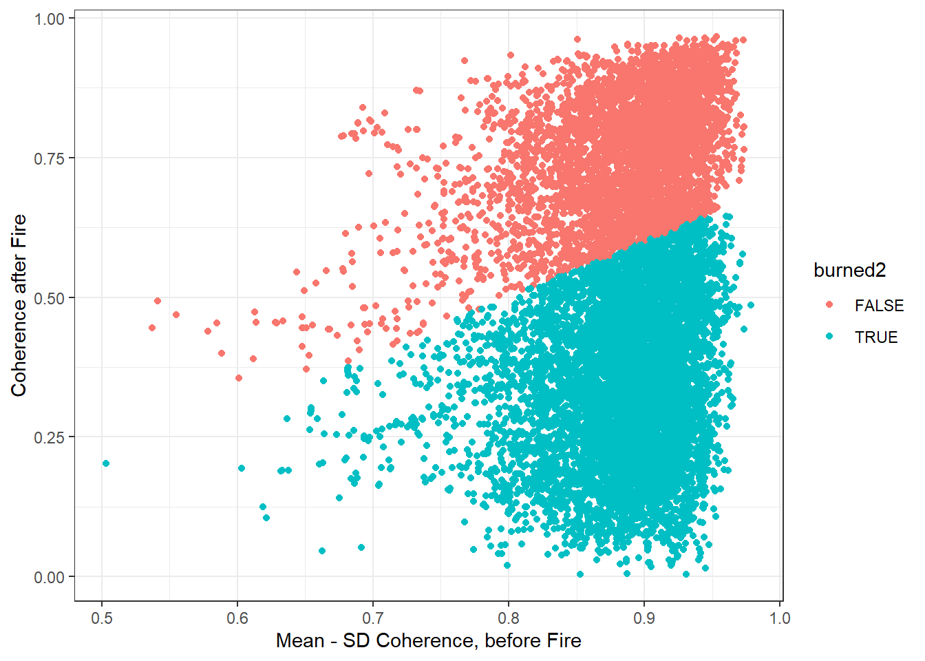
We can also visualize some random polygon as time series to drive the point of what we’re doing fully home.
set.seed(12)
random_ids <- sample(with_baseline$id, replace = FALSE, size = 30)

with_baseline %>%
  dplyr::select(id, b1_raster_value, b2_raster_value, b3_raster_value, asf_change, burned2) %>%
  st_drop_geometry() %>%
  pivot_longer(-c(id, burned2)) %>%
  mutate(order = case_when(name == "b1_raster_value" ~ 1,
                           name == "b2_raster_value" ~ 2,
                           name == "b3_raster_value" ~ 3,
                           name == "asf_change" ~ 4)) %>%
  filter(id %in% random_ids) %>%
  ggplot(aes(x=order, y = value, group = id, colour = burned2))+
  geom_point()+
  geom_line()+
  theme_bw()+
  ylab('VV Coherence')+
  xlab('Acquisition Order')+
  labs(title = 'Time Series of Coherence')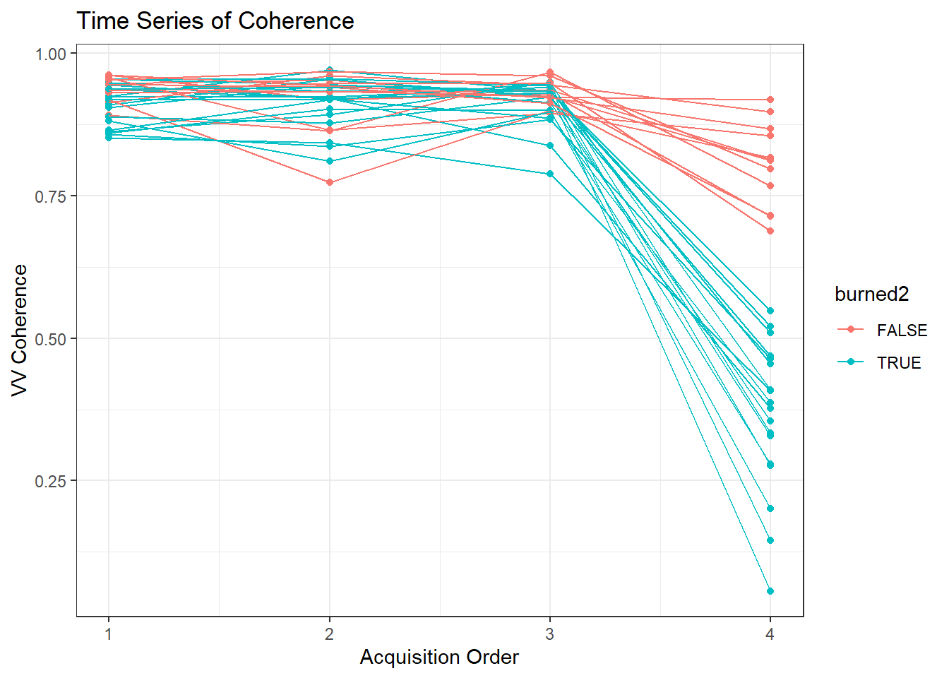
Let’s see how that does.
ggplot() +
  geom_sf(data = with_baseline, aes(fill = burned2)) +
  geom_sf(data = filter(road_lines, highway=="secondary"), color = "gray90", size = 0.3) +
 scale_fill_viridis_d(option = 'plasma', direction = -1) +
  coord_sf(ylim = c(34.18, 34.22), xlim = c(-118.16, -118.105))+
  theme_minimal() +
  labs(
    title = "Eaton Fire Estimated Damage",
    fill = "Damage"
  )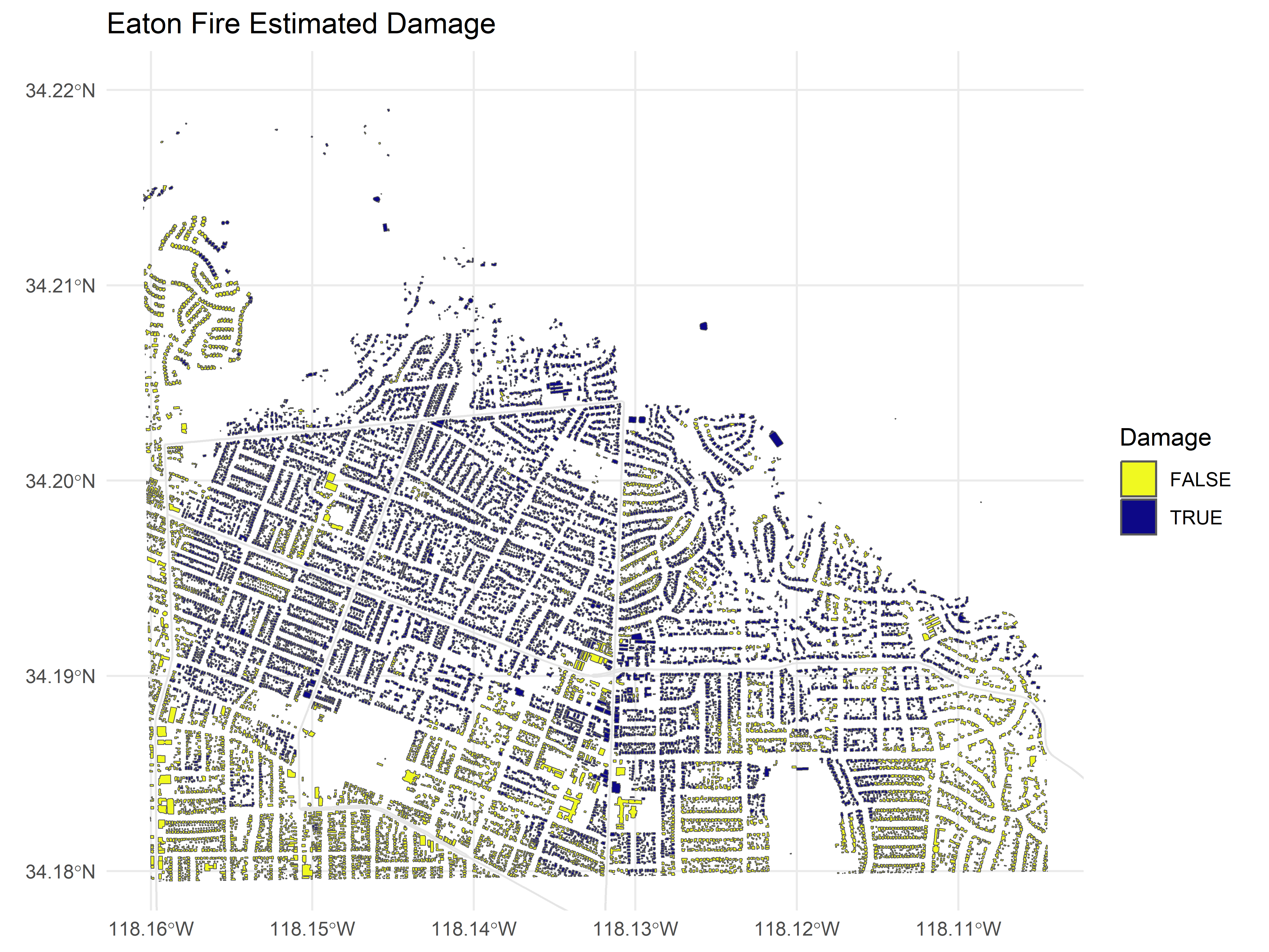
And that works surprisingly well, especially when you boil it down to what this is: no fancy neural networks over images or any of that fancy stuff but just a plain simple threshold. Information like this comes baked into the data with SAR imagery.
What if we had some labels?
That being said, I think it would also be fun to see how well this approach would do in the hypothetical scenario that we had a few labels. Microsoft’s AI for Good Lab released this assesment based on Planet optical imagery. Let’s load it, use a couple of hundred of observations as training data and test on the remainder.
planet_data <- st_read("F:/california_fires/eaton_planet_1_11_25_damage_predictions.gpkg")## Reading layer `eaton_planet_1_11_25_damage_predictions_updated' from data source `F:\california_fires\eaton_planet_1_11_25_damage_predictions.gpkg'
## using driver `GPKG'
## Simple feature collection with 156102 features and 6 fields
## Geometry type: MULTIPOLYGON
## Dimension: XY
## Bounding box: xmin: 385830.6 ymin: 3772476 xmax: 421627.1 ymax: 3791807
## Projected CRS: WGS 84 / UTM zone 11N# The planet swathe is quite large, this shenanigans is to keep the same area
bbox_latlon <- st_bbox(c(
xmin = -118.16, ymin = 34.18,
xmax = -118.105, ymax = 34.22), crs = st_crs(4326))
bbox_sf <- st_as_sfc(bbox_latlon)
# Transform the bounding box to CRS 32611 so we can filter
bbox_utm <- st_transform(bbox_sf, crs = 32611)
planet_data <- planet_data %>%
st_crop(bbox_utm)## Warning: attribute variables are assumed to be spatially constant throughout
## all geometriesplanet_data %>%
st_drop_geometry() %>%
group_by(damage_pct_0m >= 0.5) %>%
tally()## # A tibble: 2 × 2
## `damage_pct_0m >= 0.5` n
## <lgl> <int>
## 1 FALSE 8364
## 2 TRUE 6818Let’s get the VV coherence data attached again. Also we’ll lose the geometry columns since we don’t need them at this stage to make the memory overhead a bit lighter.
planet_data$b1_raster_value <- exact_extract(asf_b1, planet_data, 'mean', progress = FALSE)
planet_data$b2_raster_value <- exact_extract(asf_b2, planet_data, 'mean', progress = FALSE)
planet_data$b3_raster_value <- exact_extract(asf_b3, planet_data, 'mean', progress = FALSE)

planet_data$asf_change <- exact_extract(asf_change, planet_data, 'mean', progress = FALSE)
library(tidymodels)
labeled_data <- planet_data %>%
mutate(b_sd = sd(c(b1_raster_value, b2_raster_value, b3_raster_value)),
b_mean = mean(c(b1_raster_value, b2_raster_value, b3_raster_value)),
centroid = st_centroid(st_geometry(.)),
easting = st_coordinates(centroid)[, "X"],
northing = st_coordinates(centroid)[, "Y"],
is_burned = factor(damage_pct_0m >= 0.5))
set.seed(123)
split <- initial_split(labeled_data, prop = 0.04, strata = is_burned) # roughly 300 polygons
train_data <- training(split)
test_data <- testing(split)
xgb_spec <- boost_tree(
trees = 1000,
learn_rate = 0.001) %>%
set_engine("xgboost") %>%
set_mode("classification")
xgb_wf <- workflow() %>%
add_formula(is_burned ~ b1_raster_value + b2_raster_value + b3_raster_value + asf_change + b_mean + b_sd + northing + easting) %>%
add_model(xgb_spec)
xgb_fit <- xgb_wf %>%
fit(data = train_data)
preds <- predict(xgb_fit, test_data) %>%
bind_cols(test_data)
conf_mat(preds,
truth = is_burned,
estimate = .pred_class)## Truth
## Prediction FALSE TRUE
## FALSE 5655 1478
## TRUE 2375 5068conf_mat(preds,
truth = is_burned,
estimate = .pred_class) %>%
summary()## # A tibble: 13 × 3
## .metric .estimator .estimate
## <chr> <chr> <dbl>
## 1 accuracy binary 0.736
## 2 kap binary 0.472
## 3 sens binary 0.704
## 4 spec binary 0.774
## 5 ppv binary 0.793
## 6 npv binary 0.681
## 7 mcc binary 0.476
## 8 j_index binary 0.478
## 9 bal_accuracy binary 0.739
## 10 detection_prevalence binary 0.489
## 11 precision binary 0.793
## 12 recall binary 0.704
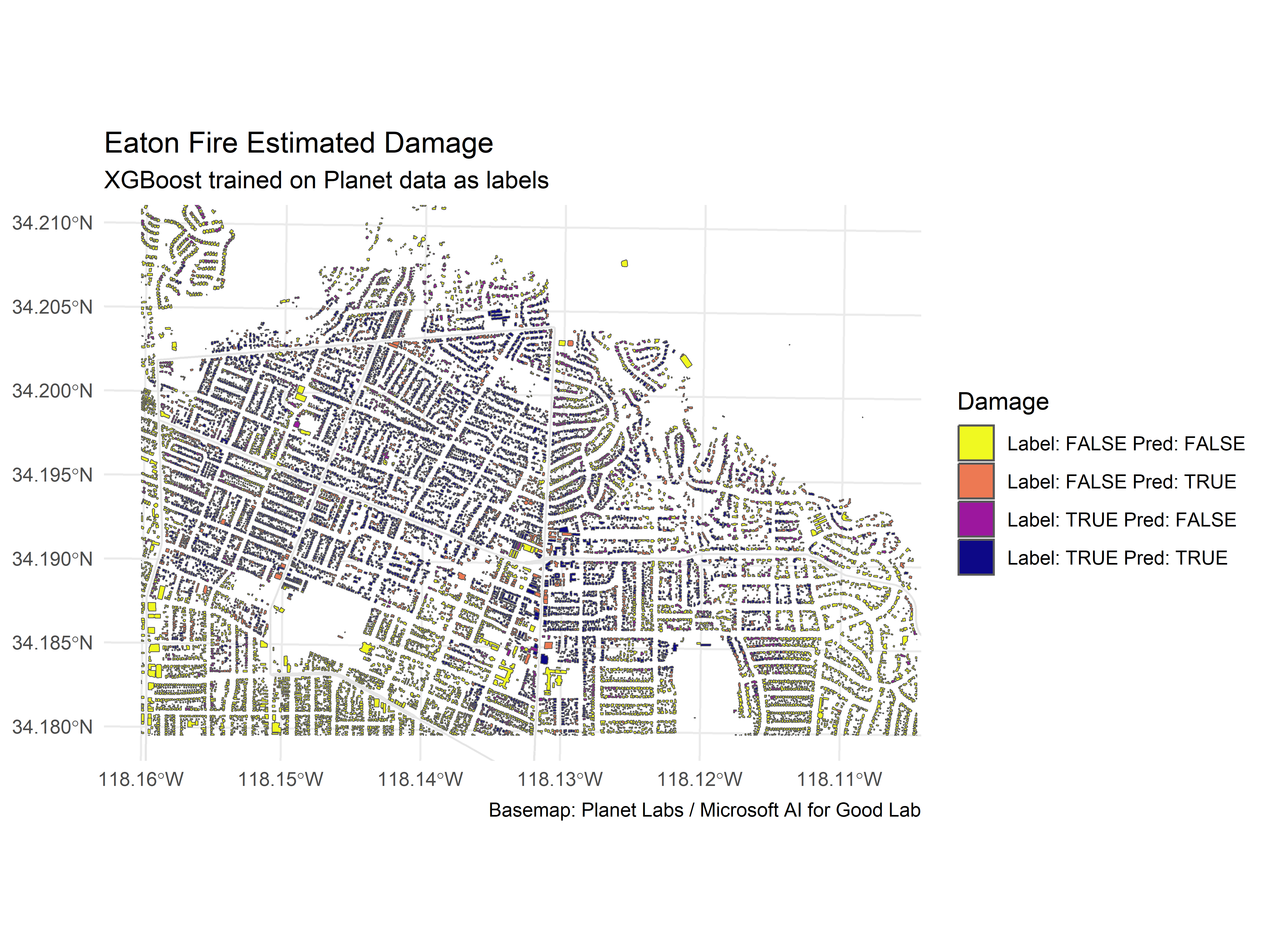
## 13 f_meas binary 0.746We can even be a tiny bit more creative and see where the disagreements are:
planet_preds <- predict(xgb_fit, labeled_data)

labeled_data$preds <- (planet_preds$.pred_class)

labeled_data <- labeled_data%>%
  mutate(combined = paste("Label:", is_burned, "Pred:", preds))

ggplot() +
  geom_sf(data = labeled_data, aes(fill = combined)) +
  geom_sf(data = filter(road_lines, highway=="secondary"), color = "gray90", size = 0.3) +
 scale_fill_viridis_d(option = 'plasma', direction = -1) +
  coord_sf(ylim = c(3782666, 3786000), xlim = c(393100, 398000))+
  theme_minimal() +
  labs(
    title = "Eaton Fire Estimated Damage",
    subtitle = 'XGBoost trained on Planet data as labels',
    fill = "Damage",
    caption = "Basemap: Planet Labs / Microsoft AI for Good Lab"
  )