I’d hardly blame you if you haven’t been paying attention, but sometime over last Autumn we sneakily crossed the point where the next election is now closer to us than the previous one.
With the next Maltese General Election slated to be held no later than March 2027, just 23 months from now, this post will be an announcement that the General Election tracker is now ‘live’, a recap of what it shows, and some observations.
Election Forecast & Poll Smoothing
The full forecast page is live here, and it remains my intention to update it more frequently going forward. But the highlights are summarised below.
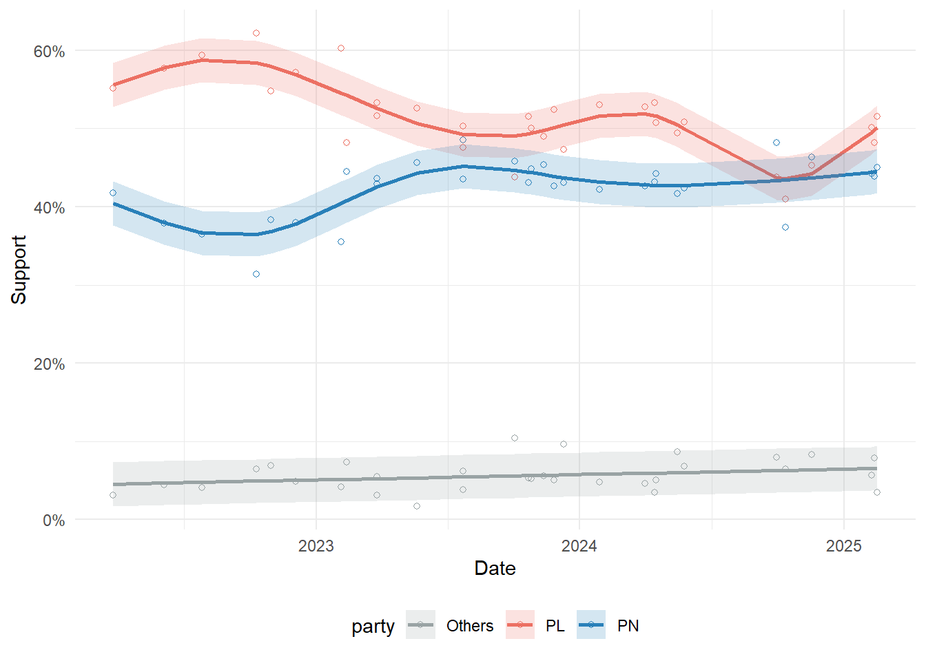
After updating with all the major polling in 2024 and 2025 I could find, the smoothed average looks something like this:
Which when you plug in uncertainty ends up looking something like this:
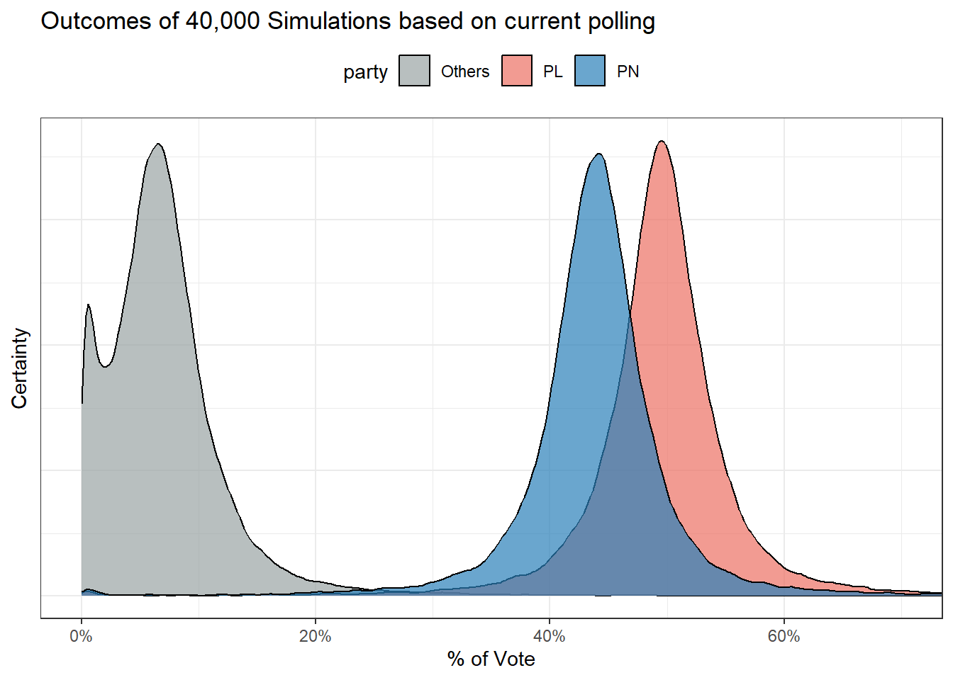
With this stack of the cards, PL win 4 out of every 5 times.
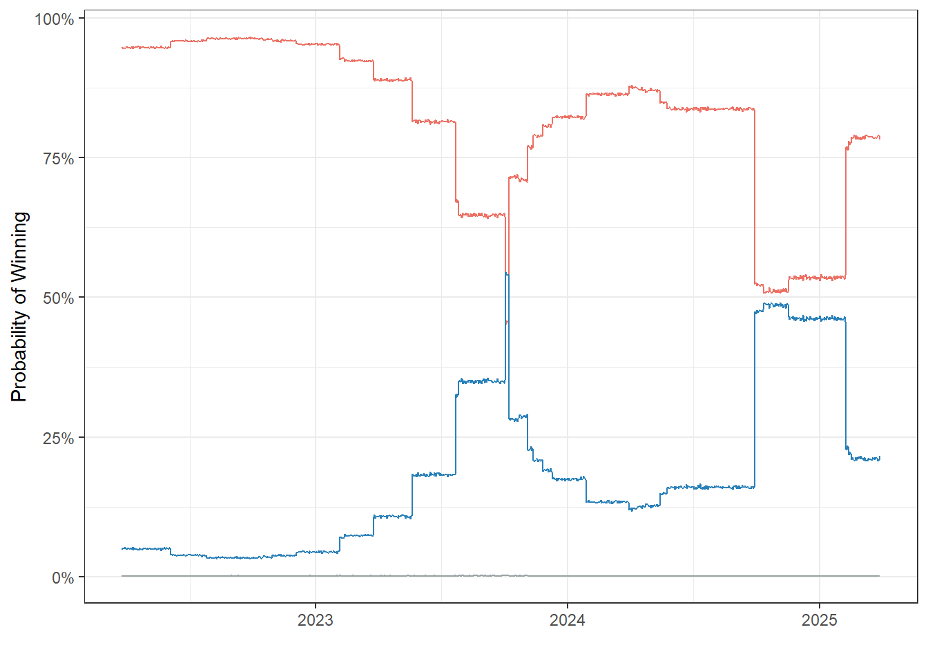
Notably, viewing the smoothed polls and the probability trend tempers the expectations set by two MT polls showing PN ahead in late 2024, which I think is a nice demonstration of the value add of poll averaging and simulations.
Ghibliometer
I’m generally immune to AI fads but as a lifelong Studio Ghibli fan, this one got the better of me, especially since I’ve been thinking of a way to map forecast probability to something more intuitive. The Ghibliometer will be at the top of the forecast page and will change with the forecast.
More specifically, certain win probability ranges are mapped to specific portraits I asked GPT-4o to generate. Some ways the Ghibliometer might look in the future include but are not limited to:

Gozo and How District Swings Work
In a previous run of this forecast, the 13th district was the only PN flip. This shift was backed up by subsequent Gozo specific polling and the 2024 Local Council Election result (which PN won by around 1,000 votes), so it might be worth explaining a bit on why Labour hangs on in this newer forecast.
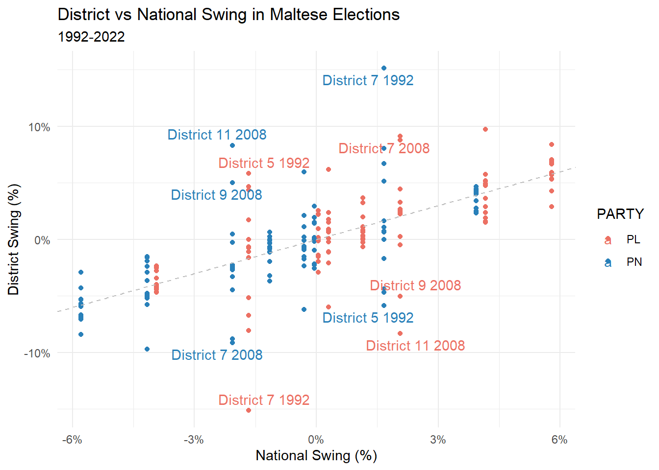
District swings are currently modeled using the simplest assumption: that the district swing is the same as the national swing. That is, if PL won the last election with 55% and is currently polling at 49%, this is a -6% swing. PL is then assumed to also lose 6% from its previous vote in each district. The PN/Other swings are also calculated the same way, and whoever has the largest share at the end of it is projected to win that district.
This is called Uniform National Swing, and I’m actually pretty sure that it’s not the best assumption for an electoral system like ours. But it is relatively straightforward to code, and somewhat holds up historically if you squint away some outliers. (Under the UNS assumption, the national and district swings should be fairly close, meaning points should lie close to the dashed line that indicates a 1:1 relationship).
So what changed? Labour gained some of its swing back from its 2023 dip by a sufficient margin to regain Gozo by a projected 1.8%. But the key point to understand here is that UNS is a tool for understanding district swings from national polls. It’s a simplifying assumption and probably wrong for Gozo at this point (PL has unique challenges here, including the hospital fallout).
That being said, I’m also generally hesitant about any sort of manual intervention, so it reverts back to PL, with this additional disclaimer.
Ecological Analysis and Why this is Still PL’s Election to Lose
I also think explaining a bit the results we saw in June 2024 would probably unpack the political situation a bit better. We’ll focus on Local Council results for two reasons. The first of which is that the analysis we’ll look at needs detailed results over many geographical units, which Local Council elections provide. Secondly, people do vote a bit differently in MEP elections than they otherwise would, and I think their behaviour in Local Council elections is more similar to that in a General Election.
Because we know election results from the same localities in both 2019 and 2024, we can fill a table like the below (using Valletta as an example).
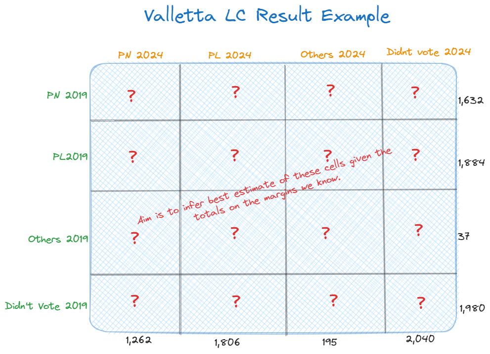
We know the values on the margins, what we do not know are the values for the cells themselves. Luckily for us, there are constraints that help us come up with plausible values: votes cannot be negative and the PL vote in 2019 for instance must equal all flows from PL in 2024. Throw in the 67 local council elections we have and some fancy number crunching, and we can make reasonably educated guesses of voter flows. This is how ecological inference works in a nutshell, by using aggregate-level data to estimate or infer individual-level behaviour.
What we end up with is a table of voter flows, where the rows are the parties in 2019 and he columns the parties in 2024. For instance, in the below PN held onto 94% of it’s 2019 vote in 2024, but PL only managed 86%. So where did the bulk of PL voters not voting for PL go? Into that ‘Not Voting’ bin.
##             PN_2024 PL_2024 Others_2024 NotVoting_2024 NET_EXITS
## PN            93.79    1.71        0.94           2.88      0.69
## PL             3.86   86.28        2.58           6.42      0.86
## Others        14.06   10.24       51.43          21.76      2.51
## NotVoting      1.89    1.31        0.65          95.33      0.81
## NET_ENTRIES   30.54    1.06        0.83          67.57      0.00
Presented more graphically, the flow looks something like this.
But the key point being made by these voter flows is that one of the largest flows in flux is PL voters becoming disengaged and not voting. Whether they repeat this pattern in a General Election is anyone’s guess, but for this reason, the next election remains very much PL’s to lose.
One final note on this. The ‘Other’ category in local elections isn’t what you might think of usually (i.e. AD and other small parties). Many local councils have independent councilors and some have locality only parties, so keep this in mind when interpreting flows to/from this bucket.