Access to public transportation is a relatively important affair, since it translates into the accessibility to healthcare for the elderly and directly ties into educational and work opportunities, especially for lower socioeconomic groups.
Answering how well Malta is served is actually not that hard, given that you phrase the question along the lines of ‘how far is it to the nearest bus stop?’, ignoring things like frequency and routes.
Getting locations of all bus stops
Getting the location of almost anything is exceptionally easy through the osmdata package: essentially a friendly R interface to openstreetmap.org.
library(tidyverse)
library(osmdata)
library(sf)
library(raster)
library(viridis)
library(scales)

bbox = c(14.18, 35.80,
         14.57, 36.08)

bus_stops <- opq(bbox=bbox) |>
  add_osm_feature(key = "highway", value = "bus_stop") |>
  osmdata_sf()|>
  purrr::pluck("osm_points") |>
  st_transform(3035)
We st_transform to the recommended projection for EU countries to switch over to meters from degrees since we’ll be measuring distances in a bit.
The raster package actually has a function to fetch country shapefiles, which I’ll also use:
mt <- raster::getData(country = "Malta", level = 2) |>
  st_as_sf() |>
  st_transform(3035)
And believe it or not, we’ve already written enough code to plot all the locations of bus stops!
ggplot()+
  geom_sf(data = mt)+
  geom_sf(data=bus_stops, alpha=0.5, size=0.5, color='darkgoldenrod1')+
  coord_sf()+
  theme_bw()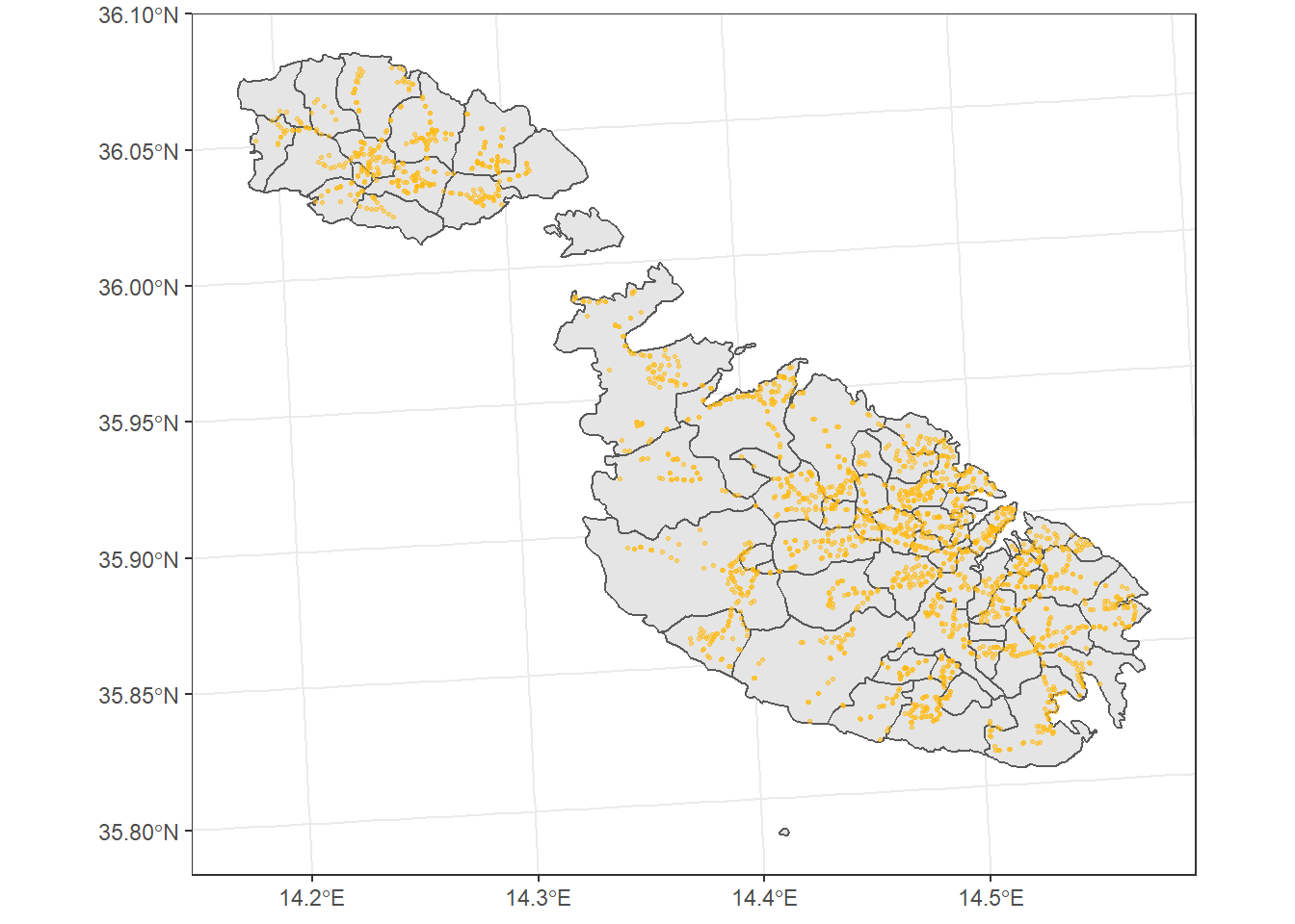
Measuring ‘Distance’
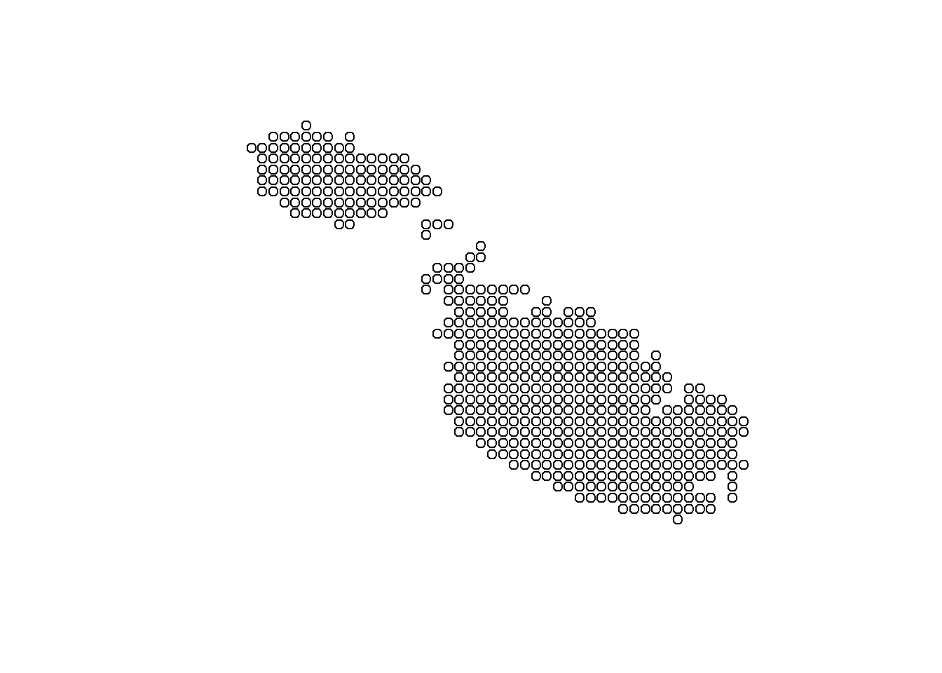
To measure the distance between the bus stops and any point on the islands, first we’ll create a grid of points, then sequentially go through them and measure the distance of each point from the nearest stop.
grid <- st_make_grid(mt, cellsize = 80, what ='centers')
grid <- st_intersection(grid, mt)
The st_make_grid returns a square grid, while st_intersection just keeps the points within the Malta shape file: there’s no use spending electrons on calculations we’re going to throw away.
What we end up with, just for the sake of illustration, is something like this but at a much finer scale:
Calculating the distance between these points and the bus stop data is then another function call away:
dist <- st_distance(bus_stops, grid, by_element = FALSE)But here, the dist object ends up being a pairwise matrix of the distances of each point from all 2,060 bus stops. We only need to keep the nearest one, so I transpose it so that our generated points are the rows and the distance from each bus stop the columns, then resort to do.call to return what is essentially a row-wise minimum.
Then it’s simply a matter of creating a dataframe of X and Y points, together with this distance. One small hack I made is artificially cap the distance above 2.8km for two reasons:
It’s not telling us anything useful, 2.5km is too far to walk anyway and I’d rather that colour scale be used to differentiate between say 200m and 400m.
The only places with these distances are Comino and Filfla.
d <- dist |>
  t() |>
  as.data.frame()

d_min <- do.call(pmin, d)

df <- data.frame(dist = as.vector(d_min),
                 st_coordinates(grid)) |>
  mutate(dist_tidy = if_else(dist>2500, 2500, dist))
And plotting it.
ggplot()+
  geom_sf(data = mt)+
  geom_tile(data=df, aes(X, Y, fill = dist_tidy))+
  scale_fill_viridis(option="inferno", begin=0.1)+
  labs(fill = "Distance(m)")+
  theme_void()+
  coord_sf()+
  labs(title='Distance to Nearest Bus Stop',
       caption = 'Data from OpenStreetMap.')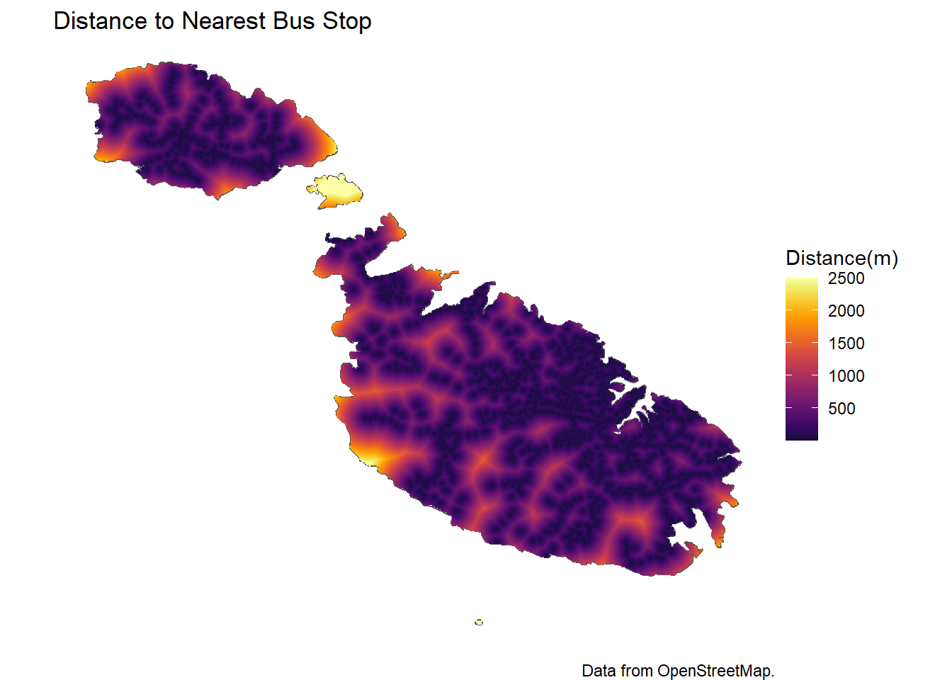
We can also convert distance to walking time, if that is more informative. Wikipedia says the typical walking speed is 5km/h, so:
df %>%
  mutate(minutes = (dist_tidy/5000)*60) %>%
  ggplot()+
  geom_sf(data = mt)+
  geom_tile(aes(x=X, y=Y, fill = minutes))+
  scale_fill_viridis(begin=0.1)+
  labs(fill = "Walking time (minutes)")+
  theme_void()+
  coord_sf()+
  labs(title='Distance to Nearest Bus Stop',
       caption = 'Data from OpenStreetMap.')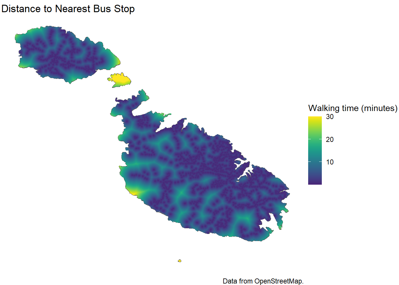
Strictly speaking, Comino and Fifla are incorrect because it would mean swimming at 5km/h as well, but you get the gist: you have to try pretty hard to be 15 minutes+ walking distance from a bus stop in Malta, and most of those locations are pretty near the coast like Ras Il-Qala, Armier or ta’ Cenc.
In fact, if we histogram the data we can see that it’s a pretty right skewed distribution, that is, most of the points are very close to a bus stop, and very very few are very far.
ggplot(df, aes(dist)) +
  geom_histogram(bins=100)+
  geom_vline(xintercept = mean(df$dist), color='darkgoldenrod1')+
  scale_x_continuous(labels = comma)+
  theme_bw()+
  xlab('Distance to nearest Bus Stop (m)')+
  ylab('# of points')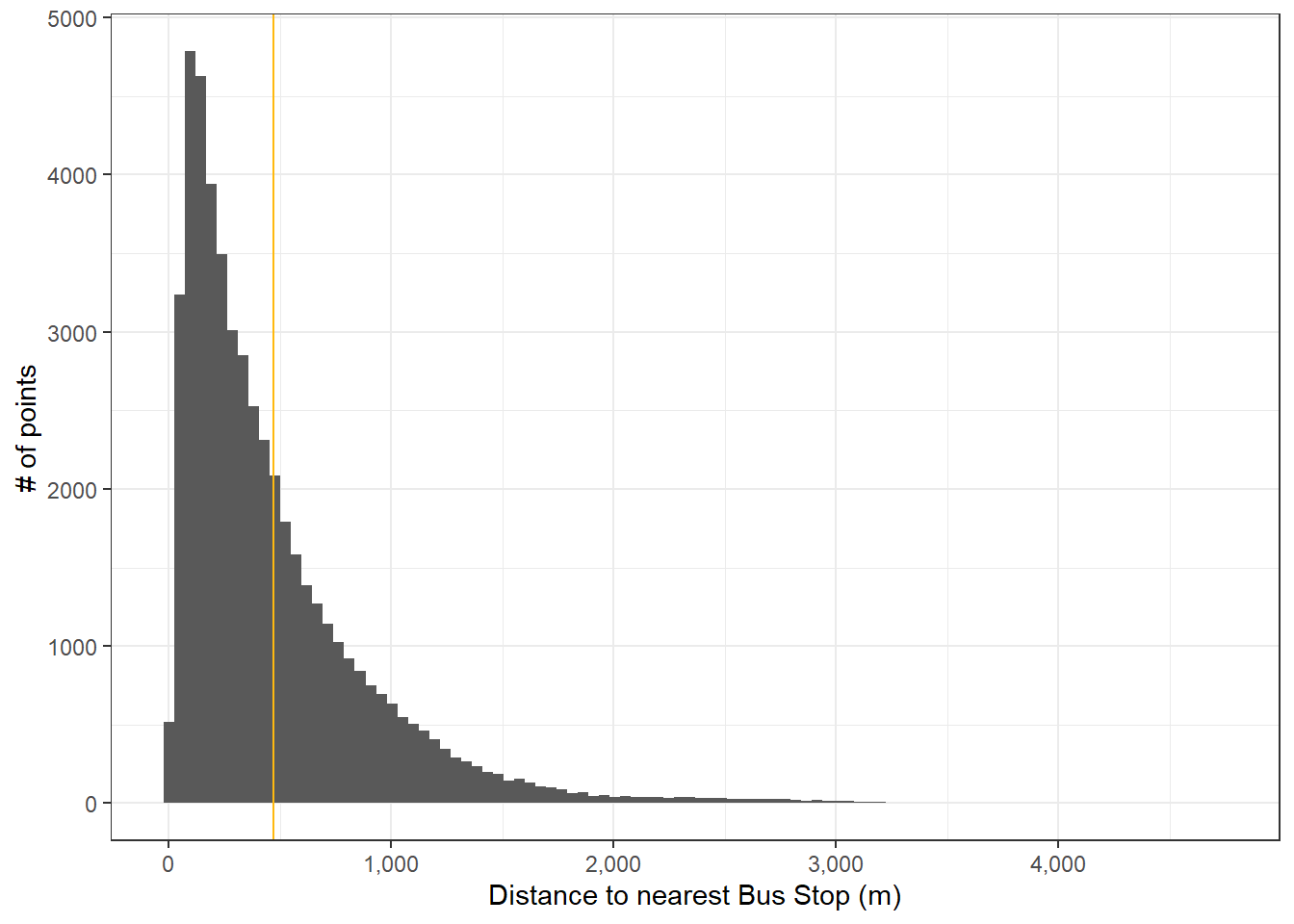
In fact, the distance away from a bus stop on average if some alien were to drop out of the sky anywhere on the Maltese archipelago, including Comino and Filfla, would be:
median(df$dist)## [1] 337.2639