This is a companion post for a reactive shiny app that lives here.
The NSO released the first part of their final report on the census a few weeks back, including fairly generous locality level data here.
In this post, we’ll:
construct an overall Malta and locality level population pyramids and wrap them in a shiny app for quick comparison.
play with ways to quantitatively compare towns for ‘demographic similarity’.
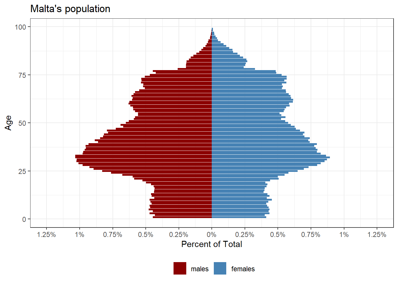
Population Pyramids
We can construct a pretty high granularity pyramid, since we have the values for each age:
Constructing the equivalent for each locality for comparison is relatively straight forward, with a few minor complications.
The first is that the locality level data aggregates 90 or older individuals as ‘older than 90’, so we have to do this for the national level data too.
The second is a personal preference, but binning age into groups of 2 year brackets seems to make a clearer graph that’s easier to compare.
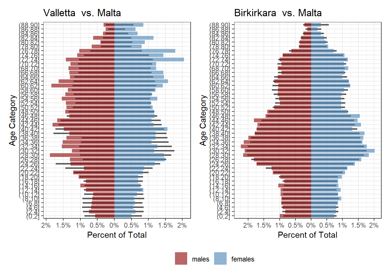
To see how any one town compares to the national average, visit this shiny app, but these are a few interesting ones. The basic principle is the same: the thinner black bars are the national values, the coloured ones that locality’s values. In places where the coloured bars extend past, that group/gender cohort is over-represented in that town. In places where the black bar juts out, that group/gender cohort is under-represented.
Under the hood, I just wrapped some ggplot code (mostly ripped off from this resource) in a function.
plot_city_pyramid <- function(city){

  name <- city

  city <- filter(cities, city==!!city)

  min_max <- city %>% group_by(age_bin, gender) %>%
    mutate(per = sum(percent)) %>%
    ungroup() %>%
    summarise(max_per = max(per, na.rm = T),
              min_per = min(per, na.rm = T))

  max_per <- min_max$max_per
  min_per <- min_max$min_per

  ggplot(total)+
    geom_col(aes(x=age_bin, y=percent), width = 0.3)+
    geom_col(data=city, aes(x=age_bin, y=percent, fill = gender), alpha=0.6)+
    coord_flip()+
    theme_bw()+
    scale_y_continuous(
      limits = c(min_per, max_per),
      breaks = seq(from = floor(min_per), to = ceiling(max_per),  by = 0.5),
      labels = paste0(abs(seq(from = floor(min_per),
                              to = ceiling(max_per),
                              by = 0.5)), "%"))+
    labs(title=eval(paste(name,' vs. Malta')))+
    ylab('Percent of Total')+
    xlab('Age Category')+
    scale_fill_manual(name='',values=c('darkred','steelblue'))+
    theme(legend.position = "bottom")
  }
So for instance, Valletta has less children than average but more males in the 26-38 bracket than average, and Birkirkara has a more ‘typical’ pyramid:
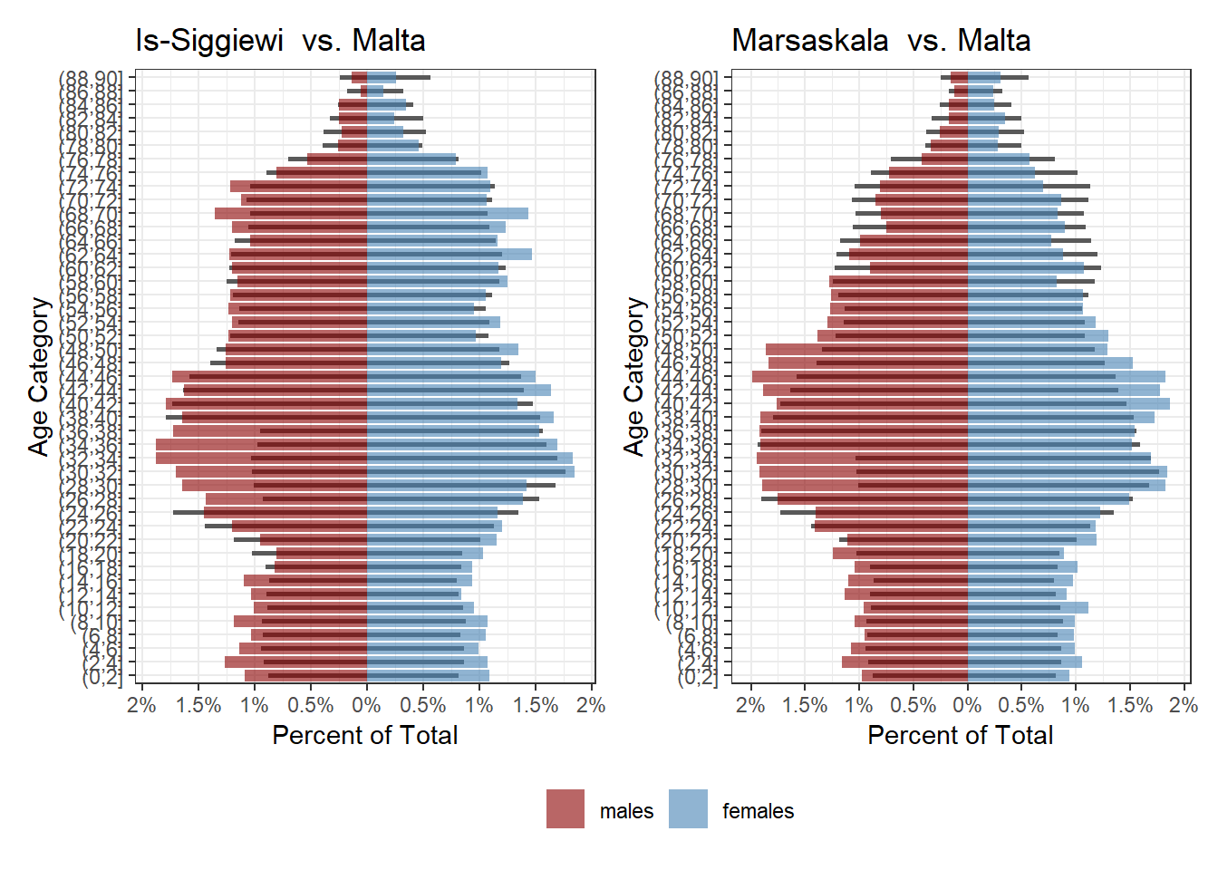
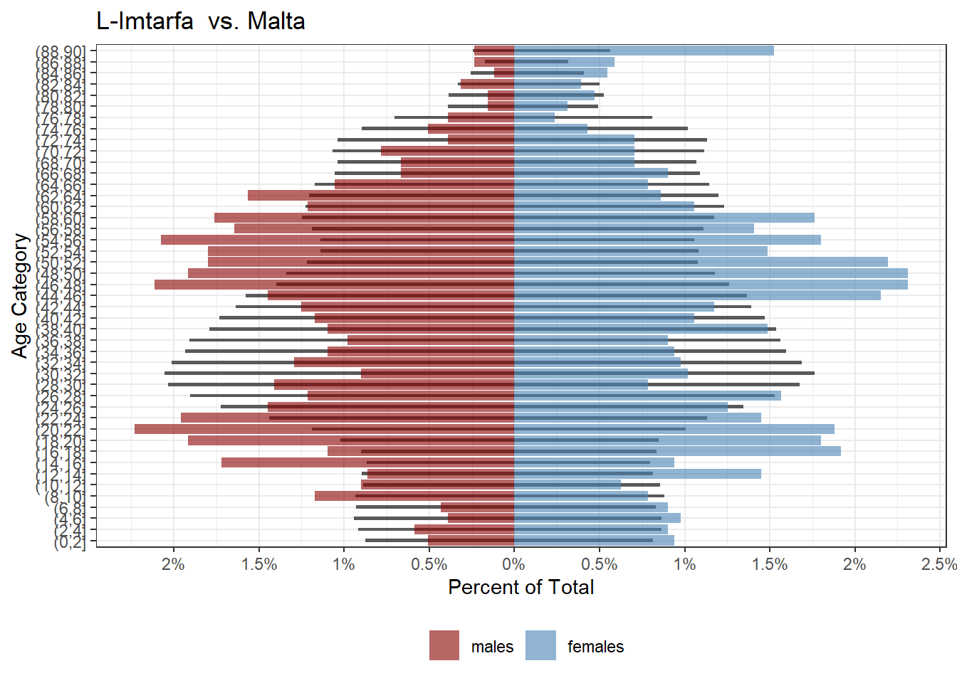
While Siggiewi and Marsaskala have more families with children than average, and Mtarfa seems to have of been in the same place 20 years ago, but with many of those people moving away now:
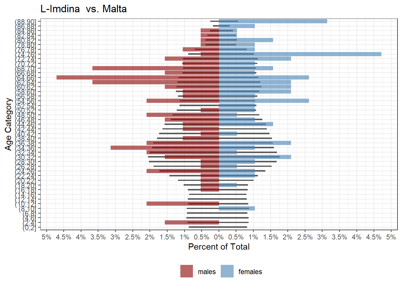
One of the most interesting towns is Mdina, which has chunks of age ranges completely missing and an exceptionally elderly population:
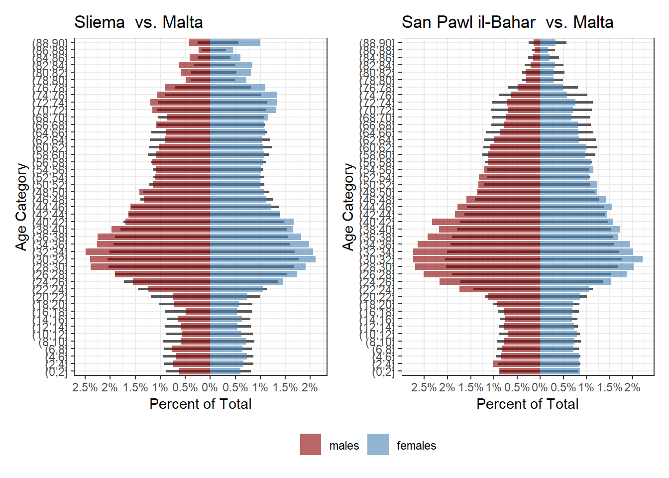
Localities with sizeable foreign populations working here also are pretty noticeable:
It wasn’t long before I was comparing random towns with each other just by eye, but there was a way to find similar towns quantitatively! My first idea was to use a statistical approach. That failed and was a bit confusing, so it’s further down. What actually runs in the shiny app is a much more simple hierarchical clustering approach.
Hierarchical Clustering
The first step before hierarchical clustering is reshaping the data to be a wider format, where each population percentage bin is a column:
## # A tibble: 6 x 42
##   city        `(0,5]_females` `(10,15]_femal~` `(15,20]_femal~` `(20,25]_femal~`
##   <chr>                 <dbl>            <dbl>            <dbl>            <dbl>
## 1 Birkirkara             1.91             2.26             2.24             2.88
## 2 Birzebbugia            1.80             2.03             2.11             2.94
## 3 Bormla                 1.32             1.95             2.30             2.43
## 4 Floriana               1.42             1.72             1.72             2.78
## 5 Ghajnsielem            2.38             1.40             2.09             2.78
## 6 H'Attard               2.37             2.16             2.33             2.61
## # ... with 37 more variables: `(25,30]_females` <dbl>, `(30,35]_females` <dbl>,
## #   `(35,40]_females` <dbl>, `(40,45]_females` <dbl>, `(45,50]_females` <dbl>,
## #   `(5,10]_females` <dbl>, `(50,55]_females` <dbl>, `(55,60]_females` <dbl>,
## #   `(60,65]_females` <dbl>, `(65,70]_females` <dbl>, `(70,75]_females` <dbl>,
## #   `(75,80]_females` <dbl>, `(80,85]_females` <dbl>, `(85,90]_females` <dbl>,
## #   `(0,5]_males` <dbl>, `(10,15]_males` <dbl>, `(15,20]_males` <dbl>,
## #   `(20,25]_males` <dbl>, `(25,30]_males` <dbl>, `(30,35]_males` <dbl>, ...
We then scale this and using the base stats hclust. What this hierarchical clustering approach will do is move up from the town level and group towns with more similar features together. The common way to plot these results is in a dendogram, where you can see the hierarchy forming from the bottom up.
d <- dist(x = df_scaled, method = "euclidean")
hc2 <- hclust(d, method = "complete" )
hc2$labels <- df$city
plot(hc2, cex = 0.6, hang = -1)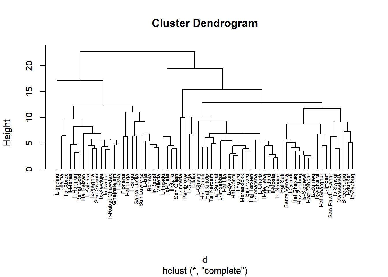
To visualize this better, we can prune the dendogram into say 13 groups, and plot the results using fviz_cluster from the factoextra package
library(factoextra)

sub_grp <- cutree(hc2, k = 12)

cd=df %>%
  column_to_rownames(var = "city")

fviz_cluster(list(data = cd, cluster = sub_grp), repel = TRUE, labelsize = 10)+
  theme_bw()+
  labs(title='Demographic Similarity of Localities')+
  theme(legend.position = 'none')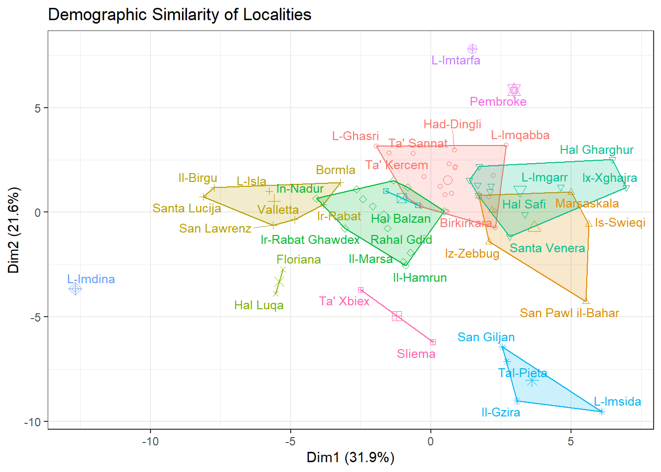
The main points for me are:
How demographically unique Mdina, Mtarfa and Pembroke are (all three have some gaps in some age/gender categories, and Mtarfa and Pembroke have this weird over-represented, under represented, over-represented dynamic).
The distinctness of the San Giljan-Pieta-Gzira-Msida group, and how San Pawil il-Bahar is close to them but ultimately closer to Swieqi and Iz-Zebbug (this is the Gozitan locality, not Haz-Zebbug).
KL Divergence
This was my initial attempt, but I abandoned it. The Shiny app runs the above clustering for similarity/dissimilarity generation but since I had written this already…
Considering that a population pyramid is a fancy form of a distribution just arranged funny, my first idea was to use something commonly used to compare distributions: the KL divergence.
The intuition behind the KL divergence is relatively easy: we can collapse a town’s population in a single distribution, plot it over any other town’s, and calculate the difference. The more differences, the larger the error we measure becomes and the less similar the two distributions.
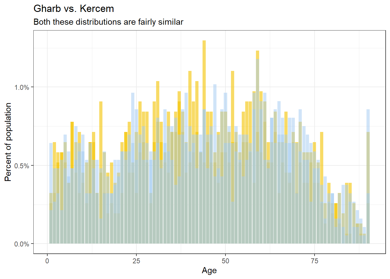
Or graphically, comparing Gharb and Kercem, two towns that are similar, there is much more overlap…
…than say Sliema vs. Ghasri, which are very different.
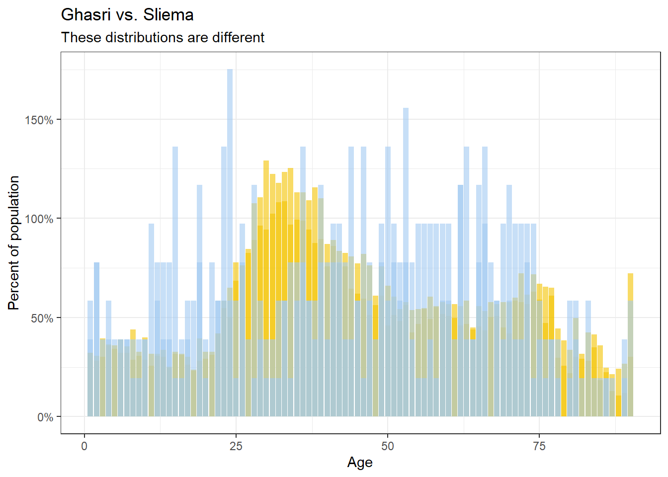
In numerical terms, if we calculate the KL divergence of the two distributions (using the KL function from the philentropy package), the closer the localities demographically, the smaller the error, granted we align the order of the ages and genders identically.
library(philentropy)

KL(rbind(gharb, kercem))
## kullback-leibler
## 0.02883498KL(rbind(sliema, ghasri))## kullback-leibler
## 0.1549449To compare the similarity of each of the 68 Maltese localities with each other, we can create a 68x68 matrix, and run a KL divergence calculation on each pair.
Before that a bit of pre-processing is on order though, I recast the bins to 5 year intervals and replace any missing values with 0. I then save each each distribution as a nested list within each locality:
cities %>%
mutate(age_bin = cut(age, breaks=seq(0, 90, by=5)),
       percent = tidyr::replace_na(percent, 0)) %>%
  select(city, age_bin, gender, percent) %>%
  group_by(city, age_bin, gender) %>%
  summarise(percent=sum(percent)) %>%
  group_by(city) %>%
  summarise(pd=list(percent))
## # A tibble: 6 x 2
## city pd
## <chr> <list>
## 1 Birkirkara <dbl [36]>
## 2 Birzebbugia <dbl [36]>
## 3 Bormla <dbl [36]>
## 4 Floriana <dbl [36]>
## 5 Ghajnsielem <dbl [36]>
## 6 H'Attard <dbl [36]>The rest is fairly ugly base R code that probably has a tidyverse equivalent somewhere but still gets the job done:
KL_mat <- matrix(nrow=nrow(city_age_dist),
                 ncol=nrow(city_age_dist))

rownames(KL_mat) <- city_age_dist$city
colnames(KL_mat) <- city_age_dist$city

for (row in 1:nrow(KL_mat)){
  for (col in 1:ncol(KL_mat)){
    KL_mat[row, col] <- KL(rbind(city_age_dist$pd[row][[1]],
                                 city_age_dist$pd[col][[1]]))
  }
}
The resulting matrix looks something like this (limiting to the first 5 towns so it fits nicely).
##             Birkirkara Birzebbugia     Bormla   Floriana Ghajnsielem
## Birkirkara  0.00000000  0.05428689 0.05880277 0.09640140  0.04314489
## Birzebbugia 0.06083927  0.00000000 0.09341382 0.15864531  0.10980517
## Bormla      0.06184174  0.10595070 0.00000000 0.04439004  0.03684491
## Floriana    0.11244901  0.19449522 0.04495561 0.00000000  0.07200527
## Ghajnsielem 0.04388780  0.09738919 0.03507119 0.06245606  0.00000000
## H'Attard    0.02143650  0.07712727 0.03544379 0.07042377  0.02464124
The diagonals (the difference of a town to itself) is 0 as you’d expect. However the difference between say Birkirkara and Birzebbuga is close but not exactly identical to the difference between Birzebbuga and Birkirkara. This inequality is a well known feature of the KL divergence and shouldn’t annoy us too much.
The more pertinent question is if these scores make sense. Plucking out say a list of localities from most to least similar to Qala, we end up with:
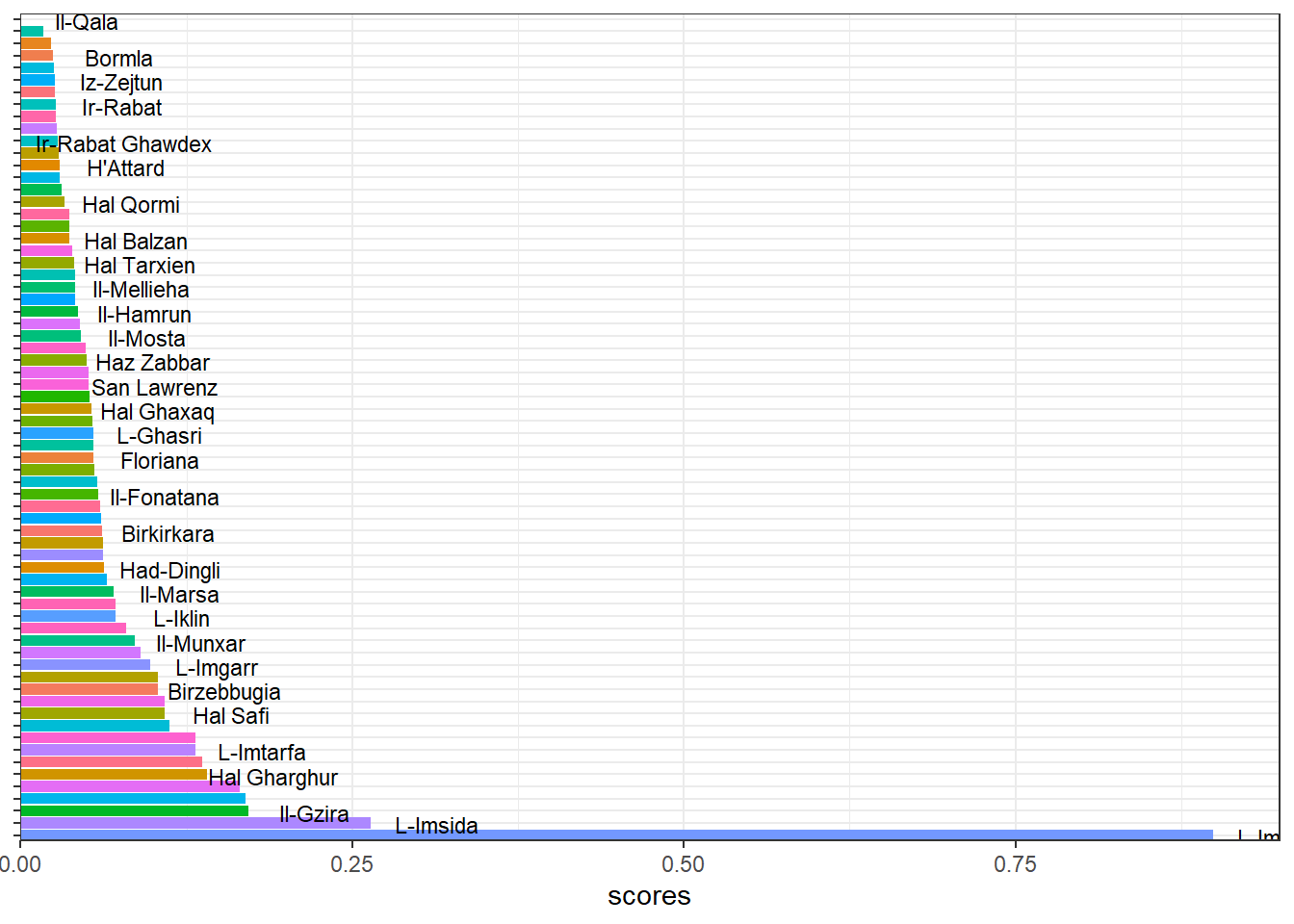
Some of those towns make sense. Others not so much.
Re-sampling to Cohort
Another thing we can do is simplify the pyramids a bit. The marketing world has borrowed the idea of generations from social science and over applied it to everything, but it will help us make a pretty graph here. I’m using this from wikipedia to get a rough age range of the generations.
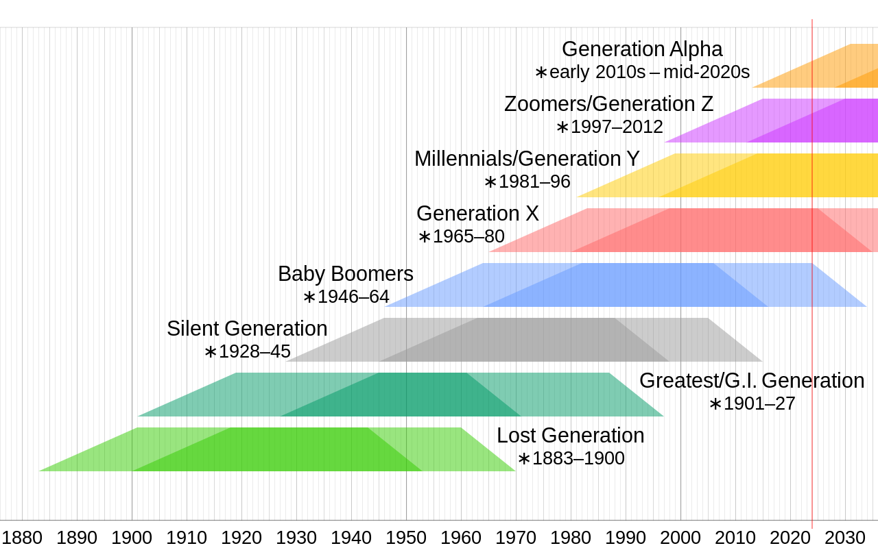
Or more concretely:
## # A tibble: 6 x 3
##   gen        last_birth_year cutoff_age
##   <chr>                <dbl>      <dbl>
## 1 Alpha                 2013          9
## 2 GenZ                  1997         25
## 3 Millenials            1981         41
## 4 GenX                  1965         57
## 5 Boomers               1946         76
## 6 pre-Boomer            1900        122
One change I did make was renaming the ‘Silent Generation’ to ‘pre-Boomer’, since I don’t think this distinction makes sense in the Maltese landscape, not least of which because this generation was actually quite animated against the British occupation in events like the Sette Giugno.