I’ve written about donkey voting in Maltese elections more than any other topic on this blog. My initial post was in 2019, with a follow up in 2021. A lot has happened since then, including another few hundred data points from a General Election in 2022 (and 2017, the old dataset only had up till 2013), and me learning a bit more about statistics.
In this post I’ll revisit donkey voting along three lines:
Does a candidate’s position on the ballot impact 1st count votes?
Does a candidate’s position on the ballot impact the total number of votes in any count?
Does a candidate’s position on the ballot impact election to the house?
To answer each of these questions, I’ll fit a Bayesian statistical model using brms. I’ll still use the John C. Lane/UoM dataset for the period spanning 1981-2013, together with an extended version of it I compiled for 2017 and 2022.
The other major difference from the initial post is that I’ve also excluded minor parties. I’ve done this since ballot position is calculated within each party block. Each ballot has 3-4 minority parties with position 1 being non elected, which in hindsight probably was drowning some of the signal.
First Count
What we are doing here is estimating the number of first count votes (CT1) as a function of ballot position (BALL2) and whether the candidate is an incumbent (INCUMB).
ct1_mod <- brm(
  CT1 ~ BALL2 + INCUMB + (1 | Dist),
  data = df,
  family = negbinomial(),
  chains = 4,
  iter = 4000,
  refresh=0
)
Weird notation aside, think of the as a sophisticated way of asking: “After accounting for everything else (like district and incumbency), does ballot position matter?”
Specifically, does each step down the ballot (1st → 2nd → 3rd) cost you votes? We use brms to estimate three number’s we’re interested in.
summary(ct1_mod)## Family: negbinomial
## Links: mu = log
## Formula: CT1 ~ BALL2 + INCUMB + (1 | Dist)
## Data: df (Number of observations: 2330)
## Draws: 4 chains, each with iter = 4000; warmup = 2000; thin = 1;
## total post-warmup draws = 8000
##
## Multilevel Hyperparameters:
## ~Dist (Number of levels: 13)
## Estimate Est.Error l-95% CI u-95% CI Rhat Bulk_ESS Tail_ESS
## sd(Intercept) 0.16 0.05 0.08 0.27 1.00 2326 3422
##
## Regression Coefficients:
## Estimate Est.Error l-95% CI u-95% CI Rhat Bulk_ESS Tail_ESS
## Intercept 6.40 0.07 6.27 6.52 1.00 4142 4562
## BALL2 -0.01 0.01 -0.03 0.00 1.00 9378 6148
## INCUMB 1.29 0.05 1.20 1.38 1.00 9430 5524
##
## Further Distributional Parameters:
## Estimate Est.Error l-95% CI u-95% CI Rhat Bulk_ESS Tail_ESS
## shape 0.90 0.02 0.86 0.95 1.00 9897 5981
##
## Draws were sampled using sampling(NUTS). For each parameter, Bulk_ESS
## and Tail_ESS are effective sample size measures, and Rhat is the potential
## scale reduction factor on split chains (at convergence, Rhat = 1).Firstly, the intercept. This shows the baseline expectation for a non-incumbent candidate at position 1 in the average district. It’s on a weird scale because we are using a log link function, which means we need to apply an exponent function on the 6.40. When we do that, we get roughly 665 votes. That’s the baseline average first count votes a candidate musters.
Being an incumbent is a huge advantage, exp(1.29) = 3.6. This means incumbents get roughly 360% the votes of non-incumbents, everything else equal. That 655 vote baseline turns into 655*3.6 = 2,358 votes.
Lastly, is the parameter we’re most interested in, BALL2. This is the slope of the regression line. A flat slope means no effect. A high number shows that as ballot position goes up, so do votes. A negative one shows that as the ballot position goes up, a candidate gets less votes (the donkey vote hypothesis).
The calculated slope we get is -0.01. Since exp(-0.01) = 0.99, every position down the ballot is roughly 1% less first count votes. This is about 6 votes per position if you are a non incumbent and 23 votes per position for an incumbent.
This is some evidence for donkey voting, but the effect is tiny and the upper 95% confidence interval straddles 0.
Interestingly, running the hypothesis function on the model yields much stronger evidence than I expected:
hypothesis(ct1_mod, "BALL2 < 0")## Hypothesis Tests for class b:
## Hypothesis Estimate Est.Error CI.Lower CI.Upper Evid.Ratio Post.Prob Star
## 1 (BALL2) < 0 -0.01 0.01 -0.02 0 22.67 0.96 *
## ---
## 'CI': 90%-CI for one-sided and 95%-CI for two-sided hypotheses.
## '*': For one-sided hypotheses, the posterior probability exceeds 95%;
## for two-sided hypotheses, the value tested against lies outside the 95%-CI.
## Posterior probabilities of point hypotheses assume equal prior probabilities.The 0.96 post prob translates into a 96% chance that being listed lower on the ballot hurts you. However, the effect is small: moving from 1st to 15th position costs you about 13% of votes. Compare that to being an incumbent, which gives you 260% more votes.
Largest Amount of Votes
Next, we’ll look into a candidate’s highest vote total on any count. This is important because it is a measure of transfers, and most voters do go with at least one candidate they know they will vote for, so maybe donkey voting kicks in after this.
Highest total is encoded as the TOPS variable, so we’ll just go ahead and use this.
tops_mod <- brm(
  TOPS ~ BALL2 + INCUMB + (1 | Dist),
  data = df,
  family = negbinomial(),
  chains = 4,
  iter = 4000,
  refresh=0
)

summary(tops_mod)
## Family: negbinomial
## Links: mu = log
## Formula: TOPS ~ BALL2 + INCUMB + (1 | Dist)
## Data: df (Number of observations: 2330)
## Draws: 4 chains, each with iter = 4000; warmup = 2000; thin = 1;
## total post-warmup draws = 8000
##
## Multilevel Hyperparameters:
## ~Dist (Number of levels: 13)
## Estimate Est.Error l-95% CI u-95% CI Rhat Bulk_ESS Tail_ESS
## sd(Intercept) 0.13 0.04 0.06 0.23 1.00 2482 3651
##
## Regression Coefficients:
## Estimate Est.Error l-95% CI u-95% CI Rhat Bulk_ESS Tail_ESS
## Intercept 6.93 0.06 6.81 7.04 1.00 5257 5108
## BALL2 -0.01 0.01 -0.03 -0.00 1.00 10387 5807
## INCUMB 1.13 0.04 1.05 1.22 1.00 12257 5112
##
## Further Distributional Parameters:
## Estimate Est.Error l-95% CI u-95% CI Rhat Bulk_ESS Tail_ESS
## shape 0.98 0.03 0.93 1.03 1.00 10880 6151
##
## Draws were sampled using sampling(NUTS). For each parameter, Bulk_ESS
## and Tail_ESS are effective sample size measures, and Rhat is the potential
## scale reduction factor on split chains (at convergence, Rhat = 1).The slope effect is still largely the same magnitude (-0.01) with the upper bound being close to 0.
hypothesis(tops_mod, "BALL2 < 0")## Hypothesis Tests for class b:
## Hypothesis Estimate Est.Error CI.Lower CI.Upper Evid.Ratio Post.Prob Star
## 1 (BALL2) < 0 -0.01 0.01 -0.03 0 76.67 0.99 *
## ---
## 'CI': 90%-CI for one-sided and 95%-CI for two-sided hypotheses.
## '*': For one-sided hypotheses, the posterior probability exceeds 95%;
## for two-sided hypotheses, the value tested against lies outside the 95%-CI.
## Posterior probabilities of point hypotheses assume equal prior probabilities.The evidence for the effect goes up, but it’s size remains small.
Elected
Lastly, we’ll do the same for wheter or not a candidate was elected, regardless of votes.
elected_mod <- brm(
  elected ~ BALL2 + INCUMB + (1 | Dist),
  data = df,
  family = bernoulli(),
  chains = 4,
  cores = 4,
  refresh=0,
  control = list(adapt_delta = 0.99, max_treedepth = 15)
)
Here, the model is assuming an outcome with 2 possibilities, elected or not elected. Because we changed the distribution, instead of exp, we have to use another transformation (plogis) that turns log odds into probabilities (maths people love log odds because they have nice properties when you’re estimating stuff, it’s beyond the scope here, and I promise I’ll make it make sense if you follow along).
summary(elected_mod)## Family: bernoulli
## Links: mu = logit
## Formula: elected ~ BALL2 + INCUMB + (1 | Dist)
## Data: df (Number of observations: 2330)
## Draws: 4 chains, each with iter = 2000; warmup = 1000; thin = 1;
## total post-warmup draws = 4000
##
## Multilevel Hyperparameters:
## ~Dist (Number of levels: 13)
## Estimate Est.Error l-95% CI u-95% CI Rhat Bulk_ESS Tail_ESS
## sd(Intercept) 0.13 0.08 0.01 0.31 1.00 969 1071
##
## Regression Coefficients:
## Estimate Est.Error l-95% CI u-95% CI Rhat Bulk_ESS Tail_ESS
## Intercept -1.59 0.12 -1.83 -1.36 1.00 3689 2920
## BALL2 -0.05 0.02 -0.08 -0.02 1.00 4855 3185
## INCUMB 1.97 0.11 1.77 2.19 1.00 4502 3419
##
## Draws were sampled using sampling(NUTS). For each parameter, Bulk_ESS
## and Tail_ESS are effective sample size measures, and Rhat is the potential
## scale reduction factor on split chains (at convergence, Rhat = 1).But essentially, plogis(-1.59) = roughly a 17% probability. This is the probability we give a candidate of being elected if we know nothing else about them.
Put another way, a fresh candidate in the first position has about a 1-in-6 chance of winning.
Now if we add the effect of being an incumbent, plogis(-1.59 + 1.97) = roughly a 60% probability of being elected. (Incidentally, this ability to add effects together like this is one of those aforementioned nice properties of log odds).
So, what does the BALL2 log odds translate into?
If you’re at position 1, then it’s essentially plogis(-1.59) = 17%.
If you’re at position 2, plogis(-1.59 + (-0.05 * 2)) = 15.5%
If you’re at position 15, plogis(-1.59 + (-0.05 * 15)) = 8.7%
This is slightly stronger evidence for the donkey vote effect than before. Once again, the Credibility Intervals tell us something about the strength of the evidence:
could be as bad as -0.08 (bigger donkey voting effect)
could be as mild as -0.01 (smaller effect)
We can also plot the above graphically by estimating predictions for a grid (indeed this is the better way to use statistical models like this.)
newdata <- expand_grid(
  BALL2 = 1:15,
  INCUMB = c(0, 1),
  Dist = unique(df$Dist)
)

preds <- add_epred_draws(newdata, elected_mod, re_formula = NULL)
preds %>%
ggplot(aes(x = BALL2, y = .epred)) +
stat_lineribbon(alpha = 0.2) +
facet_wrap(~INCUMB, labeller = labeller(INCUMB = c("0" = "Non-incumbent", "1" = "Incumbent"))) +
scale_y_continuous(labels = scales::percent) +
labs(
title = "Ballot order effect",
x = "Ballot position",
y = "Predicted probability Candidate is elected",
linetype = NULL) +
theme_minimal()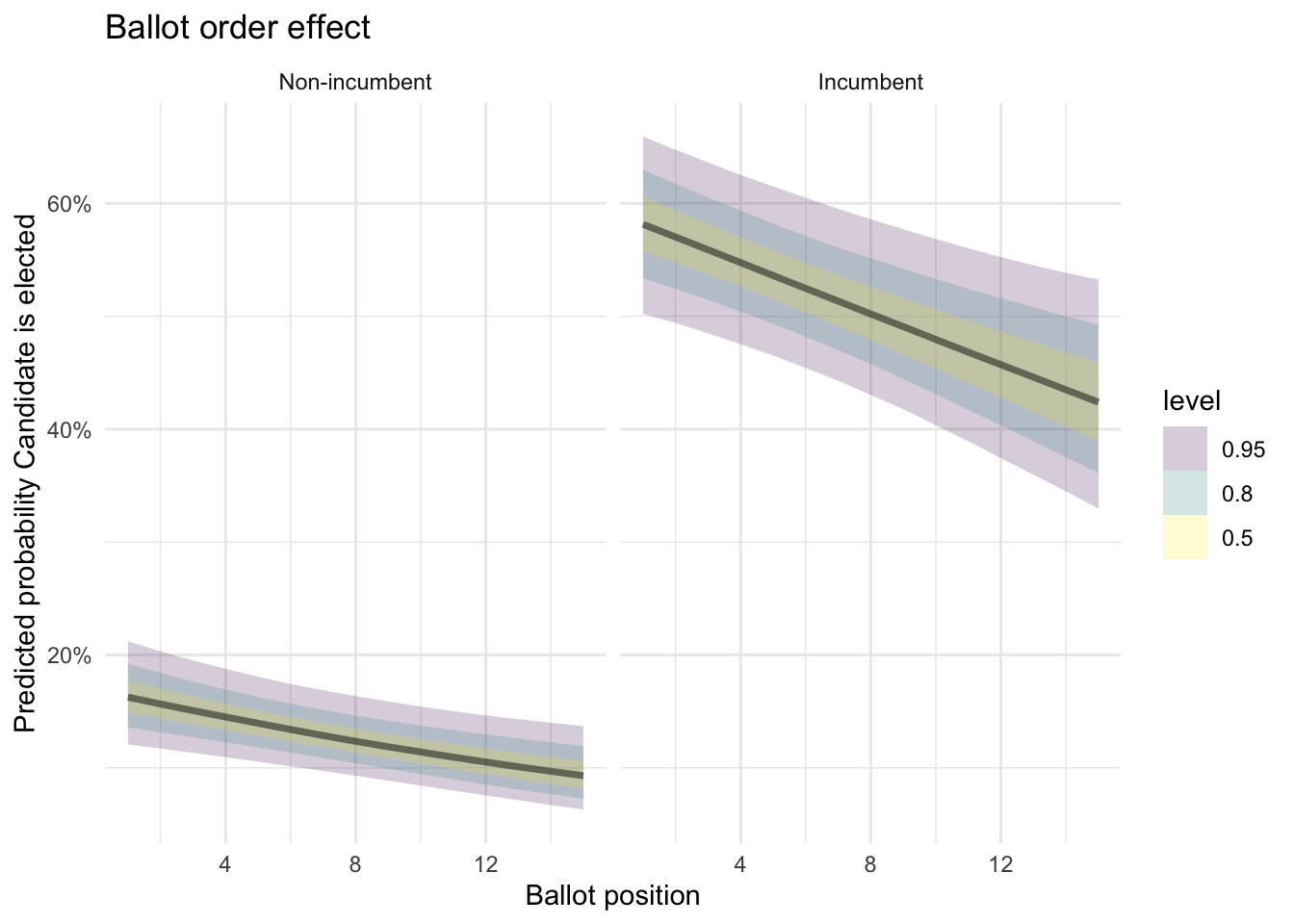
And we can also estimate them by district:
preds %>%
  ggplot(aes(x = BALL2, y = .epred, color = factor(INCUMB))) +
  stat_lineribbon(.width = c(0.5, 0.95), alpha = 0.2) +
  facet_wrap(~Dist) +
  scale_color_brewer(palette = "Set1", labels = c("Non-incumbent", "Incumbent")) +
  scale_y_continuous(labels = scales::percent) +
  labs(
    title = "Do Ballot order effects vary by district?",
    x = "Ballot position",
    y = "Predicted probability",
    color = NULL
  )+
  theme_bw()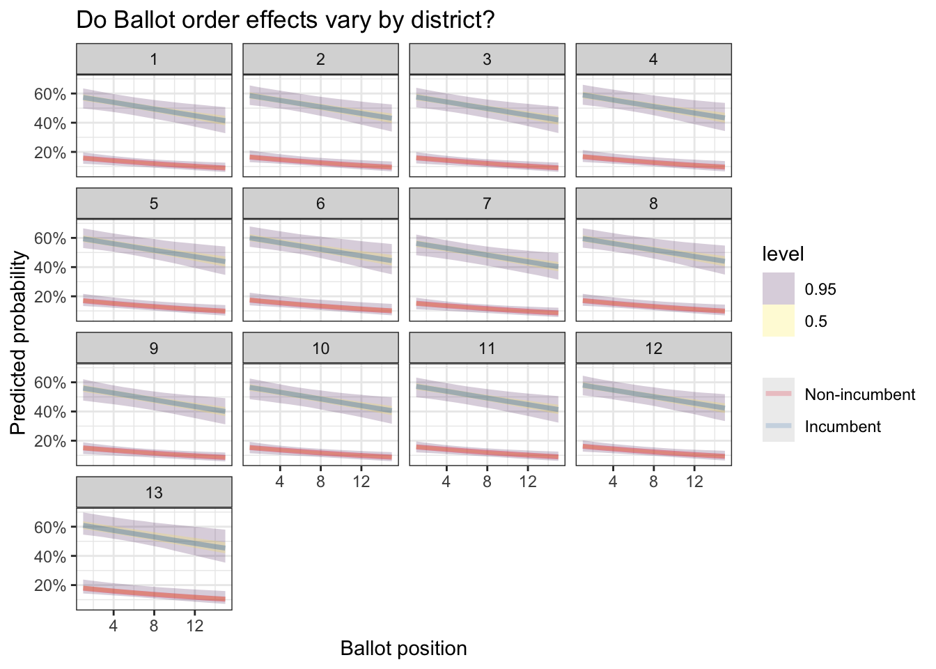
Since we found an effect, it would also be interesting to see if it changes in different elections (we add year as an interaction).
m_trend <-
  brm(elected ~ BALL2 * as.factor(YEAR) + INCUMB + (1 | Dist),
                data = df,
       family = bernoulli(),
       chains = 4,
       iter = 4000,
       refresh=0)
as_draws_df(m_trend) %>%
select(starts_with("b_BALL2:")) %>%
pivot_longer(everything(), names_to = "year", values_to = "effect") %>%
mutate(year = str_extract(year, "\\d{4}")) %>%
ggplot(aes(x = year, y = effect)) +
stat_halfeye() +
geom_hline(yintercept = 0, linetype = "dashed") +
labs(
title = "Has Donkey Voting changed over time?",
x = "Election year",
y = "Ballot order effect (log-odds)"
)+
theme_bw()## Warning: Dropping 'draws_df' class as required metadata was removed.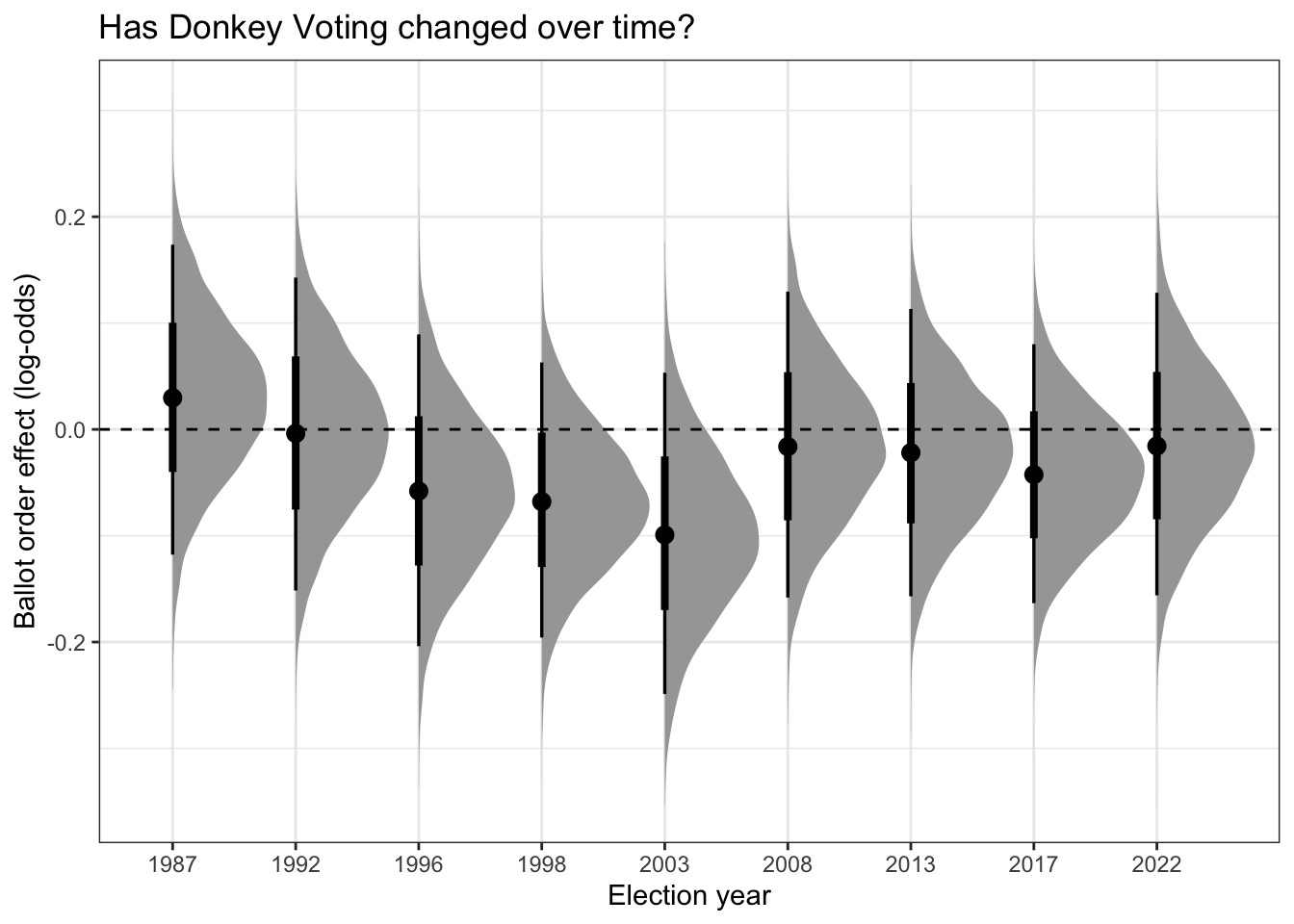
The curve is a pertinent visualization: Bayesian methods give us probability distributions of the effect. There’s a high probability the effect is where the peak is, but you can visualize the amount of uncertainty by the mass in the tail ends.
The key takeaway is that the donkey vote effect varies by election. In 1987 for instance it was quite comfortably positive (that is, opposite what you’d expect). In 2003 it was particularly strong. In years where the center point straddles 0 (the dashed line), the effect was weaker.
Or alternatively, we can plot out the position vs. predicted probability curve for each year. This is the same story, just presented differently.
newdata <- expand_grid(
  BALL2 = 1:15,
  INCUMB = c(0, 1),
  Dist = unique(df$Dist),
  YEAR = unique(df$YEAR)
)

preds <- add_epred_draws(newdata, m_trend, re_formula = NULL)

preds %>%
  ggplot(aes(x = BALL2, y = .epred, color = factor(INCUMB))) +
  stat_lineribbon(.width = c(0.5, 0.95), alpha = 0.2) +
  facet_wrap(~YEAR) +
  scale_color_brewer(palette = "Set1", labels = c("Non-incumbent", "Incumbent")) +
  scale_y_continuous(labels = scales::percent) +
  labs(
    title = "Ballot order effects by Year",
    x = "Ballot position",
    y = "Predicted probability",
    color = NULL
  )+
  theme_bw()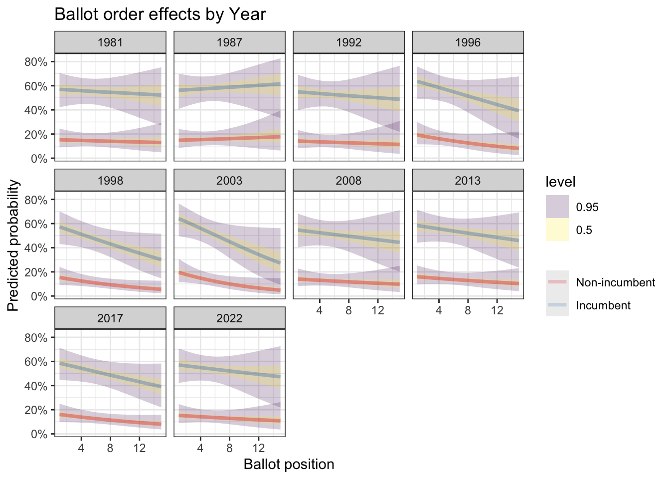
To Wrap It All Up
Going down the ballot, while everything else is equal, probably has a small but detectable effect on first count votes (6 votes less every position down if you are a non-incumbent and 23 votes less every position down if you are an incumbent.
It’s roughly the same story for highest vote total on any count. Since here the numbers are bigger, you’re 10 votes down every position for a non-incumbent and 31 for an incumbent.
Or, graphically:
add_epred_draws(newdata, ct1_mod, re_formula = NULL, allow_new_levels=T) %>%
  ggplot(aes(x = BALL2, y = .epred)) +
  stat_lineribbon(.width = c(0.5, 0.95), alpha = 0.1) +
  facet_wrap(~INCUMB, labeller = labeller(INCUMB = c("0" = "Non-incumbent", "1" = "Incumbent"))) +
  labs(
    title = "Ballot order effect on First Count",
    x = "Ballot position",
    y = "First Count Votes",
    linetype = NULL) +
  theme_minimal()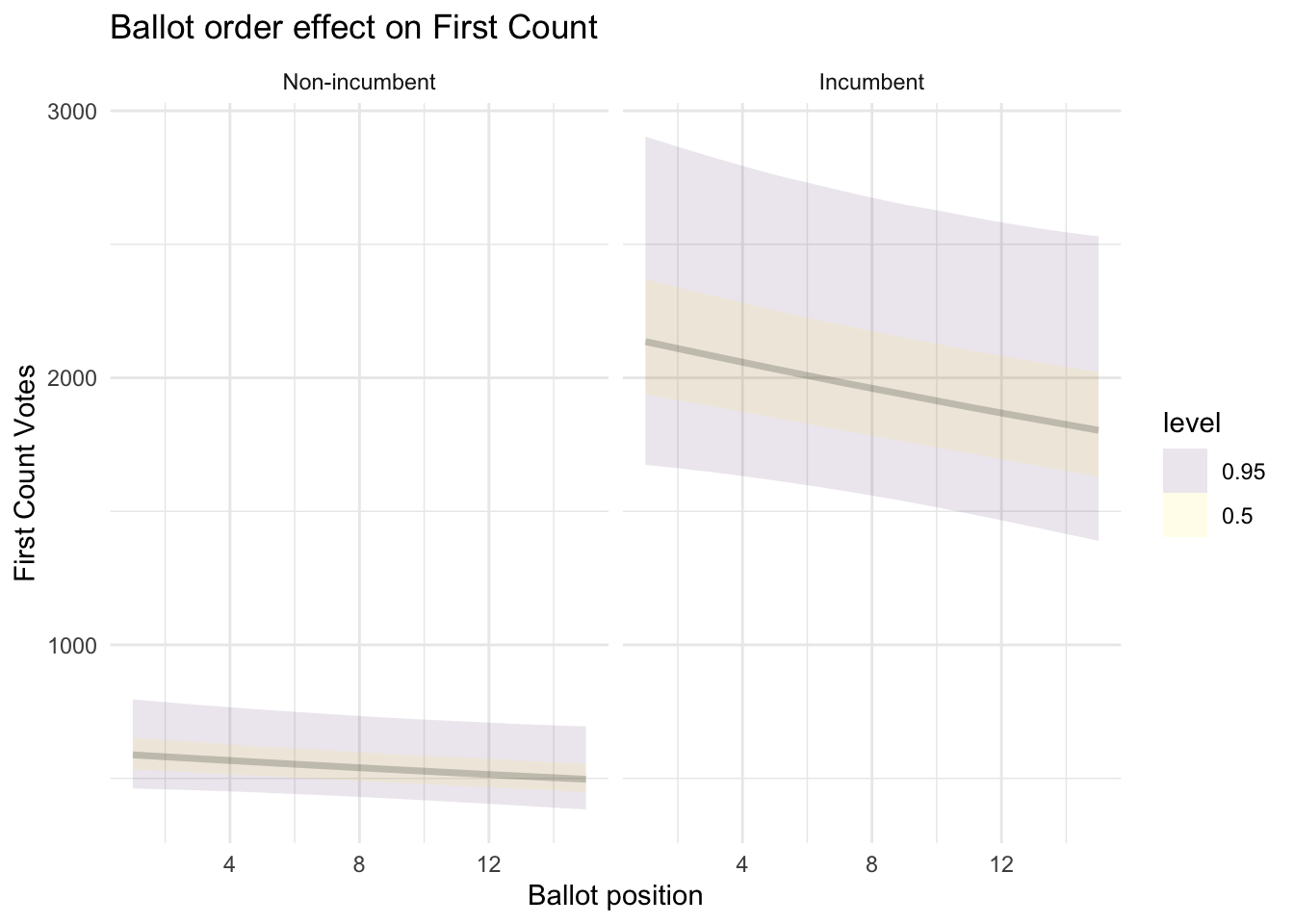
add_epred_draws(newdata, tops_mod, re_formula = NULL, allow_new_levels=T) %>%
  ggplot(aes(x = BALL2, y = .epred)) +
  stat_lineribbon(.width = c(0.5, 0.95), alpha = 0.1) +
  facet_wrap(~INCUMB, labeller = labeller(INCUMB = c("0" = "Non-incumbent", "1" = "Incumbent"))) +
  labs(
    title = "Ballot order effect on Highest Count",
    x = "Ballot position",
    y = "Votes",
    linetype = NULL) +
  theme_minimal()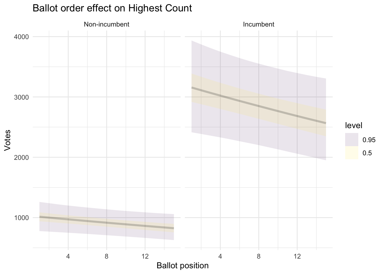
For probability of election, the evidence is stronger, and so is the effect. Everything else being equal, if you are a non-incumbent, going from the 1st position to the 10th position on the ballot means you drop from a 17% chance of election to 11%.
Is this large? I honestly don’t know. If the chance it’s going to rain tomorrow dropped from 17% to 11% I don’t know if that would impact any mental calculus. If you’d tell me the success rate of my surgeon went up from 11% to 17% after lunch, I’d really want them to eat lunch.
Just to contextualize probabilities a bit, from our very same model we saw the effect of incumbency bumps up that 17% chance to 60%.
On the other hand, tiny advantages matter most at the margins when races are tight. For candidates battling for that 5th and final seat, or standing in a quiet by-election, these small statistical edges can very well tip the balance.
As someone who was skeptical of the donkey vote, this was quite a journey. Most candidates on the other hand are quite sold in, as evidenced by their creative double-barreling of surnames, but to my eyes at least, there are so many other, better, things you can do.
The reason I missed detecting this effect the first time round is because I included ALL parties not just PN/PL. If you repeat the exact same steps without filtering small parties out, all you get is a bunch of non significant effects.
Indeed, I foreshadowed the reason why I believe this is so in the introduction, all those non-elected 1-2s, from an average of 3 small parties across 13 districts create a lot of noise that drown out a small effect like that observed.
More Stats…
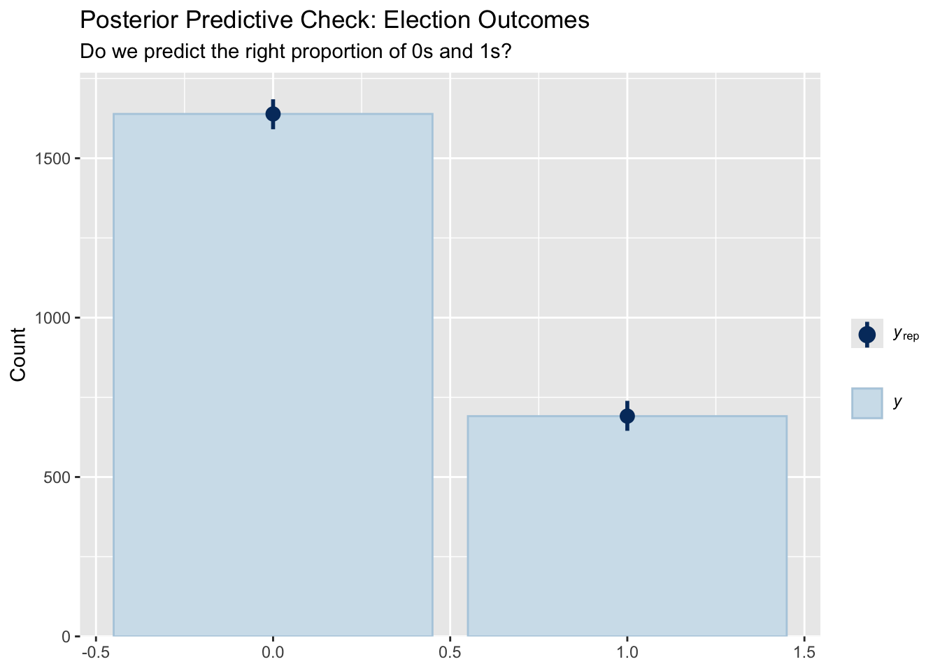
The point of all statistical modeling is to make sure your model captures your data well. If it does this, we can be confident in using the calculated parameters (like effect of ballot position or incumbency) to make claims.
Since we have a lot riding on elected_mod lets do those checks.
plot(elected_mod)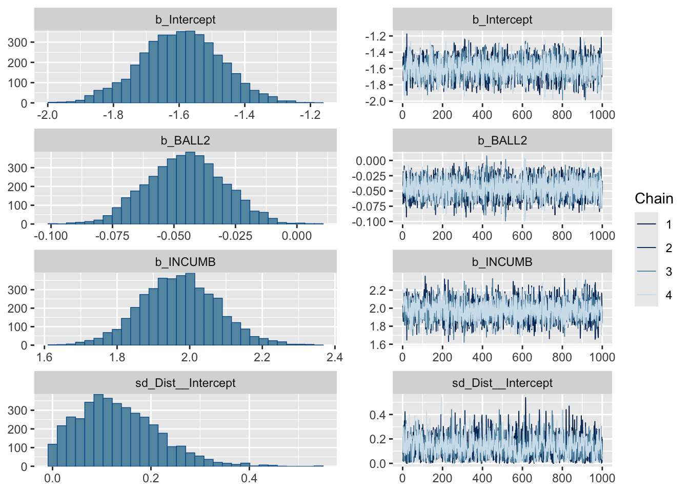
pp_check(elected_mod, type = "bars", ndraws = 1000) +
  labs(
    title = "Posterior Predictive Check: Election Outcomes",
    subtitle = "Do we predict the right proportion of 0s and 1s?"
  )
pp_check(elected_mod, type = "bars_grouped", group = "Dist") +
  labs(title = "Election rates by district")
## Using 10 posterior draws for ppc type 'bars_grouped' by default.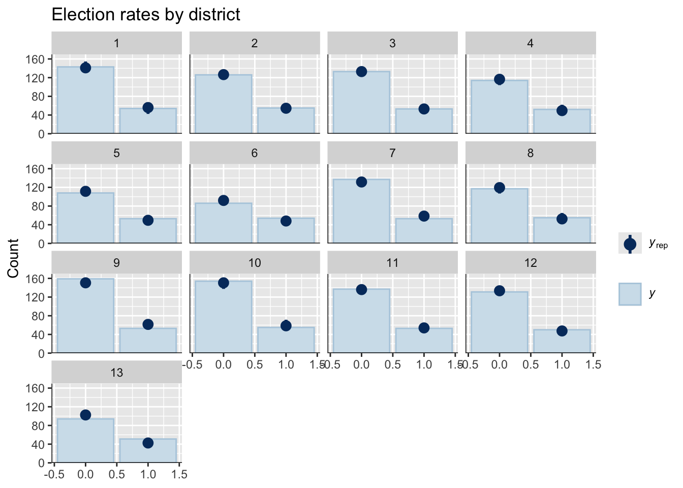
Does the model fit election rates well?
observed_by_incumb <- df %>%
  group_by(BALL2, INCUMB) %>%
  summarise(
    obs_rate = mean(elected),
    n = n()) %>%
  ungroup()
## `summarise()` has grouped output by 'BALL2'. You can override using the
## `.groups` argument.newdata_both <- expand_grid(
BALL2 = 1:20,
INCUMB = c(0, 1),
Dist = NA
)
predicted_both <- newdata_both %>%
add_epred_draws(elected_mod, re_formula = NA, ndraws = 1000) %>%
group_by(BALL2, INCUMB) %>%
median_qi(.epred, .width = 0.95)
ggplot() +
geom_ribbon(data = predicted_both,
aes(x = BALL2, ymin = .lower, ymax = .upper,
fill = factor(INCUMB)),
alpha = 0.2) +
geom_line(data = predicted_both,
aes(x = BALL2, y = .epred, color = factor(INCUMB)),
size = 1.5) +
geom_point(data = observed_by_incumb,
aes(x = BALL2, y = obs_rate,
color = factor(INCUMB), size = n),
alpha = 0.6) +
scale_y_continuous(labels = scales::percent) +
scale_color_brewer(palette = "Set1",
name = NULL,
labels = c("Non-incumbent", "Incumbent")) +
scale_fill_brewer(palette = "Set1",
name = NULL,
labels = c("Non-incumbent", "Incumbent")) +
scale_size_continuous(name = "N candidates", range = c(2, 8)) +
labs(
title = "Model Fit: Ballot Position by Incumbency",
subtitle = "Lines = predictions, Points = observed",
x = "Ballot Position",
y = "Election Rate"
) +
theme_minimal() +
theme(legend.position = "bottom")## Warning: Using `size` aesthetic for lines was deprecated in ggplot2 3.4.0.
## ℹ Please use `linewidth` instead.
## This warning is displayed once every 8 hours.
## Call `lifecycle::last_lifecycle_warnings()` to see where this warning was
## generated.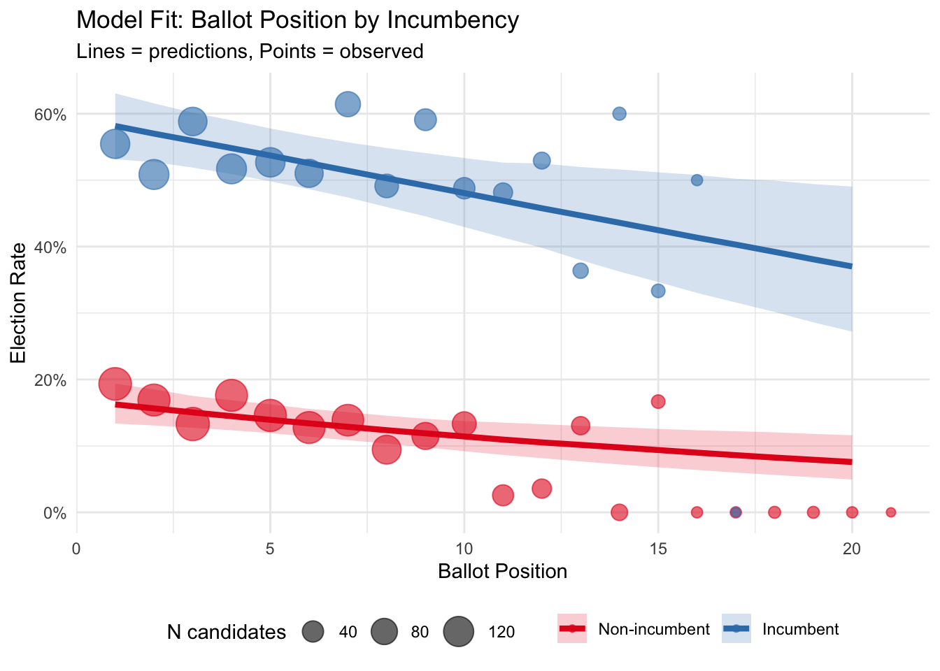
I think it looks fine! Note that the 16-20th positions are a handful of positions for which we have less than 10 observations.