“have a look at how many MPs are in parliament because of their surname”
It was July 2017, and despite being finally elected as an MP, Hermann Schiavone was still willing to talk about electoral system reform to anyone who would listen. And in this case, that someone was MaltaToday’s Yannick Pace. Schiavone wanted (and presumably still does) to reform Malta’s STV system for multiple reasons, but the one we’ll discuss here today is donkey voting.
What is the Donkey Vote?
The donkey vote hypothesis is that in elections, candidates who feature on the top of voting ballots tend to do better than candidates who feature towards the bottom. Here’s what a typical Maltese general election ballot looks like:
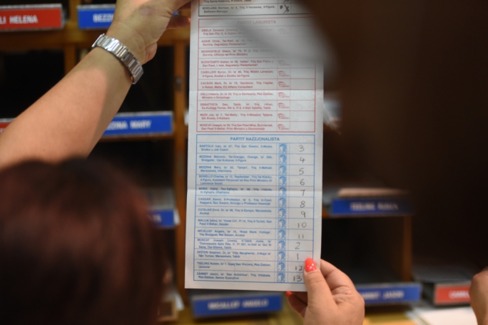
And sure enough, this example from the 2017 general election seems to have the donkey vote trademarks: a deliberate selection of the 1st and 2nd order candidates, before numbering sequentially from the top to the bottom.
Donkey votes are usually a form of protest in countries where voting is mandatory, as in Australia, so it’s presence in Maltese elections is more peculiar. Instead of apathy, the most commonly flaunted reason is party loyalty: party diehards intentionally keep the vote within the party to increase the probability of transferred votes, maximising that party’s gains.
The Data
The extent to which donkey voting is influencing who gets elected however is unclear. Some like Schiavone (whose surname coincidentally places him close to the end in ballots) are categorical: “have a look at how many MPs are in parliament because of their surname” he had said in 2017. But a deep dive into the matter is hard to come by. The sole analytically inclined article I did find was more oriented towards the local elections.
But a treasure trove of Maltese political data does exist and is hosted here by the University of Malta. Originally started by Professor of Political Science John C. Lane, the project is now in the hands of local scholars and support staff.
Could we use this to look at the phenomenon? We can certainly try. To study this we’ll load the general elections dataset, spanning all elections between 1921 and 2013. Firstly we’ll look at two variables.
BALL2 is the order that candidate appeared in his party’s group on the ballot.
CT1 is a candidate’s number of first count votes.
We’ll use Ballot position as a factor to distinguish different groups, and 1st Count Votes as a dependent variable to see if there is variability in its value between the groups.
Visualising the Hypothesis: Boxplot
A boxplot would be a great way to visually set up this hypothesis. To do this, I’ve used a subset of the data which only features elections post 1986. I decided on this split because the current political landscape was cemented at around that time.
RecentElections <- MalteseElections %>%
  filter(YEAR >= 1986, BALL2 != 0)

ggplot(RecentElections, aes(factor(BALL2), CT1, fill = factor(BALL2)))+
  geom_boxplot()+
  theme(legend.position = "none")+
  labs(title = "First Count Votes by Ballot Order")+
  ylab("First Count Votes")+
  xlab("Ballot Order")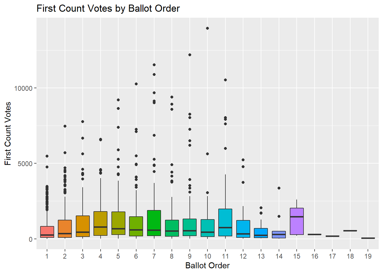
The first thing that’s apparent are several extreme values. This is logical, a handful of candidates are much more successful than many others. To help us visualise things better, we’ll plot the log of First Count Votes for now:
ggplot(RecentElections, aes(factor(BALL2), log(CT1), fill = factor(BALL2)))+
  geom_boxplot()+
  theme(legend.position = "none")+
  labs(title = "Log of First Count Votes by Ballot Order")+
  ylab("Log of First Count Votes")+
  xlab("Ballot Order")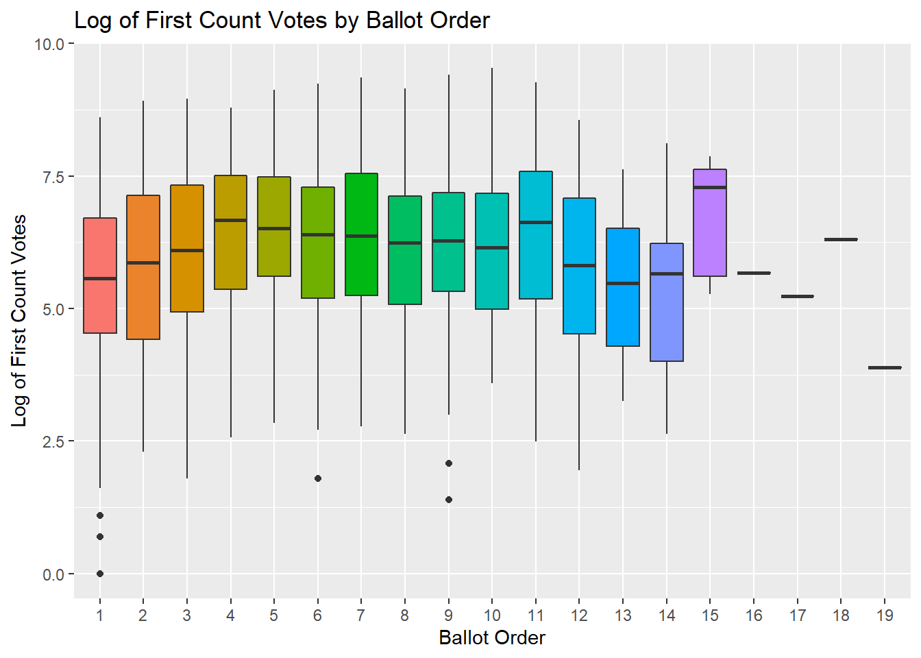
What the Donkey vote hypothesis suggests is that the median (bold line in the bars) should be higher in the first few ballot positions compared to the others. And that does not seem to be the case.
We can visualise our experiment in a slightly different way by doing away with the boxplots, and drawing a transparent dot for each candidate, with the count of votes on the y-axis and the ballot position on the x-axis.
RecentElections %>%
  ggplot(aes(factor(BALL2), log(CT1), col = factor(BALL2)))+
  geom_point(position = "jitter", alpha = 0.2)+
  theme(legend.position = "none")+
  labs(title = "Log of First Count Votes by Ballot Order")+
  ylab("Log of First Count Votes")+
  xlab("Ballot Order")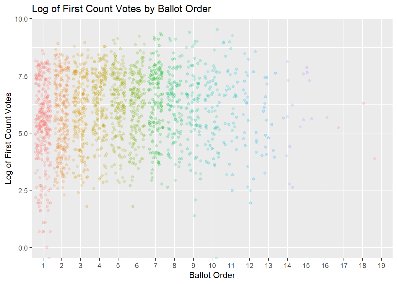
What we’ll try to test is if the distribution of those dots in each group is different than the distribution of the whole data. Instead of looking at it visually, we can make it more rigorous by using a statistical test. Since we’re interested in seeing whether the variation between groups (ballot order) is greater than the variation we see within groups (the spread of CT1 in the same group), the logical test would be the one taught in every undergraduate statistics course: ANOVA.
But before we get to that, let’s fix two things in our data. Firstly, we’ll only analyse data for the two main political parties, since independent candidates and small parties routinely contest districts with only a single candidate (in other words, ballot position is always 1). Secondly, we’ll group any position after 10 into a single group called “10+”.
The rationale for this is simple. Every election year and district combination will have a ballot position 1, but very few will have a ballot position of 19 or 18. This step will ensure that we’ll be comparing groups with around the same number of data points.
# First let's filter only for PN/PL and recode positions after 10
BigPartiesOnly <- RecentElections %>%
  filter(PARTY %in% c(13, 15)) %>%
  mutate(BallotPos = factor(ifelse(BALL2 >=10, "10+", BALL2),
                            levels = c("1", "2", "3", "4", "5", "6", "7",
                                       "8", "9", "10+")))
Our data now looks like this:
BigPartiesOnly %>%
  ggplot(aes(BallotPos, log(CT1), col = BallotPos))+
  geom_point(position = "jitter", alpha = 0.2)+
  theme(legend.position = "none")+
  labs(title = "Log of First Count Votes by Ballot Order")+
  ylab("Log of First Count Votes")+
  xlab("Ballot Position")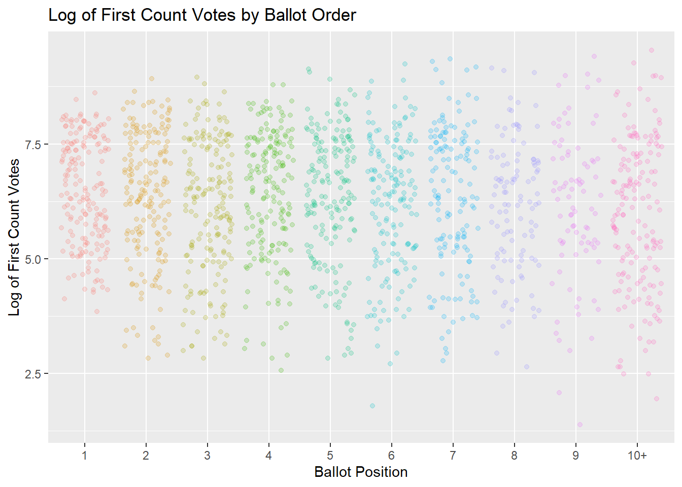
Now, time to run the test!
# Conduct the analysis of variance test
ANOVA <- aov(log(CT1) ~ BallotPos, data = BigPartiesOnly)
# Summary of the analysis
summary(ANOVA)
## Df Sum Sq Mean Sq F value Pr(>F)
## BallotPos 9 41 4.558 2.247 0.0171 *
## Residuals 1569 3183 2.028
## ---
## Signif. codes: 0 '***' 0.001 '**' 0.01 '*' 0.05 '.' 0.1 ' ' 1And what do you know, a modest F-value! If there was no difference in first count votes between ballot position, the F-value, which is the ratio of the differences between the groups divided by the difference within the groups, would be close to 1. And our p-value is low, indicating that the probability of obtaining this result due to chance is also low.
But all this tells us is that at least one of our groups is different from all the others. To see where the difference lies, we’ll have to dig deeper with a post-hoc test. What post-hoc tests do is compare all the different permutations of pairs together. However the issue with carrying out so many statistical tests is that eventually, one of them might end up being significant purely by chance when it is not, so many different frameworks of how to carry out post-hoc tests safely have been devised. In this case, we’ll use Tukey’s Honestly Significant Difference, invented by Princeton mathematician John Tukey (who also invented the boxplot and coined the term “bit”, among many other things.
# Run Tukey's HSD on the ANOVA
TukeyHSD(ANOVA) %>%
  tidy() %>%
  filter(adj.p.value < 0.05)
## # A tibble: 1 x 7
## term contrast null.value estimate conf.low conf.high adj.p.value
## <chr> <chr> <dbl> <dbl> <dbl> <dbl> <dbl>
## 1 BallotPos 10+-1 0 -0.523 -1.01 -0.0399 0.0218Since the output is literally 45 different statistical tests, I only filtered out for rows that are significant… which turned out to be only one: the comparison between the first ballot position and the ballot positions after the 10th.
What this tells us is that there might be some difference in how first count votes are distributed between candidates who appear first and those who appear in the bottom of the ballot, but these differences don’t extend to candidates who appear first and those who appeared in any other position combination. All in all, this is weak evidence for donkey voting.
It might be flimsier still. If the 1st and 2nd choices are (likely) deliberate, doesn’t the effect of the donkey vote come into effect after a few counts? While all we’ve shown is that ballot position is slightly relevant in first counts. So, let’s see if, say, the 5th count, when some of those transfers will have come into effect, shows a difference.
Count 5…
BigPartiesOnly %>%
  mutate(Count5 = as.numeric(Ct5)) %>%
  ggplot(aes(BallotPos, Count5, fill = BallotPos))+
  geom_boxplot()+
  theme(legend.position = "none")+
  labs(title = "5th Count Votes (as percentage of party) by Ballot Order",
       subtitle = "Only PN and PL Candidates")+
  ylab("5th Count Votes")+
  xlab("Ballot Order")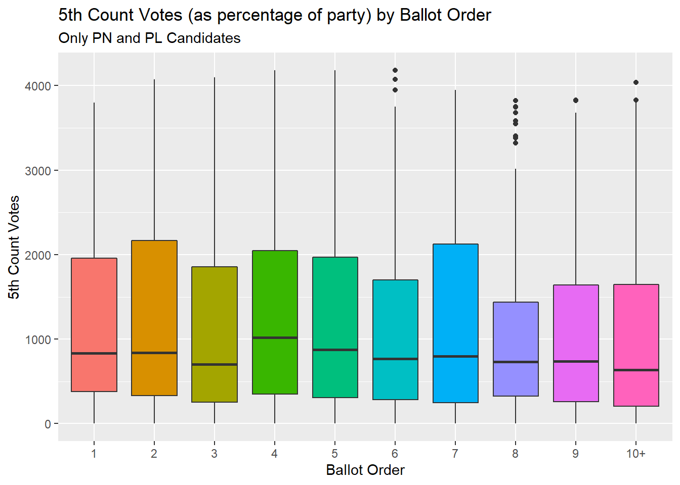
If anything, this graph shows less going on. Because those high 1st count vote values have ben transferred, we can do away with transforming our data. And another ANOVA shows no effect of ballot position on 5th count votes.
summary(aov(as.numeric(Ct5)~BallotPos, data = BigPartiesOnly))## Df Sum Sq Mean Sq F value Pr(>F)
## BallotPos 9 1.122e+07 1246171 1.061 0.389
## Residuals 1569 1.843e+09 1174696Let’s see mean seated as a function of ballot order…
Let’s approach this from another direction, and calculate the proportion of candidates seated for each ballot order. To do this, we’ll first filter where the Seated variable is either 0 (not seated) or 1 (seated) in our dataset. We do it this way because 2 codes for a candidate seated in the middle of a parliamentary session to replace a member who stepped down for instance.
Next we’ll use a handy quirk of R. When you calculate the mean of a 0, 1 categorical vector, the result is the percent of the 1 occurring.
BigPartiesOnly %>%
  filter(SEATED <= 1) %>%
  group_by(BallotPos) %>%
  summarise(PercSeated = mean(SEATED)) %>%
  ggplot(aes(BallotPos, PercSeated))+
  geom_col()+
  scale_y_continuous(labels=scales::percent)+
  labs(title = "Proportion of Candidates Seated for Each Ballot Position",
       subtitle = "Only PN and PL Candidates")+
  ylab("Percentage Seated")+
  xlab("Ballot Order")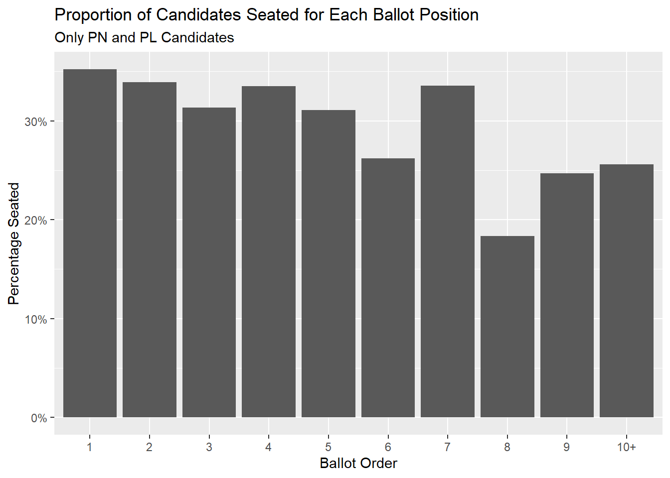
And it seems all ballot positions have a roughly 20-30% chance of being elected, with positions 1, 2, 4 and 7 being roughly equal. It is position 8 that in fact seems the lowest. And while it’s not drastically lower, let’s try a Chi-squared test to be sure. After all, this is an entirely different hypothesis now: we’re saying that ballot position might have an influence on being seated in parliament (1) or not (0).
Seated <- BigPartiesOnly %>%
  filter(SEATED <= 1)


chisq.test(BigPartiesOnly$SEATED, BigPartiesOnly$BallotPos)
## Warning in chisq.test(BigPartiesOnly$SEATED, BigPartiesOnly$BallotPos): Chi-
## squared approximation may be incorrect##
## Pearson's Chi-squared test
##
## data: BigPartiesOnly$SEATED and BigPartiesOnly$BallotPos
## X-squared = 23.871, df = 18, p-value = 0.1593And since the p-value is large, we can’t say that the proportion of candidates seated is different according to the order with which they appeared in the ballot.
The Nuanced Conclusion
So, what have we learned? Well, if you contested Maltese elections for either of the two big parties since 1986, the order with which you appeared on the ballot largely didn’t influence your first count votes. The sole exception to this seems to be in the bottom few positions, and even then, the difference is only between these and the top first position.
The difference is practically non-existent in your votes at the fifth count, and, perhaps most importantly, whether you are seated in parliament or not seems to be independent of your ballot position. This second conclusion suggests that even if donkey voting exists, it does not appear to shape which candidates get elected. Intuitively, the reason could be simple: each party only gets 2-3 seats per district, and voters usually start to donkey vote after a few deliberate choices.
Anyway, since we do have a dataset of all Maltese elections spanning 1921 to 2013 loaded, let’s have some more fun…
Top performing candidates
Which candidates get the most votes?
MalteseElections %>%
  arrange(desc(TOPS)) %>%
  select(NAME, YEAR, Dist, TOPS) %>%
  head(20) %>%
  reactable()
Party leaders.
When has contesting Multiple Elections been a thing?
Some candidates contest more than one district, either to improve the odds for themselves, or to increase first count votes for their party. Has the proportion of candidates who contested more than one district been changing through the years?
DistrictsContested <- MalteseElections %>%
  filter(NAME != "* Non-Trans. *") %>% #Filter out non transferable votes
  group_by(NAME, YEAR) %>%
  summarise(count = n()-1) %>%
  group_by(YEAR) %>%
  summarise(PercContested2 = mean(count))
## `summarise()` has grouped output by 'NAME'. You can override using the `.groups` argument.ggplot(DistrictsContested, aes(y = PercContested2, x = YEAR))+
geom_point()+
geom_line()+
scale_y_continuous(labels=scales::percent)+
labs(title = "Proportion of Candidates Contesting 2 Districts")+
ylab("Percentage of Candidates")+
xlab("Year")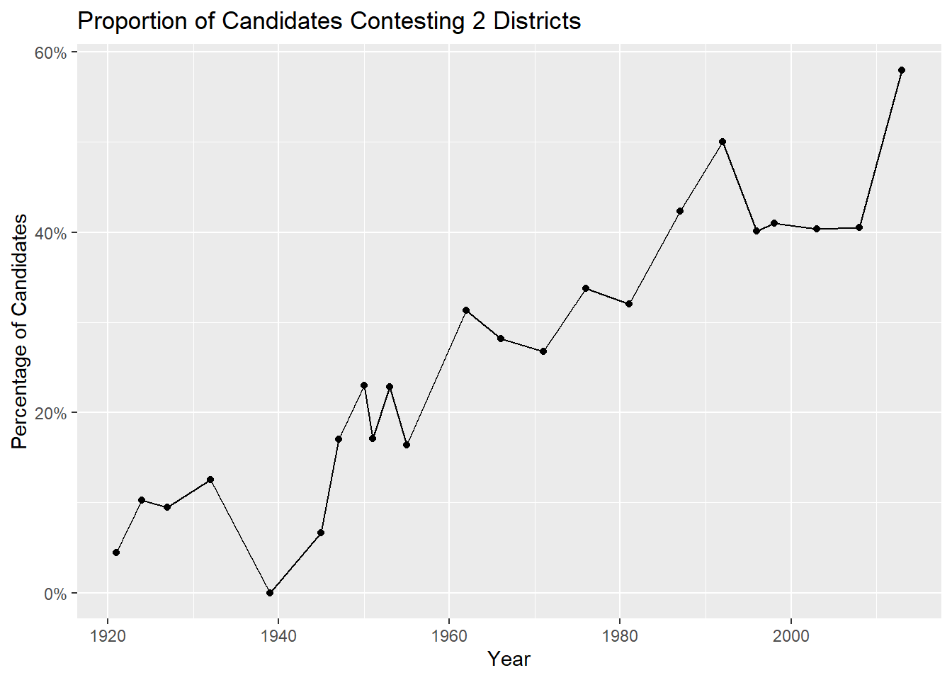
Looks like it was rarely a thing before the 1960’s.
Which districts are the most oversubscribed?
The two main parties make no attempts to try and limit their candidates in a district, and they often end up fielding many more candidates than available seats. Is this phenomenon steady across districts, and how has it evolved over time?
## `summarise()` has grouped output by 'YEAR', 'Dist'. You can override using the `.groups` argument.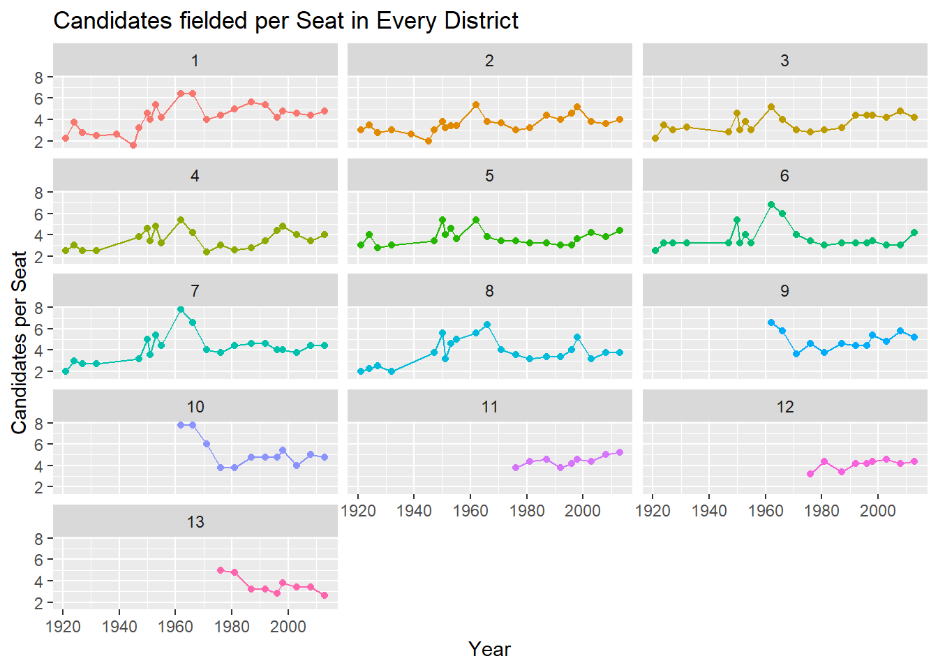
So around 4-5 candidates per available seat seems to be the norm in recent elections. There was a slight uptick in the 1960’s, and this probably has to do with the fact that those times were some of the only elections where we had a true multi-party system, with splinter parties led by Toni Pellegrini and Herbert Ganado. The 1962 election saw no less than 5 parties securing seats.
Interestingly, my district, Gozo, seems to have the lowest number of candidates per seat.
Who contested the most elections?
MalteseElections %>%
  group_by(NAME) %>%
  summarise(TimesContested = max(AGAIN)) %>%
  arrange(desc(TimesContested)) %>%
  head(10) %>%
  reactable()
The record holder seems to be Mintoff, with a remarkable 14 elections contested. Many of the names here are interesting for one reason or another, but I think Amabile Cauchi is the one most deserving of a mention. The Gozitan MP kept a pet monkey, which one day escaped and climbed atop the steeple of Ghajnsielem’s old parish church.
Gender Balance
How has the proportion of women that contest the general elections evolved?
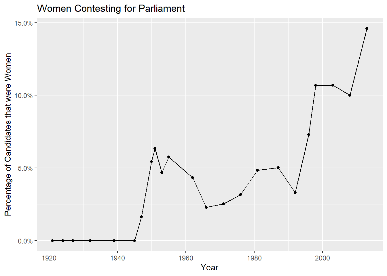
Well, prior to 1947, it was 0, since women couldn’t even vote before this. It remained relatively meagre up until the mid 1990’s, and now is trending upwards.
Candidates contesting through the years
Which leads to another question. Has the number of candidates contesting changed through the years?
MalteseElections %>%
  group_by(YEAR) %>%
  distinct(NAME) %>%
  tally() %>%
  ggplot(aes(factor(YEAR), n))+
  geom_bar(stat = "identity")+
  theme(axis.text.x = element_text(angle = 60))+
  labs(title = "Number of Candidates Contesting the General Election")+
  ylab("Number of Candidates")+
  xlab("Election Year")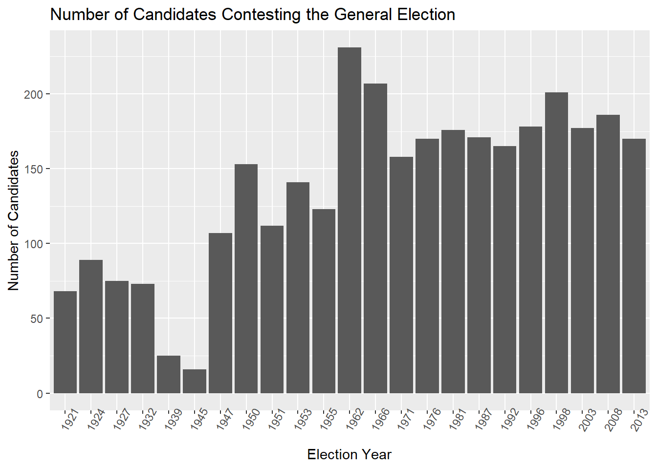
Since this is a distinct count, candidates who contest 2 districts will only be counted once. And perhaps unsurprisingly, the record belongs to the 1962 general election, which saw 231 names contest. It’s been in the 175 candidate region since then.
The post war 1945 election had the lowest number of candidates (16).
Incumbency Effect
A rich body of political science tells us that incumbency is a big boost in electability in democracies across the world. How big of a boost is it here?
MalteseElections %>%
  filter(INCUMB != 99) %>%
  ggplot(aes(factor(INCUMB), CT1, fill = factor(INCUMB)))+
  geom_boxplot()+
  theme(legend.position = "none")+
  labs(title = "Effect of Incumbency on 1st Count Votes")+
  ylab("First Count Votes")+
  xlab("Incumbent")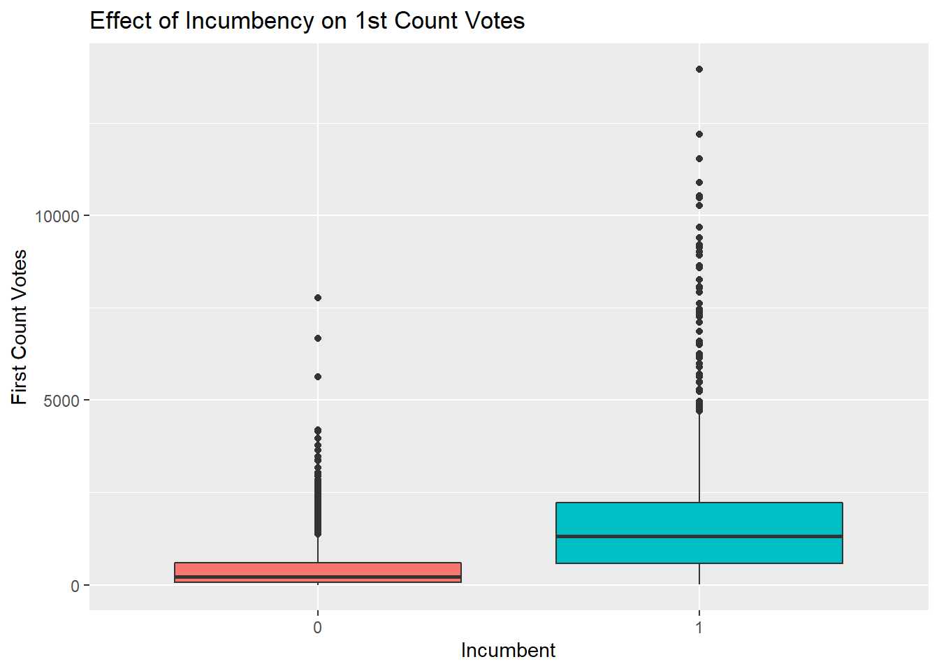
Incumbency <- MalteseElections %>%
  filter(INCUMB != 99)

lm(CT1 ~ INCUMB, data = Incumbency) %>%
  summary()
##
## Call:
## lm(formula = CT1 ~ INCUMB, data = Incumbency)
##
## Residuals:
## Min 1Q Median 3Q Max
## -1674.9 -412.7 -239.3 248.2 12279.1
##
## Coefficients:
## Estimate Std. Error t value Pr(>|t|)
## (Intercept) 453.73 19.91 22.79 <2e-16 ***
## INCUMB 1235.20 35.03 35.26 <2e-16 ***
## ---
## Signif. codes: 0 '***' 0.001 '**' 0.01 '*' 0.05 '.' 0.1 ' ' 1
##
## Residual standard error: 1054 on 4136 degrees of freedom
## Multiple R-squared: 0.2311, Adjusted R-squared: 0.231
## F-statistic: 1243 on 1 and 4136 DF, p-value: < 2.2e-16What the boxplot and linear regression tell us is that the average candidate in a Maltese General Election gets 453 votes. If that candidate is an incumbent, he or she gets another additional 1235 votes - quite a decent boost that’s equivalent to two thirds the quota usually.