Introduction
I’ve wanted to analyse something airline related for a while now, but getting my hands on data that was relevant and interesting to me was challenging. Then I read this blog post and discovered the wonderful world of opensky-network.org and their REST API. The focus of this post will be to:
- Come up with several numerical assessments to Air Malta’s operations.
- Quantify the COVID-19 Pandemic’s impact on Air Malta.
To do this, I’ve decided to examine records of Air Malta flights from 21st March to September 21st in both 2019 and 2020. The 2019 season was one of Air Malta’s busiest (if not the busiest), and this will be what we’ll use to answer question 1. The contrast with the 2020 season will be the basis for question 2.
Getting the data
OpenSky Network are a non-profit that track and record aircraft ADS-B signals. ADS-B is the latest evolution of aircraft transponders. While older technology depended on an ‘interrogator signal’ from a ground-based unit, ADS-B units automatically self-transmit hundreds of data fields at a regular interval, allowing a more complete picture for both air traffic control and other aircraft.
Using Opensky-Network.Org’s API
Using the approach in the linked blog post as a launching pad, I came up with a function that takes the an aircraft’s 24 bit ICAO identifier, the begin date and end date as arguments that then get pushed to an API call using R’s httr library.
The period argument is purely there because the API has a 30 day limit, so I constructed the function in such a way as to create as many iterations in a for loop as are required to span the dates provided while staying in that limit (i.e. if you specify a timespan of 300 days, with a period of 30, the for loop will run 300/30, or 10 iterations.)
username <- "GetYourOwn!"
password <- "It's Free :)"

getFlights <- function(icao24, begin, end, period){

  #Calculates range as seconds between begin & end points, then divides by seconds in a day...
  range <- (as.numeric(as.POSIXct(end))- as.numeric(as.POSIXct(begin))) / 86400

  #...and rounds up to iterations needed for the below for loop.
  iterations <- ceiling(range/period)

  #Create empty data frame to hold results
  df.total <- data.frame()

  for(i in 1:iterations){

    path <- glue("https://{username}:{password}@opensky-network.org/api/flights/aircraft?")

    request <- GET(url = path,
                  query = list(
                    icao24 = icao24,
                    begin = as.numeric(as.POSIXct(begin)),
                    end = as.numeric((as.POSIXct(begin) + (86400 * as.numeric(period))))
                    ))

    response <- content(request, as = "text", encoding = "UTF-8")
    table <- data.frame(fromJSON(response, flatten = TRUE))
    df.total = rbind(df.total, table)
    begin <- as.POSIXct(begin) + (86400 * as.numeric(period))
  }
  return(df.total)
}
Running Function Iteratively Using purrr
Then I used the pmap function from the purrr package to run the getFlights function iteratively for each airplane Air Malta operates (or operated) in the timespans.
icao24 <- airframes$icao24
begin <- "2020-03-20"
end <- "2020-09-23"
period <- 20

argList <- list(icao24, begin, end, period)

year2020 <- pmap_dfr(argList, getFlights)
Secondary Data Sources
Besides the ADS-B logs, I also included a table which I made in excel mapping the 24 bit identifier to the national 9H registration, the airframe’s serial number, aircraft type and configuration according to airfleets.net.
However after noticing that this website listed some aircraft as having a single class 180 seat dense layout (which I know not to be the case for Air Malta), I treated all A320’s (including the NEO’s) as having a 2 class 24 business seat/144 economy seat layout. The single A319, which only saw operation in 2019, was assumed as having a 12 business seat/ 129 economy seat layout.
Another enrichment was more detailed airport information. Besides the ICAO 4 letter airport identifier present in the data, I got this list from openflights.org to add airport name, city, and latitude/longitude points.
Additional Data Enrichment
While mostly happy, I did notice the data had a few issues of missing airports. On further inspection, this seemed to be the case with either very short flights (Catania and Palermo), or flights to Africa/Asia where coverage might not be as good (Tel Aviv, Casablanca). Since I know where each flight number was heading to, or coming from, I manually recoded the problem flights.
Then I joined the logs to the airframe table, allowing us to see what type of aircraft operated which route, and joined the airport’s table twice, once for arrivals and once for departures, to get the additional fields.
flights2020 <- year2020 %>%
  mutate(
         callsign = str_trim(callsign),
         estDepartureAirport = case_when(is.na(.$estDepartureAirport)
                         & .$estArrivalAirport != "LMML" ~ "LMML",
                         callsign == "AMC641" ~ "LICC",
                         callsign == "AMC643" ~ "LICC",
                         callsign == "AMC725" ~ "GMMN",
                         callsign == "AMC663" ~ "LICJ",
                         callsign == "AMC685" ~ "DTTA",
                         callsign == "AMC828" ~ "LLBG",
                         callsign == "AMC827" ~ "LLBG",
                         callsign == "AMC829" ~ "LLBG",
                         callsign == "AMC826" ~ "LLBG",
                         TRUE ~ .$estDepartureAirport),
         estArrivalAirport = case_when(is.na(.$estArrivalAirport)
                         & .$estDepartureAirport != "LMML" ~ "LMML",
                         callsign == "AMC642" ~ "LMML",
                         callsign == "AMC828" ~ "LMML",
                         callsign == "AMC724" ~ "LMML",
                         callsign == "AMC684" ~ "LMML",
                         callsign == "AMC640" ~ "LMML",
                         callsign == "AMC826" ~ "LMML",
                         TRUE ~ .$estArrivalAirport),
         ) %>%
  left_join(airframes) %>%
  mutate(dateFirst = lubridate::as_datetime(firstSeen),
         dateLast = lubridate::as_datetime(lastSeen),
         EstFT = difftime(dateLast,dateFirst),
         Seats = Econ + Business) %>%
  #Join Departure Airport Info
  left_join(airports, by = c("estDepartureAirport" = "ICAO")) %>%
  rename(DepName = Name,  DepCity = City,
         DepCountry = Country, DepLat = Lat, DepLon = Lon) %>%
  #Join Arrival Airport Info
  left_join(airports, by = c("estArrivalAirport" = "ICAO")) %>%
  rename(ArrName = Name,  ArrCity = City,
         ArrCountry = Country, ArrLat = Lat, ArrLon = Lon) %>%
  select("callsign", "estDepartureAirport", "dateFirst", "estArrivalAirport",
         "dateLast", "reg", "Type", "Econ", "Business", "Seats", "EstFT", "DepName",
         "DepCity", "DepCountry", "DepLat", "DepLon", "ArrName", "ArrCity",
         "ArrCountry", "ArrLat", "ArrLon")
A note on Data in the Airline Industry
The airline industry pioneered the use of data to inform their decisions decades before it became “the thing” to do for other businesses. The reasons for this are many and varied. Airlines typically (at least American ones, where the trend started) had close to real time booking systems which were easy candidates to switch to computers (American Airlines was one of IBM’s first customers in 1946). Their management, operating expensive airplanes for a living, were also more at ease with the idea of dishing out money for “technology”, and it didn’t take long for them to realise that holding on to that booking data over time could be the basis of historic models for passenger demand.
Most of this reached a culmination at American Airlines, under the guidance of its legendary CEO Robert Crandall. Using their historic data, Crandall and his team offered the first frequent flier program, which became the basis of loyalty programs in other industries. And to top it all off, they adopted, and invented, most of what would become the field of revenue yield management.
What this means for us is that there are several industry standard metrics like ASK and seat capacity which we’ll attempt to use.
Air Malta Operations
How Many flights a week does Air Malta Operate?
At the begining of April 2019, Air Malta operated around 250 flights a week, inching above 300 a week in June, and hovering around 350 in September.
2020 was markedly different, with half the period seeing only around 30 flights a week, before reaching a summer plateau of around 150 weekly flights.
## `summarise()` has grouped output by 'year'. You can override using the `.groups` argument.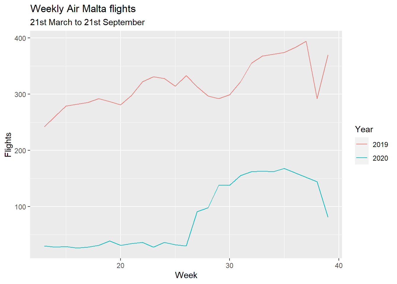
What is the fleet utilization like?
Parked airplanes do not make any money, so to maximise profit airlines try to keep them flying as much as possible. One metric is the average daily utilization in hours: that is, on an average day, how many hours does this airframe fly?
The below are block hours (from one gate to another, including taxi time on the ground).
## `summarise()` has grouped output by 'year'. You can override using the `.groups` argument.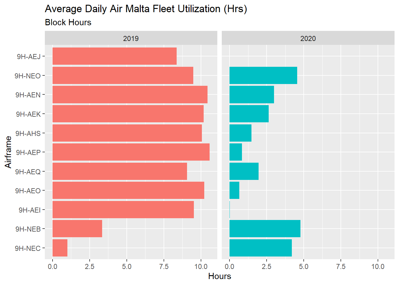
Most of the fleet in 2019 was averaging around 9 hours, with three airplanes exceeding 10 hours. 9H-NEB and 9H-NEC have such relatively low hours because they joined the fleet much later in the season (beginning of August and September). 9H-AEI was sold to a Croatian airline and 9H-AEJ was reportedly scrapped at Kemble.
Interestingly, what little flying there was in 2020 seems to have of been mostly flown by the newer A320 Neo’s Air Malta is acquiring. This makes sense. Besides sipping a bit less fuel (not that fuel was the main cost for airlines in 2020), new airplanes tend to have a “grace” period where very little goes wrong with them. There’s also a healthy gap to expensive maintenance checks which come later in an airframe’s life, so putting off that cost to a future day when it might be less rainy is sound fleet planning rationale.
The 2019 numbers are also fairly in line with what is the norm in the industry (for reference see these numbers from North American Carriers here.)
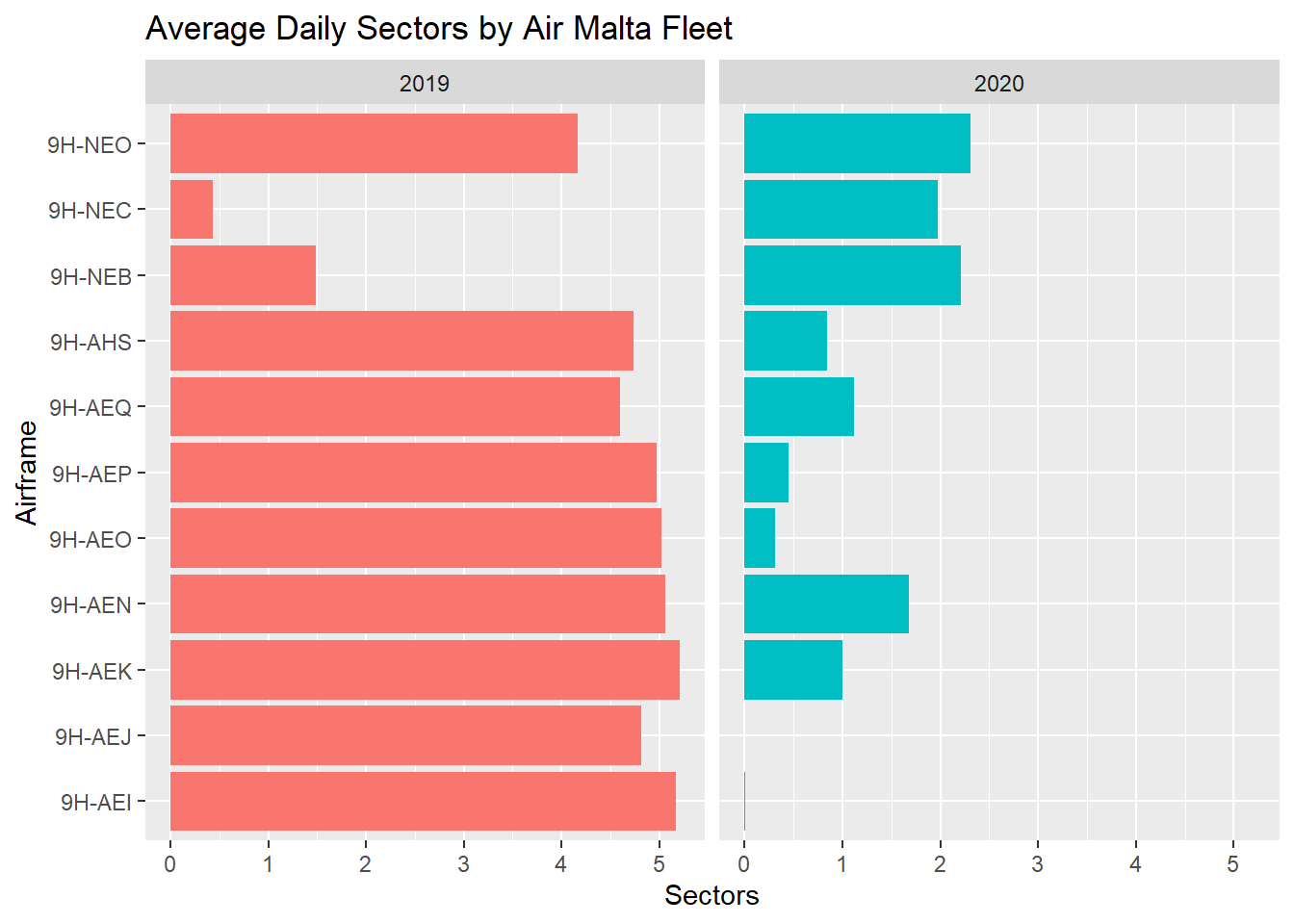
We can also do the same with the average daily number of sectors operated per airframe:
Available Seat Kilometres
The standard metric in the aviation industry for comparing one airline to another (or one airline’s year to the past one) is Available Seat Kilometres. So, for example, if an airline flies an airplane with 150 seats on a 1,000 kilometre route, that route’s ASK is 150,000 units. The main strength of this metric is that it allows direct apples to apples comparisons of capacity with different sorts of airlines.
The seats portion is fairly straightforward, since we know which airframe flew which route, and so which seating configuration was on a particular flight. We can calculate route distances because our additional enrichments allowed us to get longitude/latitude pairs for each departure and arrival airport. Simply piping these to the geosphere package’s distGeo function allows the calculation of the geodesic distance (the shortest path between two points on an ellipsoid).
 kpiASK <- flights %>%
     mutate(dist = distGeo(cbind(DepLon, DepLat),
                           cbind(ArrLon, ArrLat))/1000,
            ASK = Seats*dist)
We can then plot this over weeks, to see how both ASK evolves over the summer season and 2020’s impact on Air Malta’s capacity:
kpiASK %>%
   group_by(year, week) %>%
   summarise(TotalASK = sum(ASK, na.rm=T) / 1000000) %>%
ggplot(aes(x=week, y = TotalASK, col = factor(year), group = year))+
   geom_line()+
  labs(title = "Air Malta Available Seat Kilometres per Week",
       col = "Year") +
  ylab("ASK (Million)")+
  xlab("Week")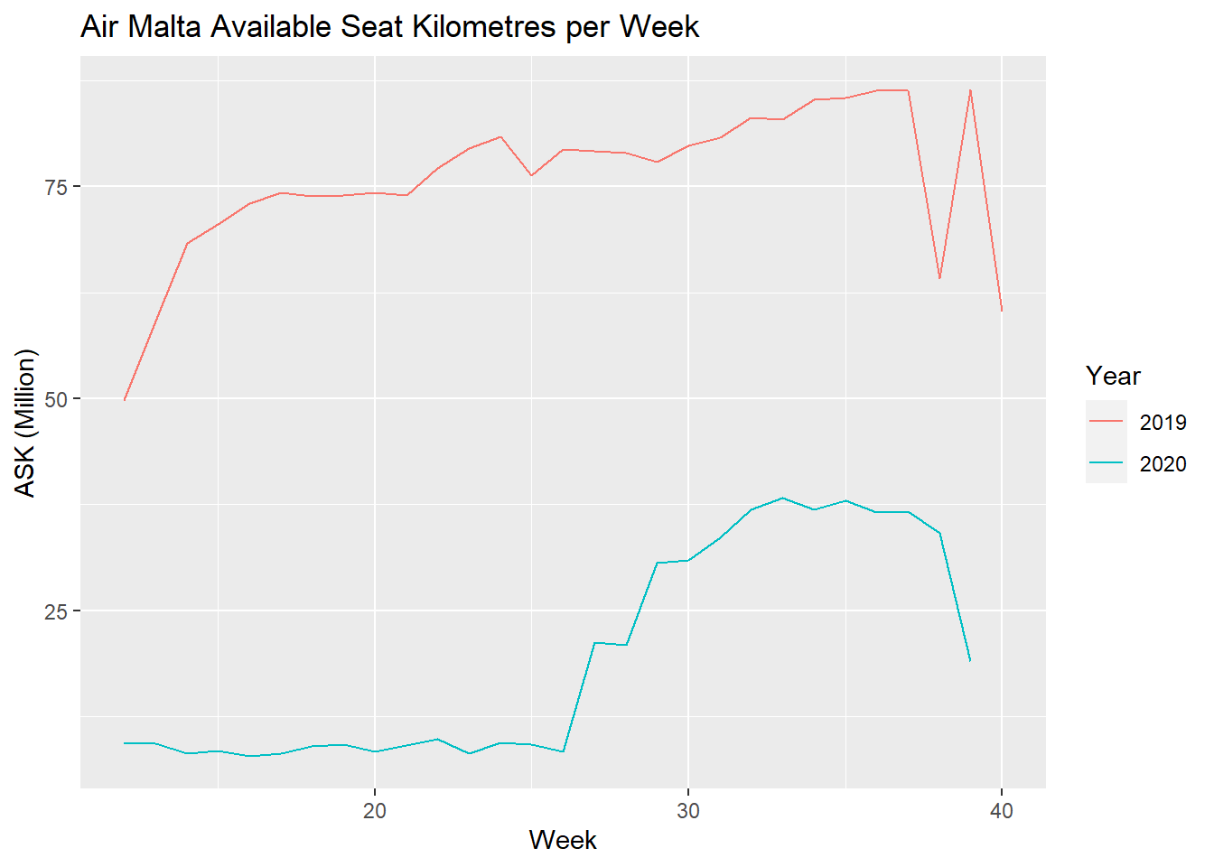
We can also sum up ASK over the entire duration of the flying season to calculate the overall difference in capacity.
kpiASK %>%
   group_by(year) %>%
   summarise(TotalASK = sum(ASK, na.rm=T) / 1e9) %>%
ggplot(aes(x=year, y=TotalASK, label=round(TotalASK,3))) +
  geom_point(stat='identity', fill="black", size=5)  +
  geom_segment(aes(y = 0,
                   x = year,
                   yend = TotalASK,
                   xend = year),
               color = "black") +
  geom_text(color="black", size=3.5, nudge_x = .2) +
  labs(title="Air Malta 2019 vs. 2020 Capacity",
       subtitle="ASK in Billions between 21st March to 21st September") +
  coord_flip()+
  theme_bw()+
  ylab("Available Seat Kilometres (Billions)")+
  xlab("Year")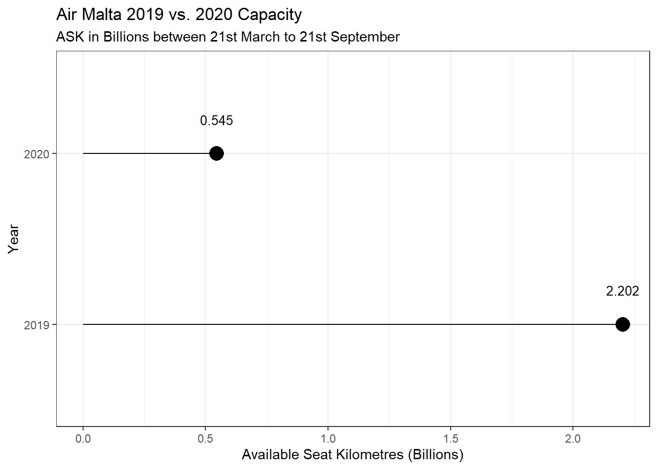
Over the same time period, Air Malta flew only operated a fourth of the capacity it operated in the year before.
Sector Length
As an aside, it is now relatively easy to plot a histogram of the calculated distances. The dashed line is at the 1,300-kilometre mark, which starts to approach the delineation between short haul flights and medium haul flights.
kpiASK %>%
  filter(estDepartureAirport != estArrivalAirport) %>%
  ggplot(aes(dist))+
  geom_histogram(bins=40, fill = "cyan4")+
  geom_vline(xintercept = 1300, lty = 2)+
  labs(title = "Distribution of Sector Lengths")+
  ylab("Flights")+
  xlab("Distance (KM)")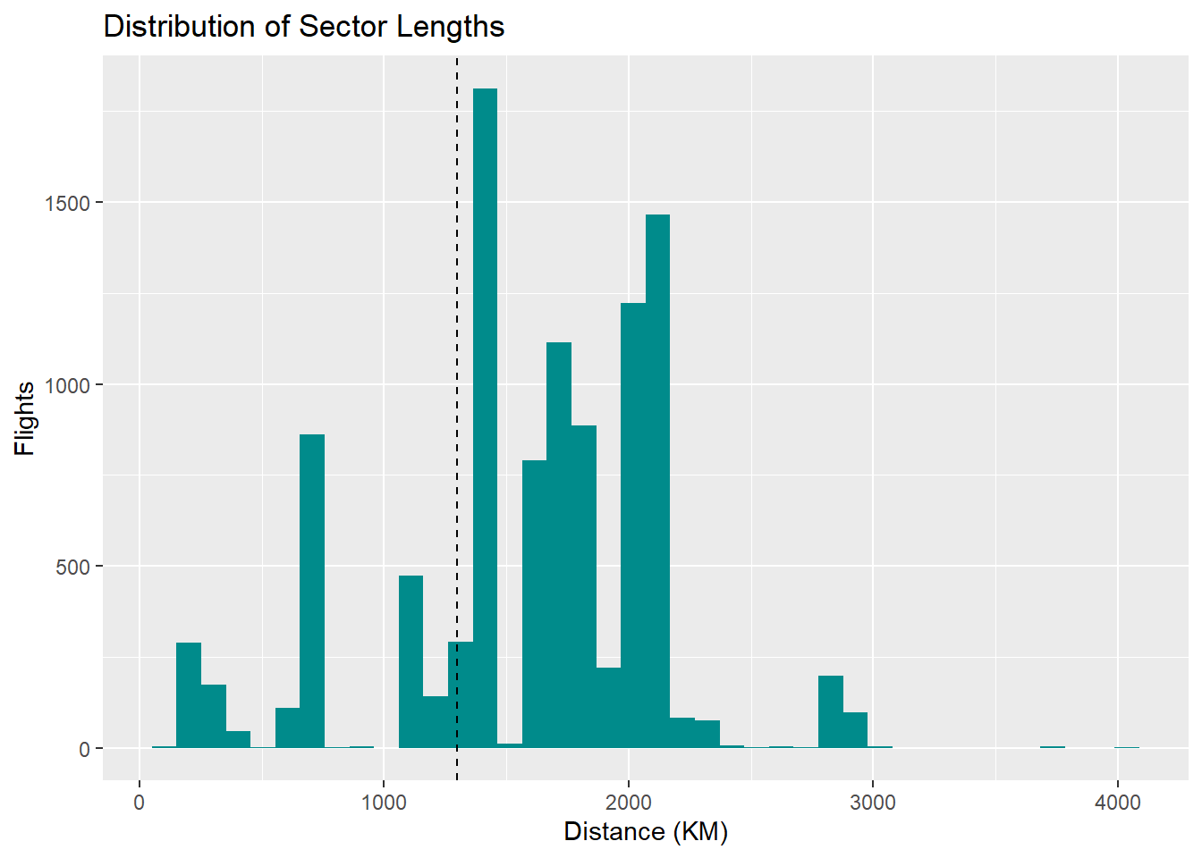
The cluster on the left are flights to Catania, Palermo and Tunis (it’s actually intriguing to me that one of Air Malta’s shortest segments is an intercontinental flight) and the small Tetris cube near the 3,000 kilometre mark are flights to Moscow and St. Petersburg.
Although I’ve rarely thought about it as a medium haul airline, that’s what the bulk of Air Malta’s operations end up being, deep into London, Paris and Brussels.
Capacity by City
We can also split that capacity by city to see which cities are important to Air Malta. For this section I’ve focused on one-way capacity leaving Malta (in reality this is half, a near perfect mirror image exists of capacity from those destinations to Malta).
Situations like these are when network graphs really excel: here the originating node is Malta in the centre, and the terminating nodes are dispersed on the edges, with the thickness of the lines being proportional to capacity in seats.
library(igraph)
library(ggraph)

cities <- flights %>%
  filter(estDepartureAirport == "LMML",
         !is.na(ArrCity),
         estArrivalAirport != "LMML") %>%
  group_by(year, ArrCity, DepCity) %>%
  summarise(flights = n(),
            total_seats = sum(Seats)) %>%
  filter(flights > 10)

set.seed(320)
cities %>%
  filter(year == 2019,
         total_seats > 12000) %>%
  ungroup %>%
  select(ArrCity, DepCity, total_seats) %>%
  graph_from_data_frame() %>%
  ggraph(layout = "stress") +
  geom_edge_arc(aes(edge_width = total_seats),
                    color = "#ee4433", alpha = .7)+
  geom_node_point(size = 4,
                  color = "grey40") +
  geom_node_text(aes(label = name),
                 check_overlap = T,
                 repel = T,
                 size = 4,
                 color = "black") +
  theme_void()+
  theme(plot.background = element_rect(fill = "white"),
        plot.title = element_text(size = 12,
                                  color = "black",
                                  face = "bold")) +
  labs(title = "  Top 14 Air Malta Destinations in 2019",
       subtitle = "   by one way seat capacity",
       edge_width = "Total Seats")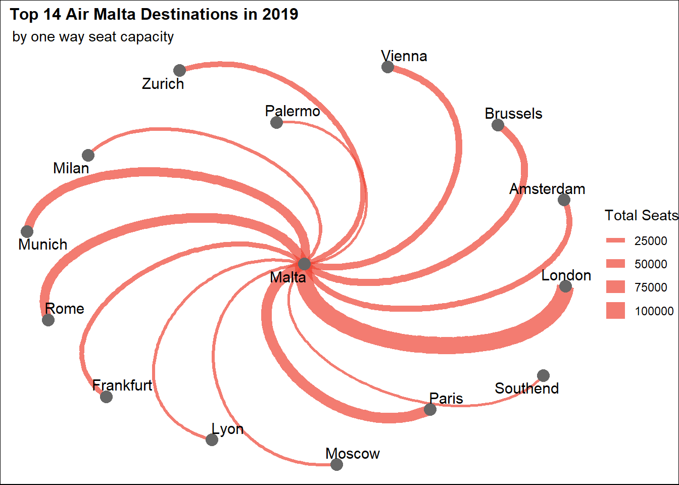
London remains the crown jewel of the Air Malta network, with an excess of 100,000 seats over 6 months, nearly double Paris and Rome, which come in second and third. Air Malta has also cemented this importance in it’s symbology, assigning the Heathrow service the first in it’s range of flight numbers – 100 – a tradition that denotes a flagship route.
To plot the change in seats from 2019 to 2020 was a little more involved, partly because I had my heart set on displaying it using Bob Rudis’s fantastic dumbbell chart addon to ggplot. To do this I had to make a wide data frame, where 2019 seats were one column and 2020 seats were another.
nintheen <-  flights %>%
  filter(estDepartureAirport == "LMML",
         !is.na(ArrCity),
         estArrivalAirport != "LMML") %>%
  group_by(year, ArrCity, DepCity) %>%
  summarise(flights = n(),
            total_seats_2019 = sum(Seats)) %>%
  filter(year == 2019) %>%
  ungroup() %>%
  select(ArrCity, total_seats_2019)

twenty <-  flights %>%
  filter(estDepartureAirport == "LMML",
         !is.na(ArrCity),
         estArrivalAirport != "LMML") %>%
  group_by(year, ArrCity, DepCity) %>%
  summarise(flights = n(),
            total_seats_2020 = sum(Seats)) %>%
  filter(year == 2020) %>%
  ungroup() %>%
  select(ArrCity, total_seats_2020)

KPIDelta <- nintheen %>%
  left_join(twenty, by = "ArrCity") %>%
  na.omit() %>%
  top_n(16, total_seats_2019)

library(ggalt)
library(ggtext)

ggplot(KPIDelta, aes(x=total_seats_2019, xend=total_seats_2020, y=fct_reorder(ArrCity, total_seats_2019), group=ArrCity)) +
        geom_dumbbell(color="black",
                        size=1, colour_x = "black", colour_xend = "red") +

        labs(y="City",
             x="Total Seats",
             title="Change in Air Malta Seating Capacity by Destination",
             subtitle="<span style = 'color:black;'>2019</span> vs. <span style = 'color:red;'>2020</span> **Period from 21st March to 21st September**") +
  scale_x_continuous(labels = comma)+
        theme(panel.background=element_rect(fill="white"),
              panel.grid.minor=element_blank(),
              panel.grid.major.y=element_blank(),
              panel.grid.major.x=element_line(),
              axis.ticks=element_blank(),
              legend.position="top",
              panel.border=element_blank(),
              plot.subtitle = element_textbox_simple(
    ))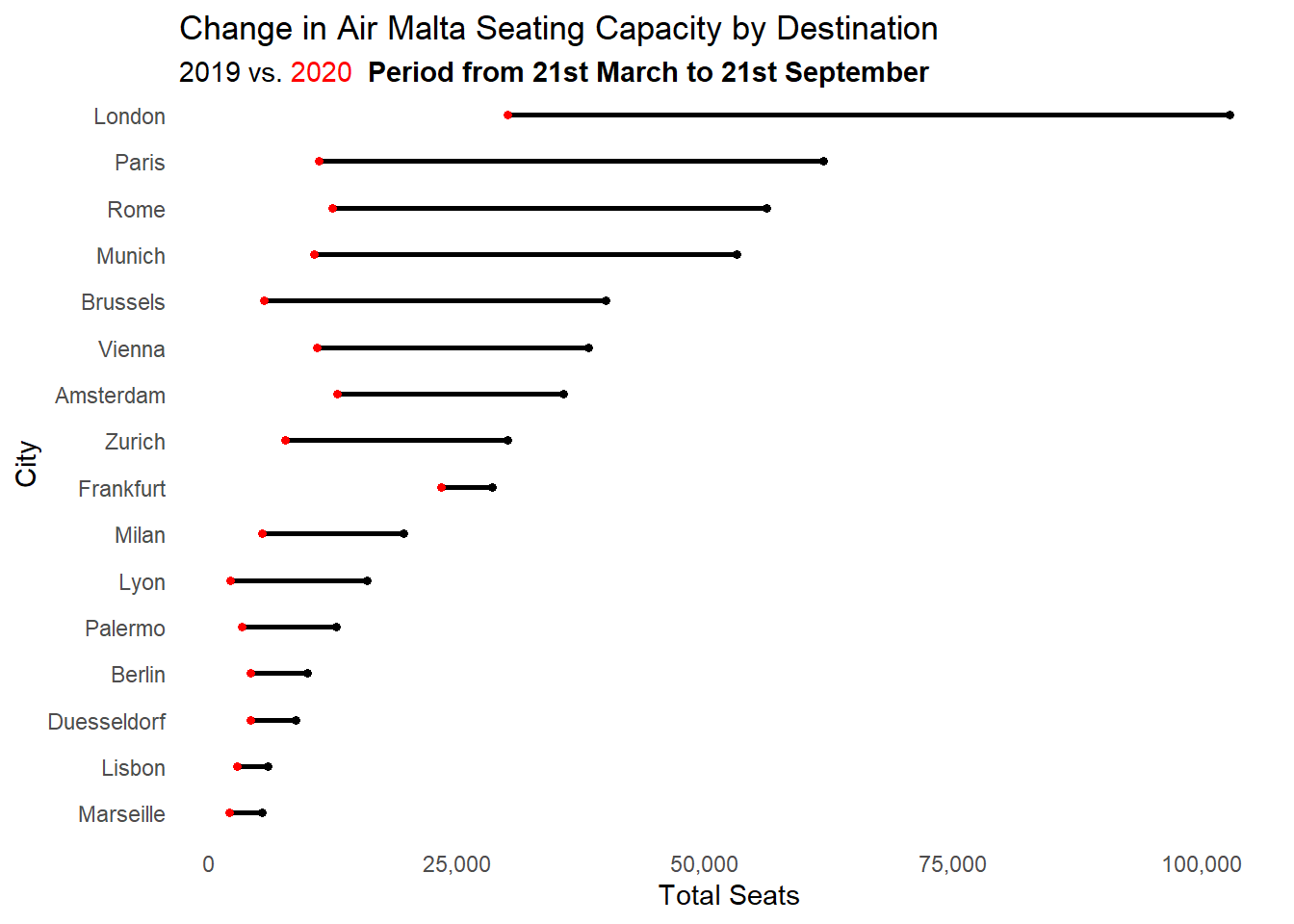
While the reductions are massive, they do seem to be constant across the board (that is, most of the cities maintain the same order relative to each other). The one real exception seems to be Frankfurt, which only was slightly impacted, remaining the second most served airport in 2020.
I believe this has to do with how Air Malta operated a “lifeline” schedule early in the pandemic, rerouting Maltese nationals and residents from around the world to either London, Frankfurt or Amsterdam.
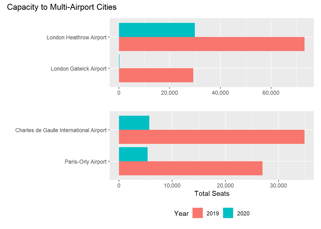
Another thing to consider is that operations to London and Paris involve two airports: Gatwick and Orly are marketed as closer, less congested alternatives if you just intend to visit the cities, while Heathrow and de Gaulle provide more international connection opportunities.
Heathrow and Gatwick are also slot restricted airports (in practice so are the Parisian ones, but they are both significantly larger than their London counterparts and so laxer). What this means is, carriers must bid for and secure their rights to operate flights. Indeed, these slots, acquired by Air Malta nearly half a century ago when competition was less fierce, remained some of its most valuable assets at an estimated 58 million euros, before being spun off to MaltaMedAir in 2018.
The kicker with slots is that they often come with capacity clauses that dictate that you for instance fly at least half the schedule or lose them. In March, when capacity collapsed, this meant that the prospect of airlines flying empty ghost flights to hang on to their slots was a possibility, until most airports announced that they would not be enforcing them for the time being.
Interestingly, although free from these limitations, Air Malta responded differently. In Paris they scaled back operations equally at both airports, while in London Gatwick was immediately dropped, with all remaining capacity going to Heathrow.