This is intended to be a companion article to this shiny app for those who are more technically oriented and want the details.
Where is the data from?
Originally, I was going to use OurWorldInData as a source, but then I discovered they were actually just piggybacking off a local project on GitHub which seems to be managed by the Department of Health, so I used that!
The only additional field I add is the daily rate of vaccinatations, which I calculate by subtracting the day’s total from the previous day’s.
vaccinations <- read_csv("https://raw.githubusercontent.com/COVID19-Malta/COVID19-Cases/master/COVID-19%20Malta%20-%20Vaccination%20Data.csv") %>%
        janitor::clean_names() %>%
        mutate(date = lubridate::dmy(date),
               daily_rate = total_vaccination_doses - lag(total_vaccination_doses))
What’s the smoother in the Main Graph?
It is a plain vanilla Generalized additive model predicting vaccinations as a function of the date. The reason I opted for a GAM is because a simple linear model was accounting for the relatively slow rollout in January, while the GAM’s spline was more than happy to comply and fit.
ggplot(vaccinations, aes(x = date, y = total_vaccination_doses))+
            geom_point()+
            geom_line(stat = "smooth", method = "gam", fullrange = TRUE,
                      se = F, colour = "orange", alpha = .8)+
  geom_line(stat = "smooth", method = "lm", fullrange = TRUE,
                      se = F, colour = "blue", alpha = .8)+
            scale_x_date(date_breaks = "1 month",
                         labels=date_format("%b-%Y"),
                         limits = as.Date(c('2021-01-03','2021-06-01')))+
  xlab("")+
  ylab("Vaccine Doses Administered")+
  theme_bw()+
  labs(title = "Linear Model (Blue) vs GAM (Orange)")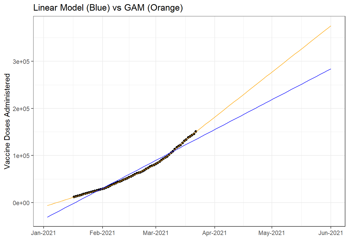
Incidentally, because the rate picked up in recent weeks, the GAM’s prediction is that it will continue to do so, albeit slightly in the future. You can notice this in the app by setting the current rate slider to 1 – the dashed line will fall slightly below.
How is the 7 day mean calculated in the secondary graph?
It’s literally a vector of last week’s calculated vaccination values piped into R’s arithmetic mean function.
last_week_rate <- tail(vaccinations, 7) %>%
        pull(daily_rate) %>%
        mean()
This is used to feed the text parameter in the dashboard:
output$text <- renderText({paste("Local authorities have been managing an average of ",
                                     "<b>",
                                     round(last_week_rate),
                                     "</b>",
                                     " daily vaccinations over the last week.")})
And as the input to the function to estimate the accelerated/decelerated rollout as inputted by the slider:
generate_preds <- function(rate, to_date = '2022-01-01'){
        #takes total vaccinations at max date and cumulitatively adds the rate
        tibble(
            Date = seq(ymd(Sys.Date()), ymd(to_date), by = "1 day"),
            Last = max(vaccinations$total_vaccination_doses),
            Rate = rate,
            n = Last + cumsum(Rate)) %>%
            select(Date, n) %>%
            mutate(n = round(n))}
e.g. to calculate the line with a rate twice the current one, the generate_preds function would be run as:
generate_preds(last_week_rate*2) %>%
  head()
## # A tibble: 6 x 2
## Date n
## <date> <dbl>
## 1 2021-03-23 157931
## 2 2021-03-24 164966
## 3 2021-03-25 172000
## 4 2021-03-26 179034
## 5 2021-03-27 186068
## 6 2021-03-28 193103How did you get the date to the 600,000th dose?
In quite a hacky way, courtesy of this stackoverflow post. I ran ggplot_build on the final ggplot object, found the geom_smooth aesthetic, filtered for the first row where 600,000 was reached, and then pull off the equivalent x-axis element. Since the geom_smooth layer converts it to a POSIXct number to run the model on, we have to convert it back using lubridate’s as_date function.
 date_fin <- ggplot_build(p)$data[[2]] %>%
        filter(y >= 600000) %>%
        head(1) %>%
        select(x) %>%
        pull() %>%
        lubridate::as_date() %>%
        sf()
What’s the relevance of 600,000?
There are around 500,000 people in Malta, so assuming a two-dose vaccine, 600,000 shots equate to around 60%. However if a single dose vaccine is deployed, that number would go up.
R’s Pretty Great…
Two of the greatest assets R leverages are RMarkdown/blogdown (which is how you’re reading this) and RShiny (which is where the interactive app resides). With their relatively small learning curve, these two tools allow you to share your analysis instead of letting it rot on your laptop.
Full Code
library(shiny)
library(tidyverse)
library(lubridate)
library(scales)
library(plotly)

# Define UI for application
ui <- fluidPage(

    # Application title
    titlePanel("Tracking Malta’s Vaccine Rollout"),

    # Sidebar with a slider input for number of bins
    sidebarLayout(
        sidebarPanel(
            sliderInput("bins",
                        "How things will look if the current rate is increased by a factor of:",
                        min = 0.0,
                        max = 4.5,
                        value = 1.5,
                        step = 0.1),

            h4("What am I looking at?"),
            p("This is a GAM smoother fitted over vaccination data updated daily from",
              a(href="https://github.com/COVID19-Malta/COVID19-Cases",
                "the amazing folks at COVID19-Malta.")),
            br(),

            h4("What's the progress?"),
            htmlOutput("text"),
            br(),

            htmlOutput("text2"),
            br(),

            htmlOutput("text3"),
            br(),

            p(a("charlesmercieca.com",
                href = "http://charlesmercieca.com/"))
        ),

        # Show a plot
        mainPanel(
            tabsetPanel(
                tabPanel("Daily Doses", plotlyOutput("distPlot")),
                tabPanel("Mean Rate & Number Fully Vaccinated", plotlyOutput("rate", height = "250px"),
                         plotlyOutput("secondaries", height = "250px")))
        )
    )
)

# Define server logic required to draw plot
server <- function(input, output) {

    vaccinations <- read_csv("https://raw.githubusercontent.com/COVID19-Malta/COVID19-Cases/master/COVID-19%20Malta%20-%20Vaccination%20Data.csv") %>%
        janitor::clean_names() %>%
        mutate(date = lubridate::dmy(date),
               daily_rate = total_vaccination_doses - lag(total_vaccination_doses))

    last_week_rate <- tail(vaccinations, 7) %>%
        pull(daily_rate) %>%
        mean()

    generate_preds <- function(rate, to_date = '2022-01-01'){
        #takes total vaccinations at max date and cumulitatively adds the rate
        tibble(
            Date = seq(ymd(Sys.Date()), ymd(to_date), by = "1 day"),
            Last = max(vaccinations$total_vaccination_doses),
            Rate = rate,
            n = Last + cumsum(Rate)) %>%
            select(Date, n) %>%
            mutate(n = round(n))
    }

    p <- qplot(x = date, y = total_vaccination_doses, data=vaccinations) +
        stat_smooth(method = "gam", fullrange = TRUE)+
        scale_x_date(date_breaks = "1 month",
                     labels=date_format("%b-%Y"),
                     limits = as.Date(c('2021-01-03','2021-12-20')))

    sf <- stamp("Sunday, Jan 17, 1999")

    date_fin <- ggplot_build(p)$data[[2]] %>%
        filter(y >= 600000) %>%
        head(1) %>%
        select(x) %>%
        pull() %>%
        lubridate::as_date() %>%
        sf()

    updated <- max(vaccinations$date) %>%
        sf()

    output$text <- renderText({paste("Local authorities have been managing an average of ",
                                     "<b>",
                                     round(last_week_rate),
                                     "</b>",
                                     " daily vaccinations over the last week.")})

    output$text2 <- renderText({paste0("At this rate, the 600,000th dose will be administered on ",
                                      "<b>",
                                      date_fin,
                                      "</b>.")})

    output$text3 <- renderText({paste0("<i> Vaccination data current as of: ",
                                      updated,
                                      "<i/>",
                                      ".")})

    output$distPlot <- renderPlotly({
        ratepreds <- reactive({generate_preds(last_week_rate*input$bins)})

        main <- ggplotly(ggplot(vaccinations, aes(x = date, y = total_vaccination_doses))+
            geom_point()+
            geom_line(stat = "smooth", method = "gam", fullrange = TRUE,
                      se = F, colour = "orange", alpha = .8)+
            scale_x_date(date_breaks = "1 month",
                         labels=date_format("%b-%Y"),
                         limits = as.Date(c('2021-01-03','2022-01-01')))+
            scale_y_continuous(labels = scales::comma, limits = c(0, 780000))+
            geom_line(data = ratepreds(), aes(x = Date, y = n), lty = "dashed")+
            xlab("")+
            ylab("Vaccine Doses Administered")+
            theme_bw()+
            theme(axis.text.x = element_text(angle = -30, vjust = 1, hjust = 0))+
            labs(title = "Vaccination Progression at Current Rate"),
            tooltip = c("Date", "n"))

        text_y <-
            round(main$x$data[[2]]$y)
        text_x <-
            lubridate::as_date(main$x$data[[2]]$x)

            main %>%
                style(hoverinfo = "skip", traces = 1) %>%
                style(text = paste(text_x,"\n", "Estimated Vaccinations: ", text_y), traces = 2)

    })

    output$rate <- renderPlotly({

        rateGraph <- ggplotly(tail(vaccinations, 7) %>%
                                  ggplot(aes(x=date, y = daily_rate))+
                                  geom_point()+
                                  ylab("Daily Vaccinations")+
                                  xlab("")+
                                  geom_hline(yintercept = last_week_rate, lty="longdash")+
                                  labs(title = "Daily Vaccinations over Last Week")+
                                  scale_y_continuous(labels = scales::comma)+
            theme_bw(),
            tooltip = FALSE)

        })

    output$secondaries <- renderPlotly({

        second_doses <- ggplotly(ggplot(filter(vaccinations, second_dose_taken > 0),
                                        aes(x = date, y = second_dose_taken))+
                                     geom_col()+
                                     ylab("People")+
                                     xlab("")+
                                     labs(title = "Fully Vaccinated")+
                                     scale_y_continuous(labels = scales::comma)+
            theme_bw(),
            tooltip = FALSE)

    })
}