How Pronounced are Heat Islands?
I was inspired by this visualization to create something similar to see the extent of the urban heat island phenomena over the Maltese islands. Unfortunately, there isn’t a city of Washington D.C. equivalent ready to provide us with a calculated raster. I could either use Landsat 8 and try to calculate the Land Surface Temperature using one of the many algorithms devised or work with Sentinel 3 data from the EU’s Copernicus Programme.
I settled on Sentinel 3 data for a number of reasons:
- both satellites have a dedicated Land Surface Temperature instrument.
- ESA pre-processes the data into 1km grids.
- Sentinel 3 measures the surface temperature at both day and night.
The final point is actually the most important since the urban heat island effect is more pronounced at night than during the day.
I downloaded the data from Copernicus Open Hub (if you’re interested in doing this yourself, all services are completely free, you will just need to create an account to get started), and picked a night with no wind. The data is in NetCDF format, so we’ll use the the ncdf4 library to wrangle it.
The most important files in the folder for us are:
LST_in.ncwhich is where we’ll get the actual LST values in Kelvin for each 1x1km gridgeodetic_in.ncwhich contain the latitude and longitude of each of those 1x1km grid
In reality it look me a bit longer than it probably should have that _in files go together, but getting the coordinates is important because unlike for instance Landsat rasters, these grids are transposed and often upside down (more on those struggles below).
#Loading libraries.
library(ncdf4)
library(tidyverse)
library(raster)
library(giscoR)
library(gstat)
library(viridis)

wd <- where_files_are

#creating filepath names
climate_filepath <- paste0(wd, "/LST_in.nc")
cart_filepath <- paste0(wd, "/geodetic_in.nc")

#reading them in using nc_open
nc <- nc_open(climate_filepath)
cord <-  nc_open(cart_filepath)
All three files are a 1200 x 1500 cell matrix. Since I had a LST value, and coordinates for each cell, I collapsed the matrix, and binded them all into a dataframe:
lat <-  ncvar_get(cord, "latitude_in") %>% as.vector()
lon <-  ncvar_get(cord, "longitude_in") %>% as.vector()
LST <-  ncvar_get(nc, "LST") %>% as.vector()

LST_DF = data.frame(lon = lon,
                 lat = lat,
                 LST = LST) %>%
  #Filter only for Malta
  filter(lat >= 35.7 & lat <=36.1 & lon >= 14.1 & lon <=14.6) %>%
  #Remove NA (sea temp) values
  drop_na() %>%
  #Convert from Kelvin to C
  mutate(LST = LST - 273.15)
Now ordinarily this would be it. I would just plot the data frame. But for some reason, that 1x1km non-standard grid was giving geom_raster some trouble, and the best I could do was a point plot. Frankly, I wanted something more pretty.
ggplot(LST_DF, aes(x = lon, y = lat, col = LST))+
  geom_point()+
  scale_color_viridis()+
  theme_bw()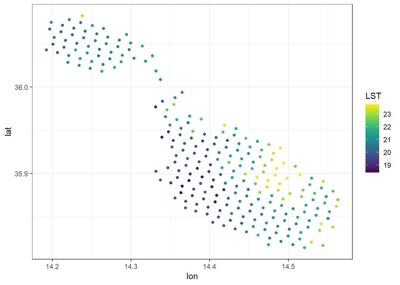
The best way I found to fix this was to create a grid from scratch, at a much finer in resolution, then use some spatial statistics to project what the temperature would have of been at those values using the surrounding observations. Mostly I recreated this post.
First step was to cast the data frame into a spatial points data frame, and create our artificial grid:
coordinates(LST_DF) <-  ~lon+lat

y.range <- as.double(c(35.75,36.15))
x.range <- as.double(c(14.1,14.62))

grid <- expand.grid(x=seq(from=x.range[1],
                         to=x.range[2], by=0.00130), #by = x max - x min/500
                   y=seq(from=y.range[1],
                         to=y.range[2], by=0.00101))

coordinates(grid)  <- ~x+y
gridded(grid) <- TRUE
The above created the below grid, and we’ll use the blue observations to fill in what the predicted ones on the grid would be (essentially smoothing them out).
plot(grid)
points(LST_DF, col = "blue")
To do this, we’ll use a rather simple inverse distance weighting interpolation method:
idw_grid <- gstat::idw(formula = LST ~ 1,
          locations = LST_DF,
          newdata = grid,
          idp=3.0) %>%
  as.data.frame() %>%
  dplyr::select(-var1.var) %>%
  rename(lon = x, lat = y, lst = var1.pred)
## [inverse distance weighted interpolation]Now this is much closer to what I actually want. I could plot this and call it a day, but there’s another problem. The sea temperature has been interpolated, using land values. This is almost certainly too high and wrong:
ggplot(idw_grid, aes(x = lon, y = lat, fill = lst))+
  geom_raster()+
  scale_fill_viridis()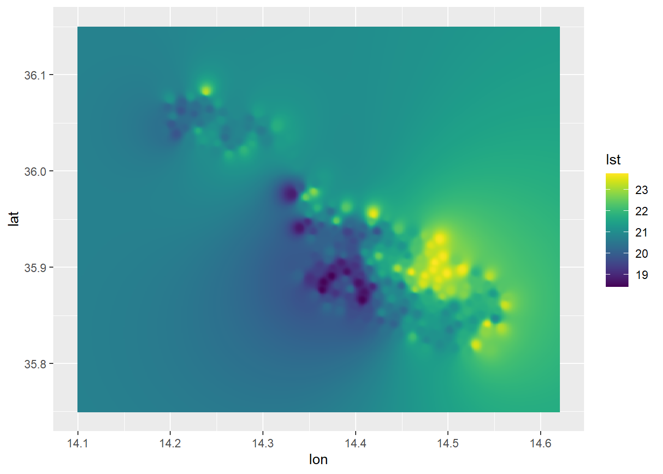
I need a mask! But masks are raster operations not data frame ones. Oy Vey. Luckily raster has a function to rasterize any x,y,z table. I’ll then use a shapefile of the Maltese islands as an inverse mask, before converting back to a data frame (I’m certain there’s a better way to do this).
#Shapefile
mt <- gisco_get_countries(resolution = "01", country = "MLT")

#Convert to raster, apply mask, then convert back to data frame.
idw_raster <- idw_grid %>%
  rasterFromXYZ() %>%
  mask(mt, inverse = FALSE) %>%
  as.data.frame(xy = TRUE)
Aaaand, we plot it, using the appropriately named “inferno” colour scale from viridis!
ggplot()+
  geom_sf(data = mt)+
  geom_raster(data = idw_raster,
              aes(x=x, y=y, fill = lst),
              interpolate = T,
              alpha = .7)+
  scale_fill_viridis_c(option = "inferno")+
  coord_sf()+
  theme_bw()+
  ylab("Latitude")+
  xlab("Longitude")+
  labs(title = "Land Surface Temperature",
       subtitle = "As Observed by Sentinel 3B on 16th June 2021 at 11 p.m")+
  guides(fill=guide_legend(title="°Celsius"))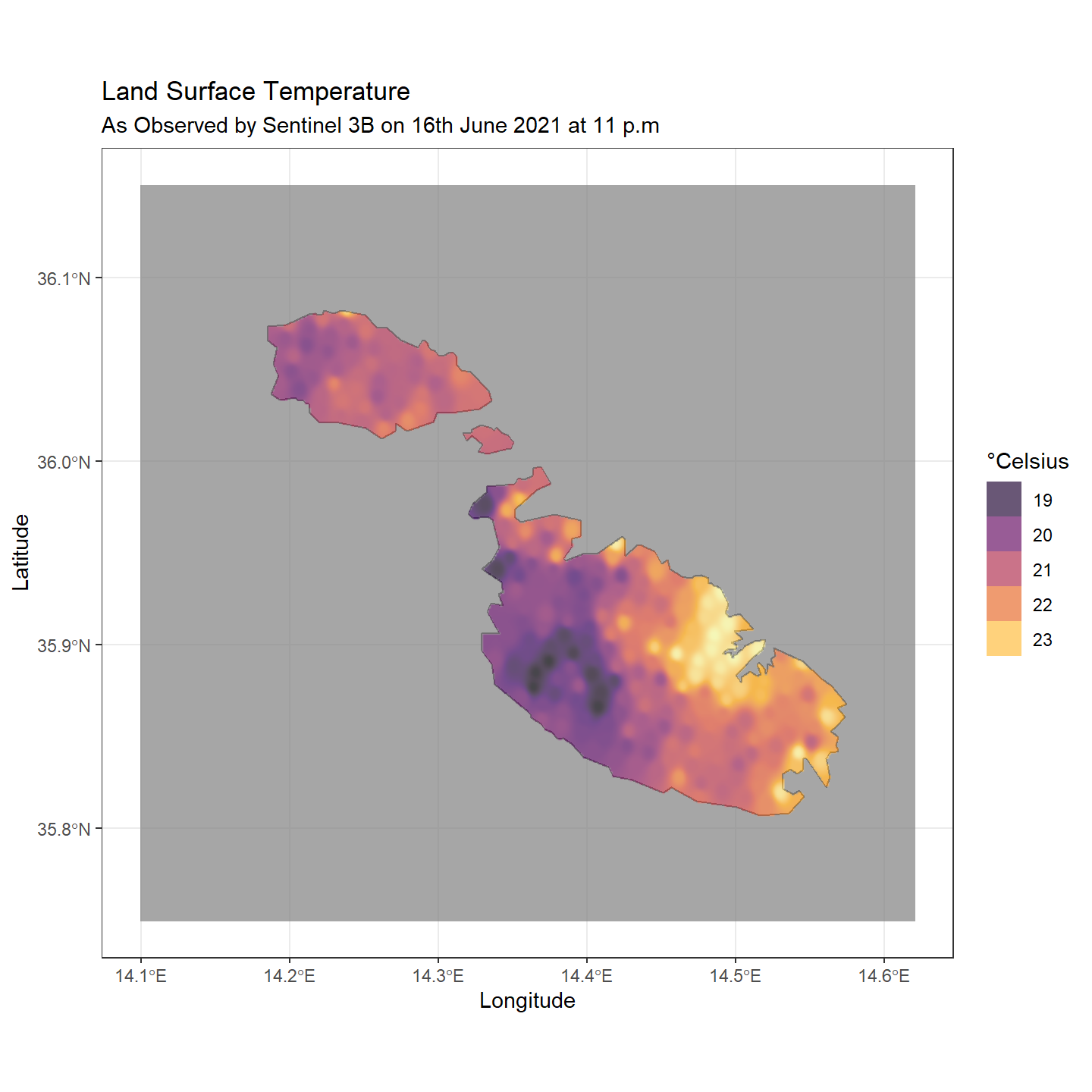
As one would expect, the effect is mostly prominent in the heavily urbanized corridor spanning Valletta-Floriana-Hamrun-Birkirkara-Msida-ta’ Xbiex-Sliema, with these areas being 2-3° warmer than their surroundings. Another spot is the urbanized area surrounding Marsaxlokk bay, with Birzebbuga and Marsaxlokk standing out from their surroundings.
The coolest areas are in Western Malta and Western Gozo. There’s also a “mini” urban island in Bugibba, and a lesser 1-2° effect in the Mosta-Naxxar and Victoria areas.
From the bit I’ve read, urban heat islands peak in summer and winter and mellow out in spring/autumn. Let’s plot a bit more days and see how it varies. I’ve wrapped the above into two functions, get_data_from_sentinel which takes a file location and does all the pre-processing returning the interpolated data frame and plot_sentinel_from_idw_df which plots them in this standardized format.
get_data_from_sentinel <- function(wd,
                                   ymin = 35.64926,
                                   ymax = 36.15681,
                                   xmin = 14.08218,
                                   xmax = 14.73441,
                                   grids = 500){

  # Loads & pre-processes SL_2_LST data into data frame ready for plotting.
  #More info on data: https://sentinels.copernicus.eu/web/sentinel/user-guides/Sentinel-3-slstr/product-types/level-2-lst
  #
  #       :param wd(str): working directory of downloaded folder
  #       :param ymin(dbl): lower latitude limit for bounding box
  #       :param ymax(dbl): upper latitude limit for bounding box
  #       :param xmin(dbl): lower longitude limit for bounding box
  #       :param xmin(dbl): upper longitude limit for bounding box
  #       :param grids(int): number of grids IDW should project to

  #       :return idw_raster (dataframe): interpolated data frame with temp in C

  climate_filepath <- paste0(wd, "/LST_in.nc")
  cart_filepath <- paste0(wd, "/geodetic_in.nc")

  nc <- nc_open(climate_filepath)
  cord <-  nc_open(cart_filepath)

  mt <- gisco_get_countries(resolution = "01", country = "MLT")

  lat <-  ncvar_get(cord, "latitude_in") %>% as.vector()
  lon <-  ncvar_get(cord, "longitude_in") %>% as.vector()
  LST <-  ncvar_get(nc, "LST") %>% as.vector()

  LST_DF = data.frame(lon = lon,
                   lat = lat,
                   LST = LST) %>%
    filter(lat >= ymin & lat <=ymax & lon >= xmin & lon <=xmax) %>%
    drop_na() %>%
    mutate(LST = LST - 273.15)

  coordinates(LST_DF) <-  ~lon+lat

  y.range <- as.double(c(ymin, ymax))
  x.range <- as.double(c(xmin, xmax))

  grd <- expand.grid(x=seq(from=x.range[1],
                           to=x.range[2], by=(xmax - xmin)/grids), #0.003
                     y=seq(from=y.range[1],
                           to=y.range[2], by=(ymax - ymin)/grids)) #0.0025

  coordinates(grd)  <- ~x+y
  gridded(grd) <- TRUE

  idw_grid <- gstat::idw(formula = LST ~ 1,
            locations = LST_DF,
            newdata = grd,
            idp=3.0) %>%
    as.data.frame() %>%
    dplyr::select(-var1.var) %>%
    rename(lon = x, lat = y, lst = var1.pred)

  idw_raster <- idw_grid %>%
    rasterFromXYZ() %>%
    mask(mt, inverse = FALSE) %>%
    as.data.frame(xy = TRUE)


  return(idw_raster)
}

plot_sentinel_from_idw_df <- function(df,
                                      sub = ""){

  # Plots data frame provided from get_data_from_sentinel function
  #
  #       :param df(df): data frame
  #       :param sub(character): subtitle for graph

  #       :return ggplot object

  mt <- gisco_get_countries(resolution = "01", country = "MLT")

  ggplot()+
  geom_sf(data = mt)+
  geom_raster(data = df,
              aes(x=x, y=y, fill = lst),
              interpolate = T,
              alpha = .7)+
  scale_fill_viridis_c(option = "inferno")+
  coord_sf()+
  theme_bw()+
  ylab("Latitude")+
  xlab("Longitude")+
  labs(title = "Land Surface Temperature",
       subtitle = sub)+
  guides(fill=guide_legend(title="°Celsius"))}
The above allows us to streamline the process greatly, since any plot is now a download and two function calls away.
p1 <- get_data_from_sentinel(Aug2020) %>%
  plot_sentinel_from_idw_df(
    sub = "13th August 2020 at 11 p.m")+
  theme_void()
## [inverse distance weighted interpolation]p2 <- get_data_from_sentinel(Feb2021) %>%
plot_sentinel_from_idw_df(
sub = "5th Feb 2021 at 11 p.m")+
theme_void()## [inverse distance weighted interpolation]p3 <- get_data_from_sentinel(Mar2021) %>%
plot_sentinel_from_idw_df(
sub = "21st March 2021 at 11 p.m")+
theme_void()## [inverse distance weighted interpolation]p4 <- get_data_from_sentinel(Jun2021) %>%
plot_sentinel_from_idw_df(
sub = "14th June 2021 at 11 p.m")+
theme_void()## [inverse distance weighted interpolation]library(patchwork)
(p1 | p2) / (p3 | p4)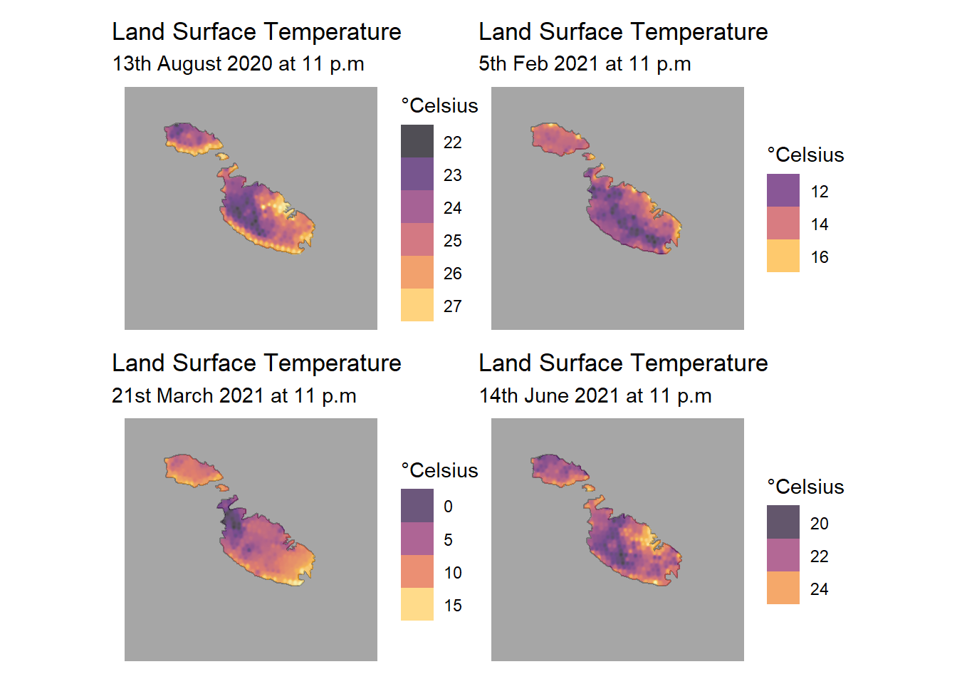
I think the abnormally cool values on the 21st of March over Mellieha are due to clouds over those pixels. If we were doing actual science, we’d probably mask those cloudy pixels in the same way we did the sea.
Struggling with Raster Conversion
Before coming up with the above workflow, I struggled a bit with converting the data to raster form. I tried the usual approach, with min and max bounds for both the x and y axis coming from the long/lat data, and using the crs specified in the metadata.
LST_matrix = ncvar_get(nc, "LST")


r_exp <- raster(t(LST_matrix),
            xmn=min(lon),
            xmx=max(lon),
            ymn=min(lat),
            ymx=max(lat),
            crs=CRS("+init=EPSG:4326"))

plot(r_exp)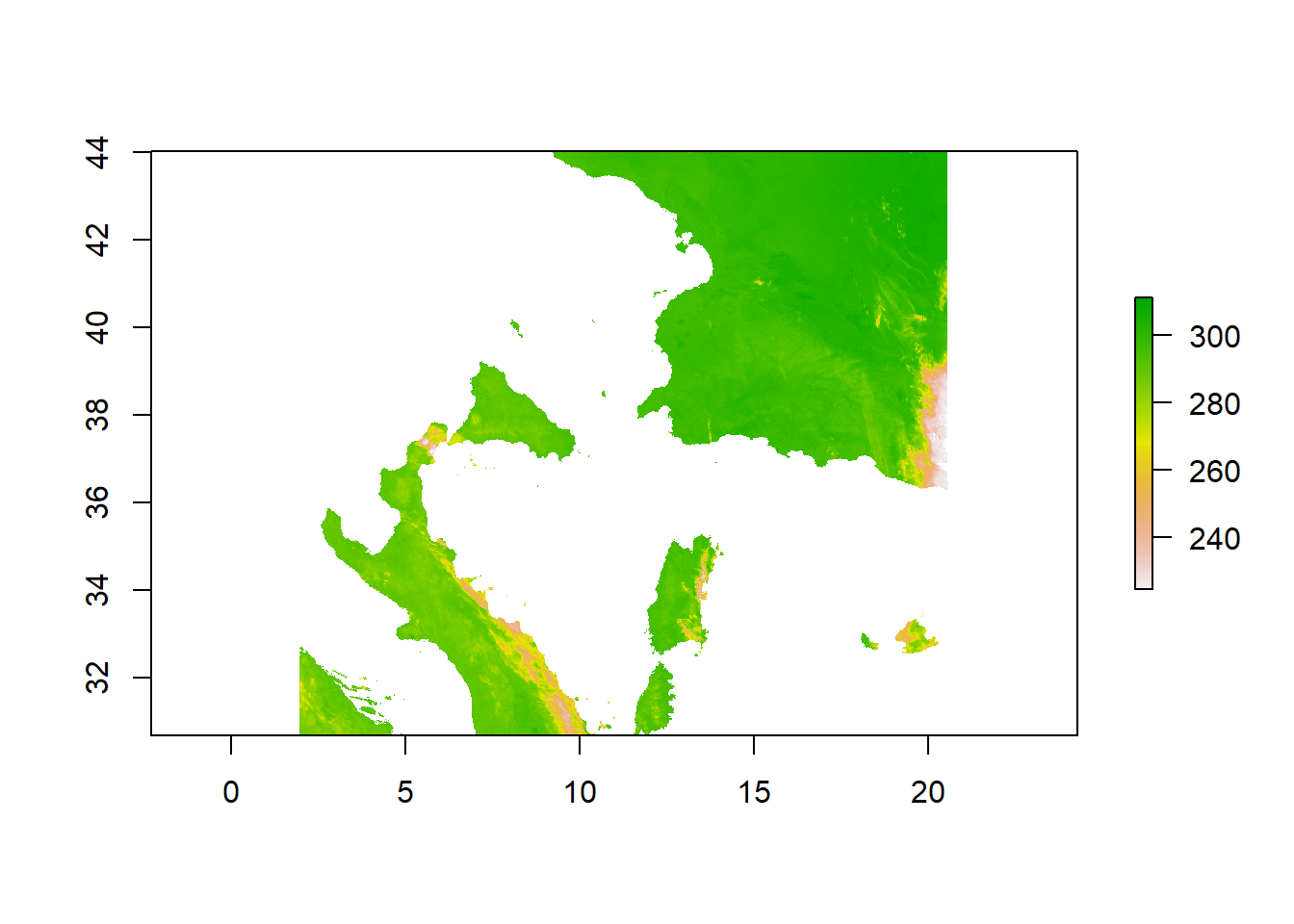
Which on first glance seems to work, only requiring us to do two flips to the data (note that we’ve already had to transpose the matrix on it’s diagonal using the t() matrix function in R).
r_exp <- flip(r_exp, direction = "y")
r_exp <- flip(r_exp, direction = "x")
plot(r_exp)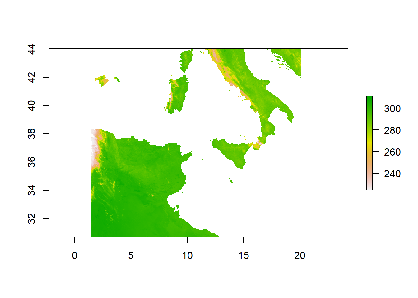
Seems fixed right? That’s what I thought, until I started trying to subset the data. Tunisia is weirdly out of shape, the Balearic islands seem an hours swim from here and the 36th parallel north in our plot passes through the southern tip of Sicily. In reality, it splits Gozo from Malta. Why this was happening only became apparent in this stack exchange post. If we plot a scatter graph of lat/lon points:
plot(lon, lat)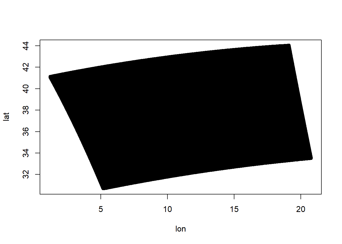
The grid hasn’t been projected onto a flat surface for us, it’s still in a spherical form. By trying to stretch it into a rectangle (essentially make the black part fit the white square), we were distorting it!