Researchers at Facebook and Columbia University have been trying to create much more detailed population density maps for close to a decade. They delve into their weakly supervised approach here, but in a sentence my understanding of the approach is that they enhance national level demographic data with Facebook/Instagram data and remap that “population” onto satellite imagery.
These population estimates have been released under their “Data for Good” umbrella here, (and this data can do a great deal of good, from helping NGO’s target their key demographics to informing the most mundane social policy decisions like where to install a bus stop).
We have a selection of files to choose from based on age and gender. Let’s start with a simple leaflet map of the whole population:
library(leaflet)
library(leaflet.extras)
library(tidyverse)
library(raster)

base <- raster("C:/Users/Charles Mercieca/Documents/RProjects/FBPopulation/Input/population_mlt_2019-07-01.tif")

palViridis <- colorNumeric(palette = "magma", values(base), na.color = "transparent")

leaflet() %>% addTiles() %>%
  addProviderTiles(providers$CartoDB.Positron) %>%
  addRasterImage(base, opacity = 0.5, colors = palViridis) %>%
  addLegend(pal = palViridis,
            values = values(base),
            title = "People per pixel")
Senglea (or at least parts of it) appears to be the most densely populated locality on the island. Also since the final step seems to be image recognition of buildings, you can see some areas where the algorithm fails (assigning “population” to schools, churches, parts of Comino and even Filfla).
You can notice from the interactive map that after you zoom in a certain amount, the raster just bins into grids. We can calculate the size of these grids using the res function, and the knowledge that 1 degree of latitude is equivalent to 111.2km on average:
res(base)## [1] 0.0002777778 0.0002777778#Length of grid in metres
(0.0002777778 * 111.2) * 1000## [1] 30.88889Just for comparison, the standard Eurostat Global Human Settlement population grid is 250m x 250m, so this is 8 times more granular.
Do Age Groups Have Different Spatial Distributions?
Since we have the total population that we can use as a base layer, and the populations of different age groups on the same resolution, we can calculate the makeup of a cell by using raster calculations.
youths <- raster("C:/Users/Charles Mercieca/Documents/RProjects/FBPopulation/Input/MLT_youth_15_24.tif")
seniors <- raster("C:/Users/Charles Mercieca/Documents/RProjects/FBPopulation/Input/MLT_elderly_60_plus.tif")
children <- raster("C:/Users/Charles Mercieca/Documents/RProjects/FBPopulation/Input/MLT_children_under_five.tif")

youthPct <- youths/base

youthPct <-   as.data.frame(youthPct, xy=T)

seniorPct <- seniors/base

seniorPct <- as.data.frame(seniorPct, xy=T)

childPct <- children/base

childPct <- as.data.frame(childPct, xy=T)


c <- ggplot() +
  geom_raster(data = childPct ,
              aes(x = x, y = y, fill = layer)) +
  scale_fill_gradientn(name = "Percent Children", colors = terrain.colors(10))+
  coord_quickmap()

y <- ggplot() +
  geom_raster(data = youthPct ,
              aes(x = x, y = y, fill = layer)) +
  scale_fill_gradientn(name = "Percent Youths", colors = terrain.colors(10))+
  coord_quickmap()

s <- ggplot() +
  geom_raster(data = seniorPct ,
              aes(x = x, y = y, fill = layer)) +
  scale_fill_gradientn(name = "Percent Seniors", colors = terrain.colors(10))+
  coord_quickmap()

c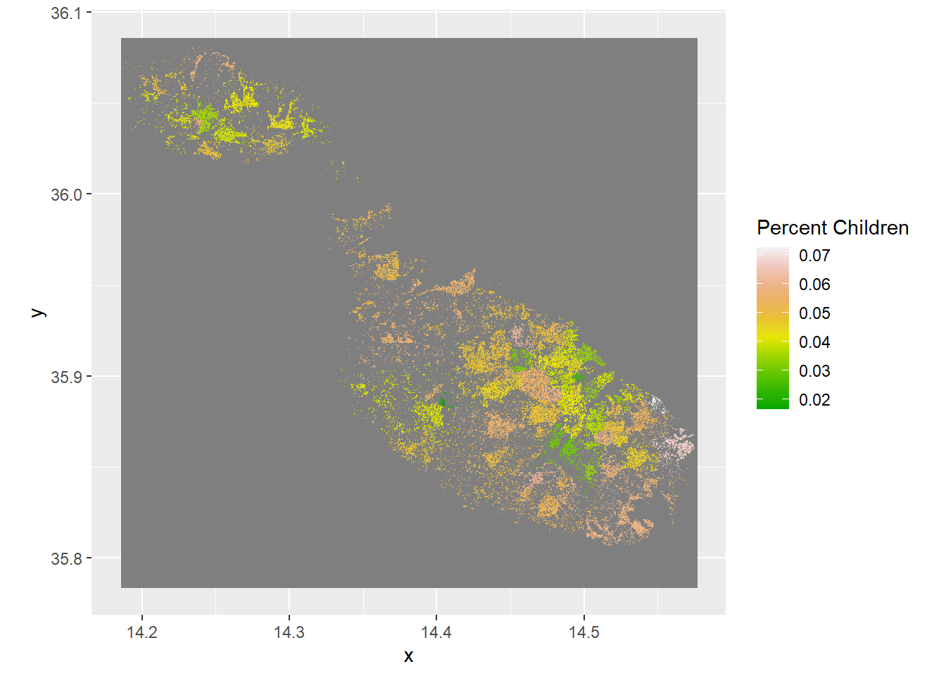
y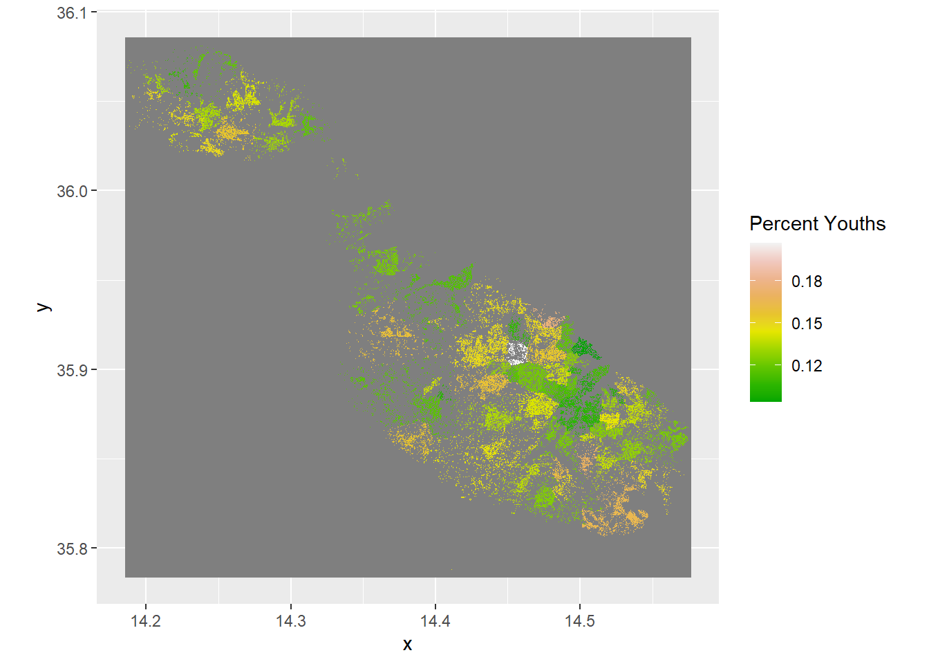
s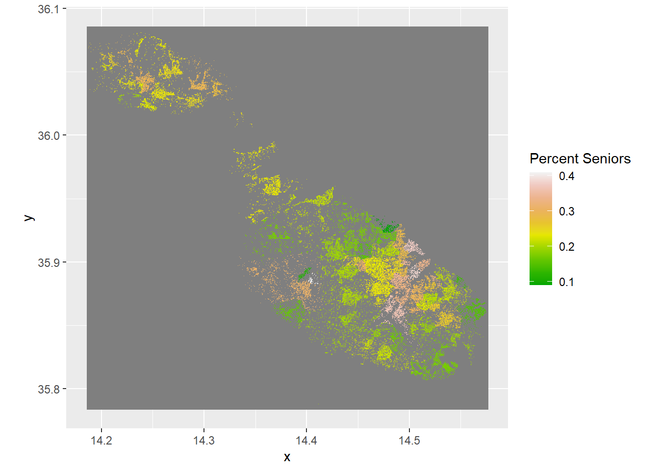
For me the key takeaways are: there’s a densely populated belt spanning Birkirkara-Hamrun-Valletta that’s much older than baseline, youths are much more likely to inhabit the suburbs of this area and the west coast and children are amazingly well dispersed across the island.